Screenshot / HELP: New player looking for tips :]
-
 21-August 25
- Views 361
- Fans 0
- Comments 7
![screen_8704 HELP: New player looking for tips :]](https://www.nedesigns.com/uploads/screens/8704/8704.png)
-
Description
Hey guys! I recently started to really get into this game, and I absolutely love it. I really want to start making nicer, more aesthetic parks like the ones in the title sequence of OpenRCT2, but I know I have a long way to go until I can make a park half as good as those ones (lol). This park is my most recent one I have made, and I was wondering how I could improve it further. To me, I think it looks good, while at the same time understanding it is probably pretty rudimentary. Please be nice (lol), but I'm open to any critiques or feedback you guys have. Thanks in advance!
-
Full-Size
-
No fans of this screenshot
-
Tags
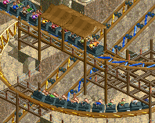
Glad to see you show up and want to improve! It's a little tough to really hone in on the fine details without zooming in, but I'll remark on what I see from a full view. I'm approaching this from the point of view of more realistic theme park principles, which IMO look good even in more fantastical settings.
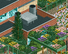
- I'm assuming the pool with the statue is where the entrance is. A realistic park design practice is to treat your paths like a river and peeps like water. (Shoutout to Liampie for the metaphor.) Your entrance would have the most path since that's where the most peeps would be at a time. Account for this throughout the park.
- The shoreline looks a bit odd with those jagged land faces. Smoothing them out and using a different land texture near the water would really make them stand out.
- Realistic foliage is more clumpy with distinct shapes rather than spread out across the map. dr dirt has a fantastic foliage tutorial I recommend to any newcomer.
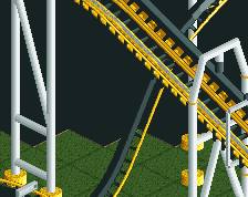
- In terms of realistic coaster designs, you wouldn't see many instances of multiple lift hills or helixes greater than 540 degrees. There are exceptions though!
- Meaningless 2x2 buildings are a staple of classic NE parks, but it would be a little more authentic if you moved those stalls into some of those buildings to give them a little more purpose.
- One way to really jazz up your parks is to build your big tracked rides and coasters first and then lay path through them to develop areas. Imagine that red corkscrew coaster mirrored so it occupies that big empty area inside the circle of path and how much more interesting it would be from a guest perspective than just observing it from a distance. Would be really inconvenient for the pandas though.
I think you'd really get a kick out of SSSammy's YouTube series Fundamental Forest. Sammy walks through the steps of making a realistic, aesthetic-forward park without using any custom scenery or hacks. We've had new members follow along with him as they build their own parks and immediately create solid and memorable parks. We'd also love to have you in our Discord which you can find at the bottom right of the website!
Wow - welcome! Looks pretty cool. My biggest suggestion is to not build up against the map edge so your rides have more room to breathe. Other than that, this is a lovely scene.
Welcome! Good feedback so far to take on board so far. Keep posting some progress shots as with every release you'll get better and better. I hope to see you entering some of our competitions soon!
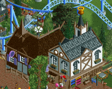
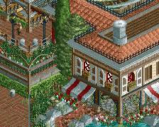
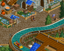
I like the strong cohesive look you applied to your map! But therein also lies my primary suggestion. When building a Chinese area, don't stick to a scenery tab that says 'Chinese scenery' or something like that. In fact, try to stick to generic walls, roofs and other scenery objects and try to find out how to arrange them in Chinese ways. I recommend looking at Ancient Worlds to get an idea of what I'm talking about. I'm not saying you should build as good as alex, Ancient Worlds is exceptional, but it's the best park to illustrate my point!
You can use themed scenery well for accents or thematic details, though.
Welcome Trevor.
I like your focus on aesthetics. It's clear even at this early stage. You've tried to form the terrain so that it responds to all 4 directions and what is neighbouring it. You've also used terrain to make a backdrop setting for the coaster (we call this sort of thing "macro"). You've also tried to combine colours in a way that they cater to an overall mood you identified you liked, but still make sense to the thing they are applied to: a path, a roof, a piece of foliage, etc.
This kind of sensibility is not a given in new players. But the fact you have it helps tremendously, as you'll be able to have a dialogue with this perception as you continue to build new things. Having this dialogue and inner artistic conversation if you will, is what will grow skills for higher creations. So I'd advise having it, perhaps by sticking to smaller maps like this. And next time don't be shy to post a screenshot at 100% zoom, so we can see all the details and read your progress better.
looks really cool tre.vor! some excellent advice in here, so i will echo those! looking forward to seeing more!