Looks fantastic Otter, definitely a lot of improvement shown here over your last solo work, just really well done overall. Excited to see the rest soon.
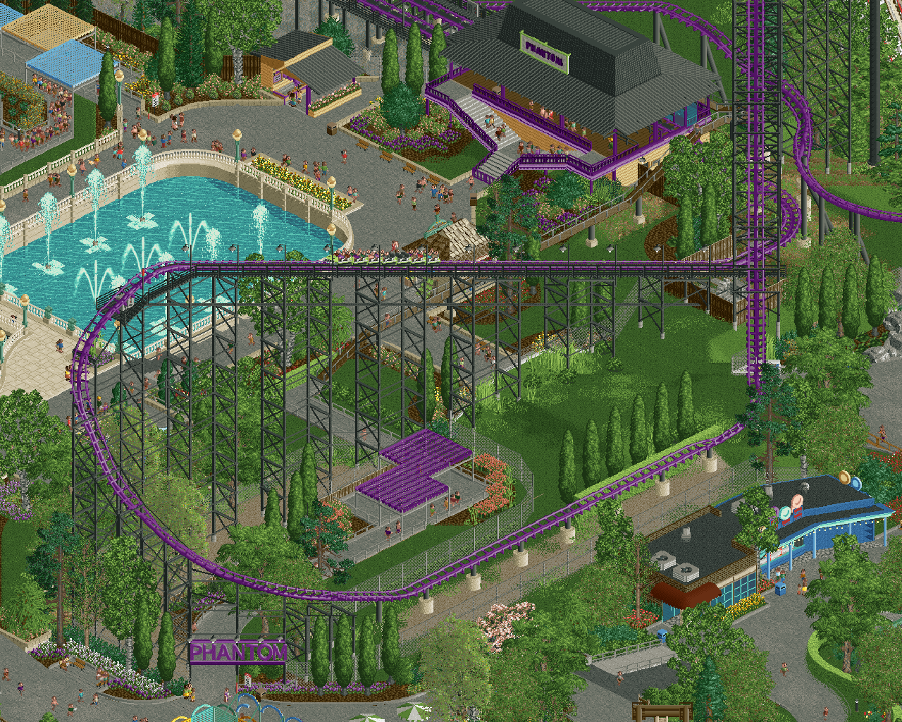
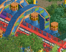
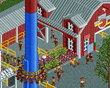
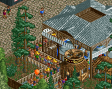
This looks nice! I'm wondering if there's a way to spruce up the station more. I'd look at putting an additional trim right below the roof to avoid having it feel too cut/flat.
Looks awesome! Can't wait to check it out. If the goal isn't a perfect recreation and open to feedback, I think the trim under the roof is a nice suggestion for additional color to the scene. Also wonder if giving the entire roof an extra unit in height would be beneficial as you can't see the fence stops between rows and could also make the operating stand more visible. I like the rounded effect on the fountain too!
A lovely and spacious screen, otter. All the elements have been given apt attention. Tho I agree about the roof, I'm needing a little bit more definition there.
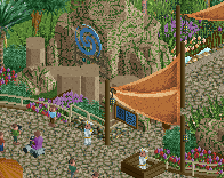
This is so good. I love the framing of that first drop and signage around the queue, and great realism throughout. The only thing I’m not loving is the tan/beige next to the gray pathing in the fountain area - a little stark for my eyes, but I might be in the minority. Love the screen overall though.
Great work as always. I agree with Anton about the beige around the fountain sticking out a bit, I think making some parts of that darker would be more harmonious. The column fence objects have very bright shading so making those dull brown instead of beige will already help a lot I think.
 12-March 26
Congrats in advance on the release! Some really lovely and straightforward realism here, no notes
Nice! Looking forward to it
Looks fantastic Otter, definitely a lot of improvement shown here over your last solo work, just really well done overall. Excited to see the rest soon.
Wasdis, never seen this before. Looking good!
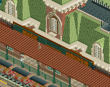
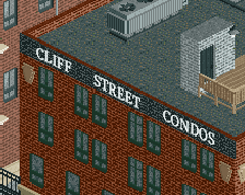
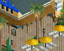
Really nice. Love the curve on the blue building.
This looks nice! I'm wondering if there's a way to spruce up the station more. I'd look at putting an additional trim right below the roof to avoid having it feel too cut/flat.
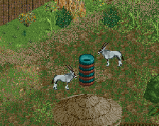
Dirty American realism is back
beautiful, with enough little touches to turn a pretty straightforward theme park scene into one that feels alive, some great choices.
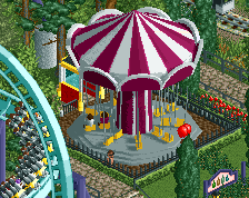
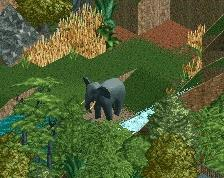
Makes me reminiscing about my visit last summer, what a great coaster Phantoms Revenge is... Very much looking forward to the whole park!
Hey! Very nice. I like the color combination. And the shops are good.
Looks awesome! Can't wait to check it out. If the goal isn't a perfect recreation and open to feedback, I think the trim under the roof is a nice suggestion for additional color to the scene. Also wonder if giving the entire roof an extra unit in height would be beneficial as you can't see the fence stops between rows and could also make the operating stand more visible. I like the rounded effect on the fountain too!
You'd shown this before hadn't you?
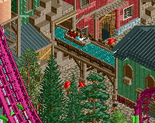
Still love it. Such beautiful layering and balance of ride and landscaping complimenting each other as equal features.
A lovely and spacious screen, otter. All the elements have been given apt attention. Tho I agree about the roof, I'm needing a little bit more definition there.
Fantastic! Great atmosphere!
Great work as always. I agree with Anton about the beige around the fountain sticking out a bit, I think making some parts of that darker would be more harmonious. The column fence objects have very bright shading so making those dull brown instead of beige will already help a lot I think.