(Archive) Advertising District / TFE
-
 24-March 05
-
 -Nemesis-
Offline
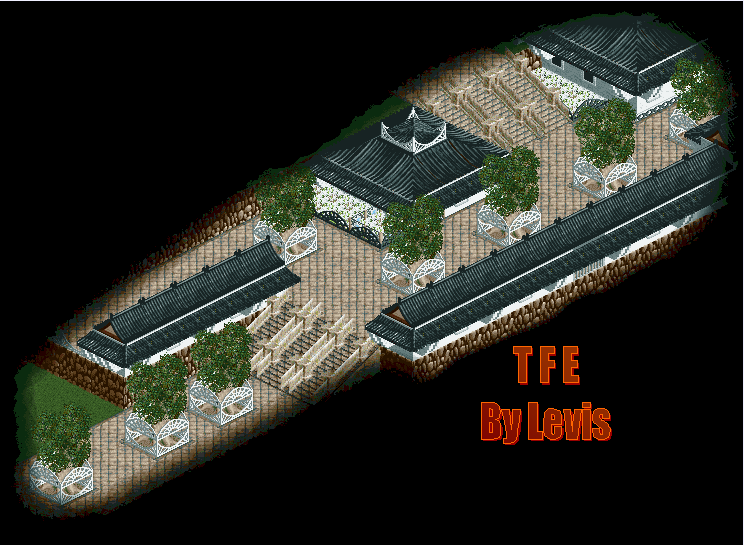
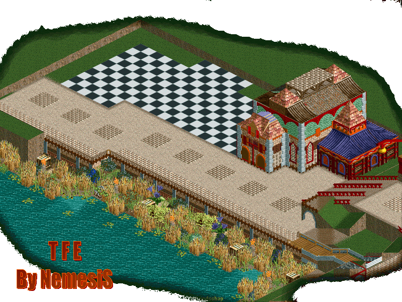
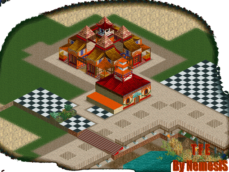
The Forgotten Empire
-Nemesis-
Offline
The Forgotten Empire
I'am new hier and this my new park.
My english isn't that good so can you maybe keep the reactions a bit simple.
The screens:
[- 1 -]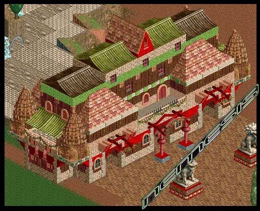
[- 2 -]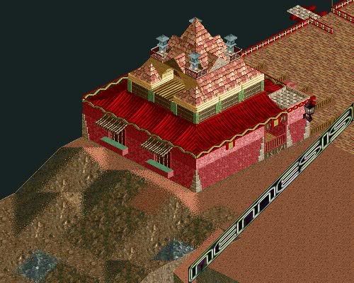
[- 3 -]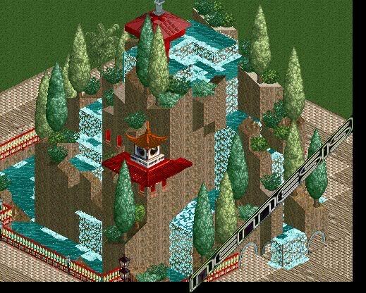
All comment is welcome
-
 Levis
Offline
there are some points that are not logic:
Levis
Offline
there are some points that are not logic:
- on the thirt screen in youre waterval, on some point the water comes out of the wall.
- what does a rock formation on a roof .
.
further are there some other points:
- on the first screen I don't like the green brick wall
- maybe you can add fences (hekjes ) round the path
- ont the second screen I should ad some variation in the wall .
.
[dutchmode]
maar toch ziet het er heel goed uit hoor .
[/dutchmode] -
-Nemesis-
Offline
Is it so nice that you nothing has gonne read ?
A new update: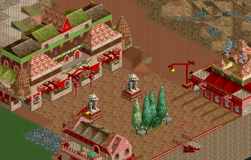
All comment is welcome
-
iGNiTED
Offline
ur color choice makes me sick...even though your theme is oriental, the red and green do not go well.
-
 X250
Offline
It looks very inspired by VOC Anno by SixFrags. Some of the colour choices do not really work too well, like bits of grey, different reds, puke green etc... None of it works. Red and green can look great if done properly, but in this case i think you just missed it. I like the waterfall in your first set of screens though.
X250
Offline
It looks very inspired by VOC Anno by SixFrags. Some of the colour choices do not really work too well, like bits of grey, different reds, puke green etc... None of it works. Red and green can look great if done properly, but in this case i think you just missed it. I like the waterfall in your first set of screens though.
-X- -
 Ride6
Offline
Okay the archetecture forms and features are excellent but the other choises made are somewhat poor... He's my suggestions:
Ride6
Offline
Okay the archetecture forms and features are excellent but the other choises made are somewhat poor... He's my suggestions:
1) Replace the custom 'brick' paths.
2) Get rid of the mayan dome things on the edges of that large building.
3) Change all the green sceanery to either a darker, more neutral green or change them to a brown or tan.
4) Get ride of one of the two brick textures on the buildings.
Other than looking like a mess of colors and textures this is quite decent. It's sad to see the building-forming talents used with such a lack of taste for the atmosphere which is jumbled and confused.
ride6 -
 Tom_Dj
Offline
you now what i think of this park
Tom_Dj
Offline
you now what i think of this park
it's al little fairytale inspired maybe you can use other colors
-
-Nemesis-
Offline
Oke:
- The lamps are great. Thanks.
- my colors aren't good.
- It is wel what inspired by VOC Anno.
- The green color -> Darker.
The next update is normal from Levis, normaal. -
 JKay
Offline
None of those screens appeal to me. Far too much randomness with colors, textures, fences, etc....
JKay
Offline
None of those screens appeal to me. Far too much randomness with colors, textures, fences, etc....
I would suggest trying to refine your theme a bit. I can tell you're going for Chinese/Japanese, but there are way too many colors and textures for me to really enjoy it as being "themed". -
jon
Offline
That first screen reminds me of the Japanese area I had in Goura Point before I lost it. I think I started a H2H park befire the re-draft in that esact style as well.
On to the park, your architecture itself, is top notch but your colours are a bit sickly. Not too bad looking though. -
 mantis
Offline
Bullshit is that chinese/japamneese architecutr we- maybe stylisticall ybut not properly. Maybe the first scnreeen but not he theothers.
mantis
Offline
Bullshit is that chinese/japamneese architecutr we- maybe stylisticall ybut not properly. Maybe the first scnreeen but not he theothers. -
tracidEdge
Offline
The only thing that looks actually chinese/japanese are those rooves. The rest is just random.
-
Scorchio
Offline
Yeah -
the first screen of your update is nice, but the rest... I dunno...they seems a little rushed, compared to the first lot of screens you showed us. -
Geoff
Offline

Everything is so off; the colors, the foilage, the roofs, the walls.... I don't like it at all.
The architecture itself is un-inspiring, and hard to look at.
Sorry for being mean, but....
-

PBJ Offline
^ OMG aka O My God
----------
about the park. i doný like it... the colors, the use of roofs, the buildings... its all so bizzy so like Geoff said: it´s hard to look at...


Tags
- No Tags