(Archive) Advertising District / Disney Downunder
-
 04-August 05
-
 Ride6
Offline
Ride6
Offline
I agree, and that makes it 10X better for me.hmm. reminds me of beejer a lot for some reason.
still, it's a very good screen.
That's some beautiful stuff guys and the hight variation in the pathing is brillence, more people really must learn to do that stuff (including me).
Excellent.
ride6 -
 Kumba
Offline
Damn this is some nice stuff, I really like pretty much everythin other then the plants and flowers, probably the last id use, but other then that its looking like a very soild Tomorrowland theme
Kumba
Offline
Damn this is some nice stuff, I really like pretty much everythin other then the plants and flowers, probably the last id use, but other then that its looking like a very soild Tomorrowland theme
-
 RCTCA
Offline
WOW!!!!!!! This is looking fantastic. Very Disney like. I love the golf course screen and I like.......... Wait I like all the screens. Once again great park can't wait for it to be released. Wow!!!
RCTCA
Offline
WOW!!!!!!! This is looking fantastic. Very Disney like. I love the golf course screen and I like.......... Wait I like all the screens. Once again great park can't wait for it to be released. Wow!!!
-Parkmaker
-
 Phatage
Offline
I don't know about this one, as a screen itself I guess its nice, but really I feel no fun, want to be a child again disney atmosphere. I feel the paths are too wide to do so, or maybe just that much space in between rides that does it. I mean that space mountain and tomorrow land are in the magic kingdoms for that reason, and this seems more like a less kid friendly epcot type atmosphere. If that's what you're aiming for, then there is nothing wrong with that, but being realistic means sticking to Disney's style and past successes with one of those being making tomorrowland the place where people dart to right when the park opens, both young and old. You have the basics down hard, and you should because you're in the masters, but now what you have to do is dive into the concept, know not just how things are but why they are, and build accordingly. This park has a lot of potential.
Phatage
Offline
I don't know about this one, as a screen itself I guess its nice, but really I feel no fun, want to be a child again disney atmosphere. I feel the paths are too wide to do so, or maybe just that much space in between rides that does it. I mean that space mountain and tomorrow land are in the magic kingdoms for that reason, and this seems more like a less kid friendly epcot type atmosphere. If that's what you're aiming for, then there is nothing wrong with that, but being realistic means sticking to Disney's style and past successes with one of those being making tomorrowland the place where people dart to right when the park opens, both young and old. You have the basics down hard, and you should because you're in the masters, but now what you have to do is dive into the concept, know not just how things are but why they are, and build accordingly. This park has a lot of potential. -
Aeroglobe
Offline
The atmosphere in this park is almost unreal. This is one of my favorite RCTM pieces so far, great work.
-
 JKay
Offline
JKay
Offline
Its the argonath blocks that make it look like beejer-style. I personally like the screen a lot. Great color scheme; very in-tune with the Disney theme; great organization and ride placement. Nice job guys.Update:
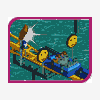
Construction on the park is progressing nicely and Tomorrowland is nearly complete.
Below you will find the entrance to Space Mountain along with a glimpse of Rocket Rods, PeopleMover, Flying Saucers and "Honey I Shrunk the Audience" 3-D show.
-
Stargazer
Offline
Personally I think this looks fucking incredible - and consider that the highest compliment as I hardly ever post in this forum.
-
 RCTNW
Offline
X250 – Thanks.
RCTNW
Offline
X250 – Thanks.
Artist – The Beemer was throwing us all off at first but we think we have it figured out now. Thanks
Inversed – Thanks, we tried!
Meretrix – Now that you bring it up, it does have that feel to it. I think it’s the colors that are doing it though.
tracidEdge and Tom Dj – beejer is not part of RCTM
iBrent – Thanks. Although the real Rocket Rods bombed, we hope our version works better.
Ride6 – I think we all need some help with that aspect.
Kumba – We kinda short changed ourselves with regards to flower selection but we do the best we can with what we have.
Parkmaker - Thanks
Phatage – Thanks for the detailed feedback. I think I know what you’re saying and will pass it along to the team. I’ll try and contact you later to see if I understand what your saying.
Aérôglòbe – Thanks
JKay – Thanks and you are correct
Metropole – Thanks Mark. This says a lot coming from the custom support king!
Stargazer – Many thanks and we do! -
penguinBOB
Offline
It's really lovely. However, in lou to what phatage was saying, it looks sterile and almost too clean. You know, kids don't want to play in something so stiff and tidy they feel like they can't move or they'll mess anything up. I don't know how to solve that dilema, or even if you can solve it whith what you already have on the table. Nonetheless, it's still impressive, and I like it.
-

RMM Offline
It really feels like something you can actutaly walk through and look around in. And that is hard to do so ups on that one.
-RMM-
-
 Buckeye Becky
Offline
Buckeye Becky
Offline
I ditto the same comments...It does look so symmetrical and sterile.It's really lovely. However, in lou to what phatage was saying, it looks sterile and almost too clean. You know, kids don't want to play in something so stiff and tidy they feel like they can't move or they'll mess anything up. I don't know how to solve that dilema, or even if you can solve it whith what you already have on the table. Nonetheless, it's still impressive, and I like it.
Nonetheless, the monorail supports are really cool and I also still like what I see...
The only real detraction for me is that ugly tree you used too much...cypress i think. The choice of flower color could be better too.
It will be great to see this park when finished. -
Geoff
Offline
I don't like the space mountain roofing (tiled spanish roof). It looks unattractive, and monotonous imo.
Other than that, everything get's a 10/10. Really lovely stuff here. The supports and escalators are extremely impressive, and look fantastic. -
 disneylandian192
Offline
The only thing is that I dont know if Disney would put THAT much white in one place. That's alot of stuff to keep clean.But Still, it all looks real nice!!
disneylandian192
Offline
The only thing is that I dont know if Disney would put THAT much white in one place. That's alot of stuff to keep clean.But Still, it all looks real nice!! -
 Carl
Offline
Never seen a B&M in a Disney park, but hey, thats what "Imagineering" is all about, right?
Carl
Offline
Never seen a B&M in a Disney park, but hey, thats what "Imagineering" is all about, right?
And those supports on the monorail are going to go down in RCT history
Only negative I can see, there might be a little too much white on that mountain-thingy. -
RCTNW
Offline
Again, thanks for the feedback. I do have a question though regarding the “White†or “Sterile†comments that have come up.
When I was younger, I remember the older version of Tomorrowland being very white indeed. In fact, Space Mountain was completely white. They then changed it to a rust and purple combination before this recent upgrade in which they went to all white once again. We did try to match the rust / purple combination but just did not look right in game. We then went back to all white but it was just too white even for us thus the addition of the purple was added to this version.
One other thing to add that not all of our Tomorrowland is this white however the Space Mountain area is very similar to the screenshot in color. -
TWX
Offline
holy shit thats f***ing AWESOME ! XDGeert - Not on this version. Sorry
makonix & tyandor - Thanks and we will see what we can do
JBruckner - Thanks
coasterfrk - Thanks
Panic - KLAP is also one of my favorites and we hope to do better. As for the fences, this particular version is only in this area of TL.
][ntamin22 - I don't see a cricket stadium in the mix just yet but you never know.
Xenon - Thanks
Update:
Construction on the park is progressing nicely and Tomorrowland is nearly complete.
Below you will find the entrance to Space Mountain along with a glimpse of Rocket Rods, PeopleMover, Flying Saucers and "Honey I Shrunk the Audience" 3-D show. -
Testudo
Offline
Unbelievably fantastic work guys! I absoluetly love it!
I hadn't seen the golf course screen before. Beautiful. If your approach shot to 18 hooks, and a monorail is coming, do you yell "Fore!!"?
How much have you guys completed? When do you expect to have it done?


Tags
- No Tags