(Archive) Advertising District / Forbidden Kingdoms
-
 22-January 06
-

disneylhand Offline
This is really good.
I agree with steve about the slanted roof looking better. It's disappointing that you went in a different direction for the dive machine, because my favorite screen of the bunch was the one captioned "A very early concept for my Diver which was quickly changed. I was going for a ruined them obviously, but I decided to try a different approach........."
-disneylhand -
 Six Frags
Offline
You have a wonderful style RFan, really sets yourself apart from the rest of the parkmakers at this site..
Six Frags
Offline
You have a wonderful style RFan, really sets yourself apart from the rest of the parkmakers at this site..
Doesn't really matter which version is better, I like them all
SF -
 X250
Offline
omfg awesome as ever lol. i love how you show the before and after for the improved buildings, the new buildings have less detail in terms of the amount of scenery used- yet they achieve the same thing as the before pic. finish this now!!! so u can help me on a certain area on my solo. =P
X250
Offline
omfg awesome as ever lol. i love how you show the before and after for the improved buildings, the new buildings have less detail in terms of the amount of scenery used- yet they achieve the same thing as the before pic. finish this now!!! so u can help me on a certain area on my solo. =P
-X- -
 Splash-0
Offline
Yes that is very nice. Hope you will finish it someday in the future. How far is the park done already (in percentages)?
Splash-0
Offline
Yes that is very nice. Hope you will finish it someday in the future. How far is the park done already (in percentages)? -
 Emergo
Offline
Wow, RFAN, sooooo much enjoy it that you are working on this amazing and supreme one again!! Thanks for the updates -and the work to organize the whole topic- and letting us step in on where you are going.
Emergo
Offline
Wow, RFAN, sooooo much enjoy it that you are working on this amazing and supreme one again!! Thanks for the updates -and the work to organize the whole topic- and letting us step in on where you are going.
Like SF said: ´Doesn't really matter which version is better, I like them all´.....
Does not matter either if you are ´building slowly´/or not having much time or being too much of a perfectionist, or whatever....as long as this can go on, you make RCT sooooo inspiring for me,
Thanks!!
Emergo
-
 RCFanB&M
Offline
Love your style man!
RCFanB&M
Offline
Love your style man!
I like the improved buildings, but for building 2, well, if I were you, I'd combine the old and the new one...the slanted roof should stay...that's my only suggestion. The grey brick blocks you used as base didn't look bad either.
Anyway, I'm very glad this park is still going. How much is it done (more or less)? -
 RCTFAN
Offline
~CF~: I wasn't asking for a vote but it's great to hear your thoughts.
RCTFAN
Offline
~CF~: I wasn't asking for a vote but it's great to hear your thoughts.
Liampie: Correct I wasn't asking but thanks anyway.
PBob: Yeah once I had moved the white stripe down, it would be overkill with another colour on the trim.
Linq: ^ and thanks.
Lloyd: Thanks very much!
Steve: Thanks. I liked the triangular trim too, but it's not within the theme.....not to say i won't use it somewhere else though. As for the square roof tops, yes I agree it did break up the symmetry but i haven't shown you any of the 'other' buildings yet....
Turtle: That's a tempting offer, but I'll have to hold out till I'm 50%, give you something more to look at then.
Disneylhand: I'm sorry you feel that way about the dive machine but i've had enough of doing 'ruined' themes and going for a more 'clean' approach for this theme. However I'm sure the new layout and the improved volcano will please.
Six Frags:Thank you, means a lot coming from you.
Sure: Thanks!
Hepta: Thanks!
X250: ha-ha yeah although the buildings were not finished in the after pics. Seeing as I'm free(er) now for the summer perhaps i can get that bit done on ye solo....
Splash-O: Well I have 2 1/2 areas complete with other very small sections dotted about. It's standard spotlight size so what's that.....30-40%?
Emergo: Well I never stopped working on it, just at a very slow pace since the last update thanks to university, that and being a fellow perfectionist . Your comments always inspire me, along with your work. It's ironic we take so much inspiration from each other. You really are my favourite parkmaker.
RCFanB&M: Thanks man!
Thanks all for the comments and keep a whether eye on the horizon for an update. -
RCTFAN
Offline
Hey guys,
Seeing as i didn't show a screen for the fiesta, here is the consolation prize. It is a very small teaser of theSpoilerArea.
--------------------------------------------------
-------------------------------------------------
Its unfinished as usual, and the colours/textures are a bit off but they change. It's a teaser so it's not the final product
Anywho i'll keep plodding away at this thing and hopefully have it out to you before Burn's gets the Jade Monkey.
RFan -
Sûre
Offline
I like arrangement of objects, above all edges and even if this parc will stay a reference for structure of buildings as you are taken a style which it's you own, i find that it lack of importants structures despite presence of structures complex just as there are a good work on fitting out, vegetation...it becomes boring. ^^
I hope it will be comprehensible. ^^ -
 Steve
Offline
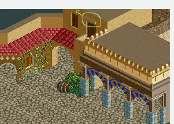
Those 1/8th grey brick columns look fantastic. However that diagonal arch looks freaking hideous.
Steve
Offline
Those 1/8th grey brick columns look fantastic. However that diagonal arch looks freaking hideous. -
 FK+Coastermind
Offline
well as always a beautiful screen RCTFAN!! you really are the perfect example of the ability to make a park with extreme detail using less. the way you make certain places jump out while others blend so well and make a really calaboative piece is perfect. cant wait for this park!!
FK+Coastermind
Offline
well as always a beautiful screen RCTFAN!! you really are the perfect example of the ability to make a park with extreme detail using less. the way you make certain places jump out while others blend so well and make a really calaboative piece is perfect. cant wait for this park!!
FK -
Grand Admiral
Offline
Everything looks wonderful so far, of course all the buildings seem to be a bit too blocky for me, but since that's the look you're going for, it really works.
-
 Evil WME
Offline
mmm...
Evil WME
Offline
mmm...
looks really, really nice.
the only thing that leaves me wondering is why most of the 'before' shots look better than the 'after' shots. Or atleast, the second one in particular. Maybe it's because you haven't redone the top yet.
Nice job though, i hope you can pack the punch with the coasters. Would be a shame to waste that theming on a soso coaster design. -
lucas92
Offline
I would put an another 1/16 building block above the window. It might look better.
Yeah, that diagonal arch wall looks awfull... You should remove that 1/4 balcony post at the base of that object. It doesn't look good at all with the contrast of the dark and bright colors... Also, I think that wall with the vines on it stand out too much from the screen. Removing them would make that screen dead though.
Beside that, buildings are all very nice with those 1/16 building blocks. Innovative.
-
RCTFAN
Offline
Zodiac: lol, cheers.
Sûre: From what i can decipher, you like the intricacies and even though people will look at these buildings for inspiration, None of them have any meaning, just facades? If that is what you were saying then yes i agree, the buildings i have shown are nothing more then facades at the moment becuase i'm still in the SE. As for ''show'' buildings (rides/entertainment) i haven't shown any yet, it's all shops, etc.
Steve: It looks better viewed fully and i have used it better elsewhere, however i think it's because the object is too thin, which is why i tried putting a 1/16 block behind it. I'll try something else.
FK+Coastermind: Thanks very muchly
Grand Admiral: Yeh it is blocky to a certain degree but remember this isn't a finished product.
Evil WME: Yeh the after shots were not finished at the time of posting but they are now. I hope my coasters will be decent enough becuase i would say that is my weakspot.
Lucas92: the 1/16 block above the door is to stop rain from dripping down the door and i wanted that to be a feature rather then having one that runs the whole length. Again with the diagonal arch, it looks better as a whole and i'll try some other things to make it look thicker, but unless i want to make my own object it's all i've got. The vines are all over that building and so it's another case of viewing it in-game as a whole. The reason they are there is becuase i couldn't contine the HP brick wall along the bottom becuase it would overlap the bottom of teh arch, so i used vines to soften the edge.
Pineapple: Yeh i've been trying to free up my buildings with diagonals since Kukuana, hopefully it will all work out. I have better examples of it but i'm not going to show them
CF: Thanks!


Tags
- No Tags