(Archive) Advertising District / Marvelous Mayhem
-
 28-February 06
-
 Tycoonman
Offline
Nicely said Jammin! Nice to see you over here at NE now. Anyways, what gets me are thoese pointed roof things over the MCBR on the coaster. They just look silly...
Tycoonman
Offline
Nicely said Jammin! Nice to see you over here at NE now. Anyways, what gets me are thoese pointed roof things over the MCBR on the coaster. They just look silly...
Keep it up!
TycoonmanEdited by Tycoonman, 04 March 2006 - 05:04 PM.
-
Tycoonman
Offline
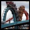
The wooden coaster looks pretty good, but the transition right after the break run on the steel coaster is just wierd. The scenery around the steel coaster is also kinda bland. There is just to much brown. You could use a red in there, and that should break things down a little.
Tycoonman -
 MachChunk 3
Offline
I was hoping that he wouldn't post any screens until after I told everyone to lick my balls.
MachChunk 3
Offline
I was hoping that he wouldn't post any screens until after I told everyone to lick my balls. -
 Jammin_Jumb_0
Offline
Jammin_Jumb_0
Offline
I was hoping that he wouldn't post any screens until after I told everyone to lick my balls.

Hoe old are you again? -
Jammin_Jumb_0
Offline
lol, I put a little on the lift hill. I just have a lot of other things to do, so I'm not working on RCT 2 as much.
-

Rhynos Offline
Coaster looks alright, just put some supports on there like ekimmel said, but with the rest of the scenery, too many textures for my taste. I think I'd rather stick with wood and metal, but se what else you can do with the stucco looking stuff. It just kinda seems outta place. Otherwise, great work. -
 ChillerHockey33
Offline
Ok, so you put custom supports on the lift. But you left the regular ones there.
ChillerHockey33
Offline
Ok, so you put custom supports on the lift. But you left the regular ones there.
-Ryan -
Jammin_Jumb_0
Offline
More Screens guys. PLEASE gimme constructive Crit. Because I really want to become good at Architecture on this game.


-
 Panic
Offline
There's something I can't help but like about this work. Part of it is undoubtedly the fact that you haven't slipped into redundant 2x2ism and your architecture, in terms of shapes, looks as though you are making a conscious effort to have your own individual look. Textures are the only thing to fix up; I wouldn't change the shapes much at all. I also do like your coasters; they are rough-hewn, true, but show a number of good ideas and good inspirations from real life, such as the helixes on the woodie and the post-brake run turns on the steel twister, and it looks like you have some idea what you're doing with them. So keep it up, and all I'd do is refine your wall texture choices.
Panic
Offline
There's something I can't help but like about this work. Part of it is undoubtedly the fact that you haven't slipped into redundant 2x2ism and your architecture, in terms of shapes, looks as though you are making a conscious effort to have your own individual look. Textures are the only thing to fix up; I wouldn't change the shapes much at all. I also do like your coasters; they are rough-hewn, true, but show a number of good ideas and good inspirations from real life, such as the helixes on the woodie and the post-brake run turns on the steel twister, and it looks like you have some idea what you're doing with them. So keep it up, and all I'd do is refine your wall texture choices. -
 zburns999
Offline
I agree with Panic. The 2x2 archy is fine with me (I do it a lot), but I cant help but think that you may be going overboard with shapes in an effort to be creative and have a unique style. It's just a little too untidy for my taste. But, on the other hand, you have made seemingly odd coaster layouts work well in the park and you have themed it well, so that part is good. Its funny, because when looking at overviews, the park looks very nice, because the eye can sense all the different textures and shapes, however when you see close up, all the shapes and textures just dont seem to fit. The park is not at all bad though. I think you could have a very unique style if you developed the archy a bit more, while keeping the random, crazy coaster layouts the same. That is my favorite element of your work. Keep that up.
zburns999
Offline
I agree with Panic. The 2x2 archy is fine with me (I do it a lot), but I cant help but think that you may be going overboard with shapes in an effort to be creative and have a unique style. It's just a little too untidy for my taste. But, on the other hand, you have made seemingly odd coaster layouts work well in the park and you have themed it well, so that part is good. Its funny, because when looking at overviews, the park looks very nice, because the eye can sense all the different textures and shapes, however when you see close up, all the shapes and textures just dont seem to fit. The park is not at all bad though. I think you could have a very unique style if you developed the archy a bit more, while keeping the random, crazy coaster layouts the same. That is my favorite element of your work. Keep that up.


Tags
- No Tags