Fiesta! / My solo plus a bonus screenshot
-
 05-January 07
-
 ekimmel
Offline
Here's two screens from my solo then one of my current project which may or may not be related to the work I'm doing for the Canada Road Rally. My solo wouldn't normally be screenshot-worthy but...hell...it's Fiesta!!
ekimmel
Offline
Here's two screens from my solo then one of my current project which may or may not be related to the work I'm doing for the Canada Road Rally. My solo wouldn't normally be screenshot-worthy but...hell...it's Fiesta!!


-
 Evil WME
Offline
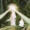
the last screen is very nice, i think you got some really nice theming elements with the odd tree to create a lovely dark swampish atmosphere that looks really creepy... BUT...
Evil WME
Offline
the last screen is very nice, i think you got some really nice theming elements with the odd tree to create a lovely dark swampish atmosphere that looks really creepy... BUT...
..
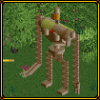
why is there black wood all over the landscaping in the second screen, and especially, why are there colorful flowers everywhere? They really, really don't work for you in these screens. The buildings in the first screen don't seem quite as unique and standing out as they should be, i really think you should go with the choices you made in your third screen (such as the trees and the rocks) and fit the rest of the choices (no flowers, interesting wooden buildings) in with those. Because i'd really like to see more of the last screen, but the first two wouldn't have even gotten me to reply. -
 Levis
Offline
a bit dark atmosphere but it looks really nice
Levis
Offline
a bit dark atmosphere but it looks really nice . altough I don't like the foilage on the seccond screen.
-
ekimmel
Offline
Basically I was envisioning darker landscaping than you can create with the standard exposed dirt on the landscaping. I was experimenting with the black wood to see how it looked. I've found that the lack of textures on the "side" of landscaping is extremely limiting. You can choose 10 different landscape textures but only 4 "sides" -- of which only 1 really applies anywhere but special cases (waterfalls and real wood retaining walls). It's very frustrating. Anyways, the black wood will be changed back to mud when I get an opportunity to work on the solo again.
Thanks for the comments. -
 Ling
Offline
I agree wtih Evil on the flowers...
Ling
Offline
I agree wtih Evil on the flowers...
and I don't really think art deco goes with a jungle theme. Especially black pieces (in the first screen) -
 Carl
Offline
I don't think that is supposed to be art deco, Ling, I think its just the shape of the building. And I think the black is a necessary color for the building, but only as a trim color.
Carl
Offline
I don't think that is supposed to be art deco, Ling, I think its just the shape of the building. And I think the black is a necessary color for the building, but only as a trim color.
These are very good, Rick. You've integrated the rides into the theming/landscaping very well. I think the flowers go well with the jungle theme in the first 2 screens, and the 3rd screen, which is clearly a different park, is a good "Canadian-looking" theme, with no flowers of course, cause we all know Canada is completely devoid of flowers
 J/K
J/K
The gray side walls aren't too bad. Instead of either all gray or all brown, why not experiment with a mix? Might look good if done right, or it might look like crap, who knows, but everything is worth trying once. -
 Tom_Dj
Offline
Don't like the first two screens but the last one is wonderful There's nice atmosphere in that screen
Tom_Dj
Offline
Don't like the first two screens but the last one is wonderful There's nice atmosphere in that screen
-
Xcoaster Offline
The first and the second screen are both a bit too dark. I love the third screen though. Your landscaping certainly is top notch. And the coaster looks nice too. -
 J K
Offline
I think one of the main reasons the third screen appeals to me so much, is it shows how much you've improved. Your really going for all the landscaping which dose'nt become a main feature in most parks now. Congrats you've got the atmosphere in the third screen nailed
J K
Offline
I think one of the main reasons the third screen appeals to me so much, is it shows how much you've improved. Your really going for all the landscaping which dose'nt become a main feature in most parks now. Congrats you've got the atmosphere in the third screen nailed
-
ekimmel
Offline
Thanks for the comments guys. They have definitely helped me determine which of my experiments worked and which didn't.
-
 Coaster Ed
Offline
Before you scrap this and go back to the drawing board, I'm going to have to go against the majority here because I really like the look you've created in those first two screens. The third one is nice in a kindof typical natural looking way, but that second screen is something special. People used the dark wood texture for rocks a lot in LL actually. Certain people did anyway. And I really like how the bright flowers mix there. Reminds me of Mount Sinister a bit. Or that dark section in Unversal's Outrage. That rather generic looking brown brick building in the first screen I could do without though. It doesn't really fit in my opinion.
Coaster Ed
Offline
Before you scrap this and go back to the drawing board, I'm going to have to go against the majority here because I really like the look you've created in those first two screens. The third one is nice in a kindof typical natural looking way, but that second screen is something special. People used the dark wood texture for rocks a lot in LL actually. Certain people did anyway. And I really like how the bright flowers mix there. Reminds me of Mount Sinister a bit. Or that dark section in Unversal's Outrage. That rather generic looking brown brick building in the first screen I could do without though. It doesn't really fit in my opinion. -
 Ride6
Offline
I quite like the large building in screen one... And I kinda agree with Ed with how the color and texture grouping makes a wonderful sort of light & dark atmosphere, which was common in Mt. Sin (best park ever imo).
Ride6
Offline
I quite like the large building in screen one... And I kinda agree with Ed with how the color and texture grouping makes a wonderful sort of light & dark atmosphere, which was common in Mt. Sin (best park ever imo).
Anyway I'm quite interested in your little going on here, because of that atmosphere actually.
Ride6 -
 RCTNW
Offline
Again, solid work and I really don't have any neg comments other than add some time between logs on the log ride.
RCTNW
Offline
Again, solid work and I really don't have any neg comments other than add some time between logs on the log ride.
Keep it up
James - rctnw


Tags
- No Tags