(Archive) Advertising District / My Crap.
-
 21-June 08
-
 Godzillaman
Offline
I am obviously new here, I just wanted to see what you would say about some of my coasters.
Godzillaman
Offline
I am obviously new here, I just wanted to see what you would say about some of my coasters.
Since this is the first time I've uploaded anything, I only am posting the links for individual coasters. The coasters Are what I want you to care about, not the stations...
Mental Instability.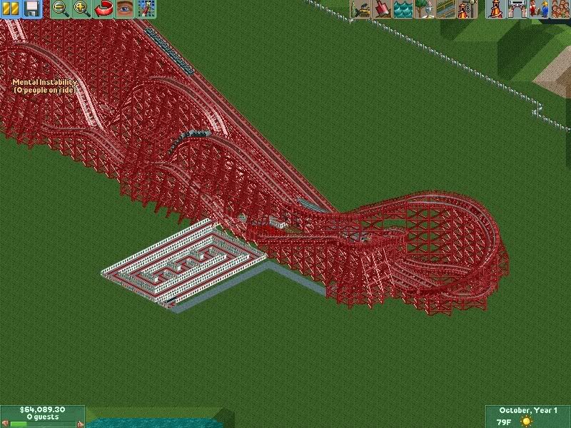
Comet.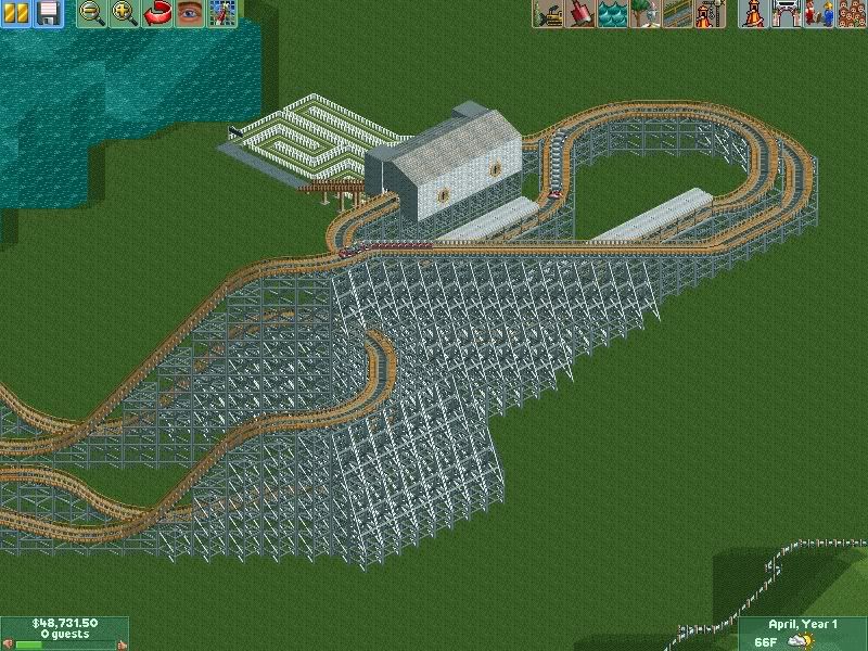
Enjoy...(hopefully... )
)
Edited by Godzillaman, 21 June 2008 - 09:00 PM.
-
 Mike Robbins
Offline
First coaster... too red. The layout looks like it's going to be too big. It's really hard to tell if it's a god coaster or not. This site is more about the theming that goes along with it.
Mike Robbins
Offline
First coaster... too red. The layout looks like it's going to be too big. It's really hard to tell if it's a god coaster or not. This site is more about the theming that goes along with it.
Second coaster... Color choice is a bit better, but those flat turns are a no-no. -
 Cocoa
Offline
Welcome, Godzillaman!
Cocoa
Offline
Welcome, Godzillaman!
Take a look at the other work on this site and you'll definitely get better.
The colors are not very good, the layouts are awkward and you said not to comment about the stations.
Also, if you're releasing them they should go in the release-your-parks-land. -
 turbin3
Offline
The first screen is too red, take another colour.
turbin3
Offline
The first screen is too red, take another colour.
Also the start of the station isn't good.
The second screen is better, but also not so good.
The track seems to be "strange".
Yannik -
 posix
Offline
don't comets use to always unbanked curves? i think it's actually intended that way and i also find your layouts to be pretty nice looking. the colour doesn't matter, it can quickly be exchanged.
posix
Offline
don't comets use to always unbanked curves? i think it's actually intended that way and i also find your layouts to be pretty nice looking. the colour doesn't matter, it can quickly be exchanged. -
 Nokia
Offline
that is an hudge amount of que. in the first screen.
Nokia
Offline
that is an hudge amount of que. in the first screen.Edited by Nokia, 22 June 2008 - 09:24 AM.
-
 nin
Offline
and people say I use too much red.
nin
Offline
and people say I use too much red.
And change the name to something other than "mental instability".Edited by nin, 11 July 2008 - 09:45 AM.
-
Godzillaman
Offline
Hmm...I was expecting reactions like that.
Now to answer some people:
The red was intended to give it a mental feel to it. The layout is terrible though because I tried to remake a coaster I lost, which was a lot better in terms of the layout.
The commet has unbanked turns because it doesn't really go fast on the turns, and it gives it a sort of older feel to it.
Thanks for all the imput. I'll keep your comments in mind.


Tags
- No Tags