(Archive) Advertising District / Project Blue
-
 06-August 08
-

FullMetal Offline
I figured I should start my own topic.
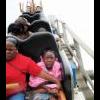
Screen from the Dump Place.
A nice shot of the station and lift. I still need to add foliage by the queue.
All comments welcome!
Edited by Xin, 28 September 2008 - 01:28 PM.
-
 jusmith
Offline
I know its called Project Blue, but maybe one or two more accent colours besides green would help brighten up the atmosphere.
jusmith
Offline
I know its called Project Blue, but maybe one or two more accent colours besides green would help brighten up the atmosphere.
Someone already stated that land under the water is a little flat, so maybe some gentle sloping and some weeds to make it more visually appealing.
For the second screen, you have pretty good structural details to the station, but it is a little boxy, so maybe more of an open air concept would work, and some roof height variation. Also, I think you could do more with the que, as the station is quite extravegent, yet the que looks just flat. So maybe incorporate it in some landscaping or into the station itself...?
Good job.Edited by jusmith, 07 August 2008 - 12:49 AM.
-
 Comet
Offline
I hate the queue, both the tye of path you chose and fences.
Comet
Offline
I hate the queue, both the tye of path you chose and fences.
I also think the chain return would look better as a black or grey to break away from all the blue and green your using. Also you should have ploes coming down from the catwalk to hold the chain return up as well as then connecting to the supports.
Also I agree with jusmith on making the station open air as that would make it a little bit more interesting and allow you to detail the inside.
It looks good though, definitely the best I've seen from you. -
 zodiac
Offline
i think maybe adding more of the gold accents like the victorian spikes on top of the station would help the screen immensely. besides making the station open-air, it's always been a perk of mine to change the land under the paths, but that's not really important. you've really been improving lately, so let's see you finish this.
zodiac
Offline
i think maybe adding more of the gold accents like the victorian spikes on top of the station would help the screen immensely. besides making the station open-air, it's always been a perk of mine to change the land under the paths, but that's not really important. you've really been improving lately, so let's see you finish this. -

inVersed Offline
This is a lot better than anything else you have ever shown. I mean its still not great, but it shows a lot of improvement. Though i feel you do need a few more colors in there, the yellow fence at the top of the roof looks out of place. IMO it still has a very bland feeling to it which is by no means appealingEdited by inVersed, 07 August 2008 - 01:42 PM.
-
FullMetal Offline
@jusmith: I've been struggling with the colors, actually. Aside from blue, sea-green and gold (the spikes on top of the station), I haven't found any other colors that I think work well. Any suggestions? As for the station, I might make a few alterations, but I don't really want to completely redo it.
@Comet: I probably will change the color of the chain in due time.
@zodiac: I do plan on finishing this, hopefully by next week. It's going much quicker than I predicted. But thanks for the advice!
@Evil WME: If you honestly don't know, I'll give you a hint: Straits of Gibralter.
@inVersed: The gold victorian rail is an accent for the roof. I just need to figure a way to incorporate more gold in other places.
@Kevin: Thanks!
-
 Kumba
Offline
I like it, but you have a PT3 deadline and I assume some form of schooling coming up, so id work on the PT3 if I were you... or do what I did and be a loser who decided to play RCT instead of going to his classes. Thats what I did and now im 24 and 49 credits shy of that amazing degree.
Kumba
Offline
I like it, but you have a PT3 deadline and I assume some form of schooling coming up, so id work on the PT3 if I were you... or do what I did and be a loser who decided to play RCT instead of going to his classes. Thats what I did and now im 24 and 49 credits shy of that amazing degree.
-
 Evil WME
Offline
Evil WME
Offline
@Evil WME: If you honestly don't know, I'll give you a hint: Straits of Gibralter.
How exactly was i supposed to 'honestly' know that?
As others said, it doesn't look bad.. but it's quite a long shot to call your theme apparant. It just looks like a pretty random building with some pillars to me. Definitely put some more gold in, if anything. Not sure the turqouise works on the building.. seems like you have more than enough of it with all the water and the coaster being that color.. -
FullMetal Offline
@Kumba: Thanks for liking it. And fuck the PT3. I'm having way more fun with this design. I've probably done more work on this one design than I have in all my PT3 prelims and my final.
@Evil WME: I don't know how you would know that. I thought the theme was obvious, what with the green columns and water and all...
Anyway, here's some stuff I did today:
Roll over water. Sorry about the rain.

Dive loop. And I worked on unevening the ground under the water. -
Kumba
Offline
Yeah fuck the PT3... since I run it... I built part of X250's PT2... *gasp*

Now that the cats out of the bag I guess people can't be DQ'ed for helping... with 20 days to go... collabo it up fast bitches
-
 X250
Offline
X250
Offline
Yeah fuck the PT3... since I run it... I built part of X250's PT2... *gasp*
You did? :' />
:' />
-X- -

Kevin Enns Offline
10/10 again
Its the Straight of Gibraltar
This may be the best design ever. Make a park! -
 Nokia
Offline
^are you serious?
Nokia
Offline
^are you serious?
its okay.
but its nothing great.
you've never seen greatness.Edited by Nokia, 08 August 2008 - 03:18 PM.
-
FullMetal Offline
@Kevin: I didn't say it was the Strait of Gibraltar, but the Strait is commonly associated with the theme, among other things. Thanks for the enthusiasm though.
@Nokia: You are very correct. There are much better things out there than this.
I won't be working the project this weekend. I'm going to Holiday World before I go back to school. I would've thoroughly enjoyed making it to King's Island, but maybe next year (when they have Diamondback ).
).
-
FullMetal Offline
New screen after having a great weekend and getting back to school.
A purposeless building, a banked dive off the break run, and transfer track. Slightly unfinished in the back.Edited by Xin, 12 August 2008 - 06:48 PM.
-
 nin
Offline
You're getting better.
nin
Offline
You're getting better.
But I find the white floor a little over powering, and I don't like the support on the building.
Tags
- No Tags