(Archive) Advertising District / International World of Extremes
-
 26-August 08
-
 Mosquitox216
Offline
Mosquitox216
Offline

the entrance to my park, as you can see. its build in a dark fashion
EDIT: look below for the newer entrance(because this sucks)
More of my entrance. The gardens use every color in the rct2 color palette


This park is going to be themed with maybe 30-40 different themed areas. This is the second part finished, the midnight carnival. it has fireworks in all the free spaces
ok, this park is only on it's 3rd draft form, so any help in design for these parts would be appreciated!Edited by Mosquitox216, 26 August 2008 - 07:33 PM.
-
 Sey
Offline
Sorry, but I don't like that!
Sey
Offline
Sorry, but I don't like that!
The colors are vey ugly, and the buildings are too blocky.
Have you ever seen benches onto a building, where
nobody's able to go?
-
Mosquitox216
Offline
so i should change it to bright colors and make the buildings with more curves?
-
Kevin Enns Offline
I really liked it and 30-40 themed areas may be a record and IWoE is a great name! -
Mosquitox216
Offline
thanks kevin_enns. i remember you posted an idea for a park called "the sea farers", and can i use some of those ideas? ill even credit you if i ever finish this. and random question to all: should i still use the dark theming for the entrance or should i make it brighter?
-
 MF72
Offline
MF72
Offline
so i should change it to bright colors and make the buildings with more curves?
I'm pretty sure he doesn't just mean to add curves. Spruce up the buildings a bit. Don't just leave them as a box. Add smaller additions to the side or something of the sort.
And you'll also want to put the ATM and health place in a building as well. -
 robbie92
Offline
Add details like balconies, awnings or something like that. The buildings look like boxes. Also, add some theming to the rides to coherently connect them together. It's a good start, but that's what is is: a start. Work on detailing and attractive color combinations and you could have a potentially good park. Good luck!
robbie92
Offline
Add details like balconies, awnings or something like that. The buildings look like boxes. Also, add some theming to the rides to coherently connect them together. It's a good start, but that's what is is: a start. Work on detailing and attractive color combinations and you could have a potentially good park. Good luck! -
Sey
Offline
I'm pretty sure he doesn't just mean to add curves. Spruce up the buildings a bit. Don't just leave them as a box. Add smaller additions to the side or something of the sort.
And you'll also want to put the ATM and health place in a building as well.
Yes, that's what I meant.
AND please change the path! It's too dark on the first picture... -
 Camcorder22
Offline
now THAT is much better than your first picture. See what happens when you put some time and planning into your parks? There is still much room to improve though, try to keep your walls on one side of the tile so they dont stick out. And the building could use a few more details if you have the right objects.
Camcorder22
Offline
now THAT is much better than your first picture. See what happens when you put some time and planning into your parks? There is still much room to improve though, try to keep your walls on one side of the tile so they dont stick out. And the building could use a few more details if you have the right objects.
Also, I never have and probably never will see anyone pull off 30-40 themed areas in a park and make each of them have some degree of quality. No matter how big your map is. It will never happen. -
Kevin Enns Offline
A) Use whatever you want. I never thought my ideas would actually make it into RCT in a good park!!! Creditting me would be awesome!!!thanks kevin_enns. i remember you posted an idea for a park called "the sea farers", and can i use some of those ideas? ill even credit you if i ever finish this. and random question to all: should i still use the dark theming for the entrance or should i make it brighter?
 You should definately have a dark area (more than one, with 30-40 themed areas), but maybe not the entrance if you are aiming for a realistic park.
-
Mosquitox216
Offline
2 more pics

the two buildings next to the fountains have restrooms, an atm, a first aid room, and info kiosks in them. at the left is the food court(with checkered ground and invisible path )
)
The Purple building holds one of my rides, Musical Masterpiece(it plays the gentle theme). The Skyskraper holds the station platform for an observation tower, Top of the World. And the black glass building has a super looper, named 3.14. NOTE: ignore the scenery at the back. i still have to import a ride from one of the older save files.
now tell me ho much you hate this -
Mosquitox216
Offline
because no one is posting, i have to double post, unfortunately. here are two more pics(they're un decorated and look ugly, but i dont know what to add)

the hollywood sign for my newest area, hollywood
EDIT: i replaced the old one with this one
a ride in the hollywood area, Enter the Pyramid. Inspired by DCRachet's Journey into the pyramid(but mine is worse)-http://www.youtube.com/watch?v=MieijoS3gWMEdited by Mosquitox216, 30 August 2008 - 07:31 PM.
-
 ChillerHockey33
Offline
You seem...uninspired..for lack of a better word..
ChillerHockey33
Offline
You seem...uninspired..for lack of a better word..
Might I suggest downloading designs and spotlights to help inspire your work. -
 Maverick
Offline
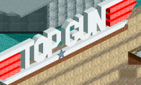
Hollywood sign needs some angled blocks to get rid of the pixelated lettering style.
Maverick
Offline
Hollywood sign needs some angled blocks to get rid of the pixelated lettering style.
I.E. more like this:Attached Thumbnails
-


Tags
- No Tags