(Archive) Advertising District / Emperor
-
 04-February 09
-
 Nokia
Offline
the coaster has a very nice feel to it.
Nokia
Offline
the coaster has a very nice feel to it.
is there going to be any custom supporting for the woodie? -
 Fr3ak
Offline
Nice.
Fr3ak
Offline
Nice.
Shame you give PRY up =(
BUT you've used the best parts to create a really great design!
<3 -
 Sey
Offline
Sey
Offline
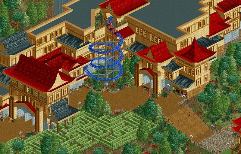
the spiral is perfectly placed.
Exactly what I thought!
Promising screens you have there, very lovely! ^^ -
 Turtle
Offline
Yeah very good, again. Fantastic architecture, considering it's all the same colour. Detailing is perfect.
Turtle
Offline
Yeah very good, again. Fantastic architecture, considering it's all the same colour. Detailing is perfect. -
 eyeamthu1
Offline
Again, really really awesome; I love it.
eyeamthu1
Offline
Again, really really awesome; I love it.
The one thing I'm not quite sure of is the blue-coloured coaster. I don't dislike it, but I just wonder if another colour would work better - one which fits in with the rest of the theme more? Not sure; it might work in-game. -
BreakAway
Offline
I'm just loving that spiral in that corner. The woodie looks a bit crowded to my tastes, but maybe it looks better in game.
Great stuff though.

-
rct2123
Offline
Awesome just what I was waiting for...
I too love that spiral lift. I also very much like the color of it. It makes it stand out yet still blend with the scenery. I don't know how to explain it...
I really hope the timing on the woodies is good. They look so fantastic IMO.
I don't know about the path selection though. It looks alright, but I think maybe some other options would be worth looking at. Also that sign to nowhere in the first pic needs to go...
Keep us updated...
-Rct2123Edited by rct2123, 07 February 2009 - 11:38 PM.
-
 turbin3
Offline
The interaction with the spiral is really good, like the rest of the screens.
turbin3
Offline
The interaction with the spiral is really good, like the rest of the screens.
Really like it! -
Alpengeistfan1
Offline
The buildings have great architecture, but there needs to be another color thrown in there. It's pretty much all tan.
-
 RCTNW
Offline
The architecture is starting to frow on my. I have to admit that I was not huge fan of it when you first showed it. Now that the coasters are getting in place, it's giving a nice feel to it.
RCTNW
Offline
The architecture is starting to frow on my. I have to admit that I was not huge fan of it when you first showed it. Now that the coasters are getting in place, it's giving a nice feel to it.
Keep it going Loius!
James -
 Casimir
Offline
One little detail I just saw:
Casimir
Offline
One little detail I just saw:
The little brick arches inside the gates look too thin for brick. I would get rid of them completely, just keep the gate. -
 nin
Offline
nin
Offline
No! Leave it!The little brick arches inside the gates look too thin for brick. I would get rid of them completely, just keep the gate.
There is one thing I don't like, the custom sign. It's just ... there. Add some substance around it. -
 Todd Lee
Offline
This is one of my favorite projects right now! The spiral is a thing of beauty, and the maze adds so much to the area, the way the building supports are planted right in there, I love it!
Todd Lee
Offline
This is one of my favorite projects right now! The spiral is a thing of beauty, and the maze adds so much to the area, the way the building supports are planted right in there, I love it! -
Rub!X
Offline
^
I have to agree.
This is a very interesting project, not many projects like this one going on. One thing that really gets me is that spiral, it gives the place a really nice touch!
Looking forward to next update.
//RubixEdited by Rub!X, 09 February 2009 - 05:53 PM.
-
 Six Frags
Offline
Six Frags
Offline
Looking forward seeing it on the frontpage then!Six Frags - Thanks. It's a design
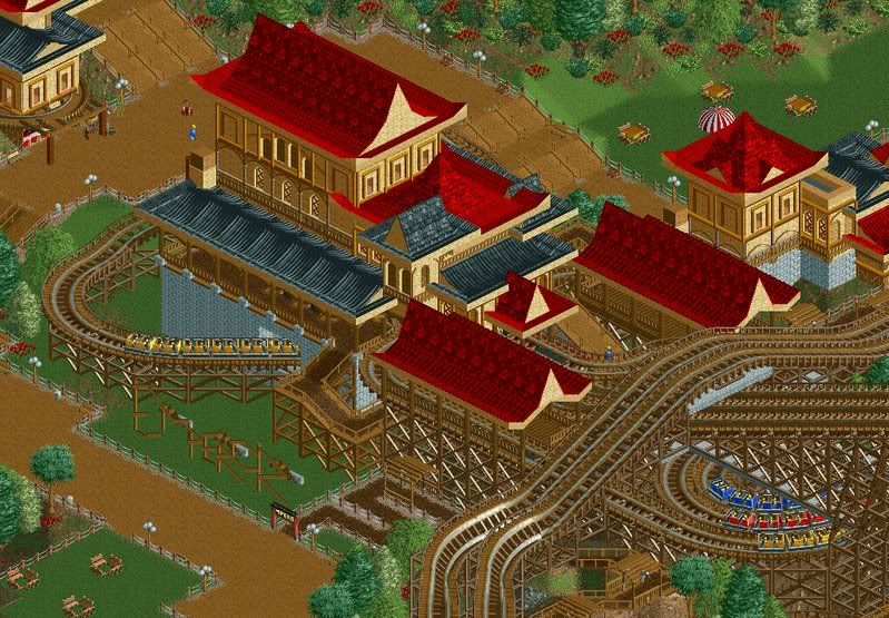
On the last 2 screens; A bit monotone in the color department, but otherwise looks nice..
SF


Tags
- No Tags