(Archive) Advertising District / My first build for nigh on 8 years
-
 23-July 09
-

 Ross Bad Taste
Offline
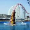
Christ, it's been a while? Here are a few early screens from what i've been paying around with for the past few days. Not a lot to go on at the moment, but thoughts and comments would be appreciated.
Two things im struggling with - Flowing from one section to another ... where to go from building my first coaster?
And secondly building with the isometric view. Often i place things, thinking they are where they should be. only to flip the view and find they're halfway across the park but because of the angle, it looked like they were in the right place. How can you build intricate structures with the dodgy view, especially when you are building inside or behind something youve already made?


-

 posix
Offline
the path around the coaster is genius. i'm definitely getting a nostalgia feeling from this. very cool
-

 Jaguar
Offline
the path around the coaster is genius. i'm definitely getting a nostalgia feeling from this. very cool

You'r right, and it is also unique. -

 Xophe
Offline
The isometric view takes a bit of getting used to. It'll get easier with practice.
That looks like a promising start though. The coaster layout is really good and the grey stone castley thing looks nice. I absolutely despise the blue roof though. The object itself is hideous - not your usage of it haha. -

 LDW
Offline
That grey structure looks alot better than your previous structures. I do love that path that encircles the coaster too. Overall, a great start.
Edited by LDW, 25 July 2009 - 02:22 AM.
-

 Cocoa
Offline
How can you build intricate structures with the dodgy view, especially when you are building inside or behind something youve already made?
ctrl key. press the control key with your mouse over an object when making scenery and the piece you're building with will stick on that level. also, once you hover your piece to where you want, continue holding the ctrl key and also press shift to move it up and down.
otherwise, you just get used to it. I don't have problems with it anymore. -

 Six Frags
Offline
YAY!! Someone else who absolute hates that cjk roof!! I'm always campaigning against the use of that object because it just doesn't belong in RCT.. The lining is too thick and too black around the tiles, which makes it look horrible.. I advise to use Magnus recolorable castle roofs.. They are basically the same, but the pixeleration is A LOT better.. You can get them if you download any of my parks for example from this site..I absolutely despise the blue roof though. The object itself is hideous - not your usage of it haha.
The screens itself looks alright. I especially like that facade in front of the swinging ship..
SF -

FullMetal Offline
 Pixeleration = Change in pixels / Time
I'll have to remember that one.
Any comments I could give would simply be repeating what's already been said.
 Tags
Tags
- No Tags
