(Archive) Advertising District / Monsters of the Underworld
-
 05-October 09
-
 Wolfman
Offline
Yeah, the stacked trees isn't doing it for me either. The structure looks cool though.
Wolfman
Offline
Yeah, the stacked trees isn't doing it for me either. The structure looks cool though. -
 RCTNW
Offline
The entire project looks great and the coasters look like a blast to ride but I do have a question for you (sorry if this has already been asked) but why so many major coasters if this is a design per the topic title? Designs are generaly one major coaster with some supporting rides to support the theme.
RCTNW
Offline
The entire project looks great and the coasters look like a blast to ride but I do have a question for you (sorry if this has already been asked) but why so many major coasters if this is a design per the topic title? Designs are generaly one major coaster with some supporting rides to support the theme.
Thanks -
 hulkpower25
Offline
Thanks guys, the reason for all the coasters is that the final park will not just be a design, it will be a mini park.
hulkpower25
Offline
Thanks guys, the reason for all the coasters is that the final park will not just be a design, it will be a mini park. -
Wolfman
Offline
It makes sense to create a park topic, now that Kraken:The Mighty Beast has been completed.
-
 Lowenaldo
Offline
i enjoy your stuff hulkpower, and thats an interesting site youve got going on wolfman.
Lowenaldo
Offline
i enjoy your stuff hulkpower, and thats an interesting site youve got going on wolfman. -
![][ntamin22%s's Photo](https://www.nedesigns.com/uploads/profile/photo-thumb-221.png?_r=1520300638) ][ntamin22
Offline
I'd agree- the white roof for the building should probably be gray or a different texture, something to differentiate it. Looking pretty good, hulk.
][ntamin22
Offline
I'd agree- the white roof for the building should probably be gray or a different texture, something to differentiate it. Looking pretty good, hulk. -
 tdub96
Offline
Ya, the roof on the towers is a bit off...but the base building is great and so is the green one nice update
tdub96
Offline
Ya, the roof on the towers is a bit off...but the base building is great and so is the green one nice update -
 Alpengeistfan1
Offline
I like the green building, but I still don't like the roof of the yellow one next to it.
Alpengeistfan1
Offline
I like the green building, but I still don't like the roof of the yellow one next to it. -
hulkpower25
Offline
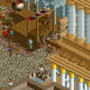
Some work on Medusa, the station,

tell me what you guys think i should do to make it better. -
 Cocoa
Offline
its raised blocks. there is not detail on that. you haven't even changed the land color, let alone added foliage and scenery.
Cocoa
Offline
its raised blocks. there is not detail on that. you haven't even changed the land color, let alone added foliage and scenery. -
Cornshot
Offline
The stairs look pretty cool and mythical but it just doesn't look right. The green and purple colour sceam also looks a bit weird with the little amount of scenery there is. The coaster layout looks pretty good though form what I can see
-
 Stoksy
Offline
The start looks incredibly short, unless you are using a vertical lift hill. As for the station, maybe using some 1/4 tile land blocks would help the detail. Or, you could make the "island" a little bigger and build a temple on top.
Stoksy
Offline
The start looks incredibly short, unless you are using a vertical lift hill. As for the station, maybe using some 1/4 tile land blocks would help the detail. Or, you could make the "island" a little bigger and build a temple on top.
And, make that B&M track in the top right go down vertical, instead of diagonal.


Tags
- No Tags