Fiesta! / Fi3sta
-
 08-March 10
-
 Ozone
Offline
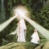
Gorgeous. I'm a big fan of the vines on the buildings and the exit path over the entrance queue. Also, the chain link fence over the incline / decline is awesome.
Ozone
Offline
Gorgeous. I'm a big fan of the vines on the buildings and the exit path over the entrance queue. Also, the chain link fence over the incline / decline is awesome. -
 Liampie
Offline
Liampie
Offline
I'm a big fan of the vines on the buildings and the exit path over the entrance queue.

-
 Faas
Offline
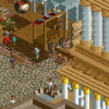
It looks really great but I don't like the fact that the turn at the bottom of the second screen touches the ground.
Faas
Offline
It looks really great but I don't like the fact that the turn at the bottom of the second screen touches the ground. -
 Levis
Offline
Levis
Offline
I love it when someone can make brown look this good

that used to be my trademark .
.
Looks nice turbin .
.
-
 5dave
Offline
I guess it's a design?
5dave
Offline
I guess it's a design?
Looks pretty brown, but nice!
Be sure to not make the map too small. There should be more space around the coaster instead of the black tiles right next to the track.
"MFG" -
 turbin3
Offline
@Faas: Yeah, that's one thing I'll change.
turbin3
Offline
@Faas: Yeah, that's one thing I'll change.
@Levis: Thanks.
@5Dave: Yeah, it's a design. And yeah, I agree, it's a bit small, but tbh I dont how what I could add.
But I'll see, what I can do. Thanks.
-
 Timothy Cross
Offline
Really like how that entrance and exit queue work. Great interactions going on there.
Timothy Cross
Offline
Really like how that entrance and exit queue work. Great interactions going on there. -
 Six Frags
Offline
I think the white on the queue line and the overuse of hobbes' slanted deco pieces kinda ruin the screens imo.. You might want to look into that..
Six Frags
Offline
I think the white on the queue line and the overuse of hobbes' slanted deco pieces kinda ruin the screens imo.. You might want to look into that..
I like those slanted steel fences on the woodie and its interaction with the queue line and station..
SF -
 Austin55
Offline
I think if the awnings didnt have brown it would look better, Specially the first screen with the brown and dark orange awning. But thats really my only problem, the rest looks really good man
Austin55
Offline
I think if the awnings didnt have brown it would look better, Specially the first screen with the brown and dark orange awning. But thats really my only problem, the rest looks really good man


Tags
- No Tags