(Archive) Advertising District / Canizaro"s Orchard
-
 13-March 10
-
 Lowenaldo
Offline
A little park ive been working on late, its only 60x60 but I wanted a smaller park that i knew i would finish.
Lowenaldo
Offline
A little park ive been working on late, its only 60x60 but I wanted a smaller park that i knew i would finish.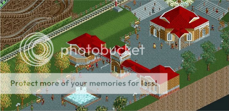 [/img]
-
 turbin3
Offline
Reminds me a bit of Windsor Point.
turbin3
Offline
Reminds me a bit of Windsor Point.
The foliage looks rushed and and not good. Place some more small bushes and change the land-textures.
Rest looks okay, nothing special, but you're improving.
Good luck! -
 SSSammy
Offline
very nice. take a look at some recent screens for tips on foliage, especially Dr dirts fiesta one. ive typed out my terraforming advice so many times i should have it on a word document, haah. good screen, though, youre improving.
SSSammy
Offline
very nice. take a look at some recent screens for tips on foliage, especially Dr dirts fiesta one. ive typed out my terraforming advice so many times i should have it on a word document, haah. good screen, though, youre improving. -
 Xophe
Offline
I really like the left side of the screen. It has a nice kind of old-school charm with the train tracks and the hedge and the nice orderly trees. But I'm not too keen on the building on the right: looks like you tried to hard to make it an interesting shape, and it just looks a bit odd.
Xophe
Offline
I really like the left side of the screen. It has a nice kind of old-school charm with the train tracks and the hedge and the nice orderly trees. But I'm not too keen on the building on the right: looks like you tried to hard to make it an interesting shape, and it just looks a bit odd. -
 JDP
Offline
JDP
Offline
I agree. If you add more bushes and shrubs I think it would look a whole lot less fake.The foliage looks rushed and and not good. Place some more small bushes and change the land-textures.
-JDP -
 Faas
Offline
But it's an orchard, they don't have bushes in between them right? The screen looks pleasant.
Faas
Offline
But it's an orchard, they don't have bushes in between them right? The screen looks pleasant. -
 Cena
Offline
Cena
Offline
Reminds me a bit of Windsor Point.
Because he has the same color as JDP for the red roofs? Or am I missing something here? -
 Luketh
Offline
Looks good, Lowenaldo. I agree about the foliage, though, ADD SMALL DETAILS PLEASE! Just a few bushes here and there, leaves under the trees, longer grass where mowers can't reach, it'll all make it look better.
Luketh
Offline
Looks good, Lowenaldo. I agree about the foliage, though, ADD SMALL DETAILS PLEASE! Just a few bushes here and there, leaves under the trees, longer grass where mowers can't reach, it'll all make it look better.
That woodie in the corner looks interesting, though, and the archy looks great. -
Lowenaldo
Offline
A note on the foliage is that it was done this way on purpose. I wanted a very clean feel in regards to just trees and grass as I want the entrance area to look like an actual orchard. I shall however play around with some longer grass or brush near the pathways to see if I can get it to look anybetter.
Turbin3: Yes when I saw JDP's topic I thought crap, Im using the same colors as he is, but Ive decided to go along with it because I really like that color combination.
Sammy: Thanks and I may take a look although I dont think this screen depicts on what the foliage actually looks like in the rest of the park.
Xophe: Thank you, and the building my change, the reason it has its current design is the fact that I wanted to avoid a square building.
JDP: I'll see what I can do.
Faas: Thanks, glad you noticed the orchard bit
Cena: I believe it is the color similarity.
AF1: Thanks, I have been trying to improve my archy.
Luke: The woody itself isnt anything great, just a small one for the younger park goers. -
 Splitvision
Offline
I enjoy quaint stuff like this. Some suggestions though: Perhaps you could try a more "natural" path? Also, it looks to me that the trees all are in the same angle, mix it up a bit.
Splitvision
Offline
I enjoy quaint stuff like this. Some suggestions though: Perhaps you could try a more "natural" path? Also, it looks to me that the trees all are in the same angle, mix it up a bit. -
Lowenaldo
Offline
good catch SV in regards to the trees, guess I got a little lazy, as for a more natural path do you have one in mind?
-
 Austin55
Offline
I regards to making the Orchard look more Orchardish you should try and line them up along the straight lines rather than diagonal. Maybe try that if it makes sense.
Austin55
Offline
I regards to making the Orchard look more Orchardish you should try and line them up along the straight lines rather than diagonal. Maybe try that if it makes sense.

![][ntamin22%s's Photo](https://www.nedesigns.com/uploads/profile/photo-thumb-221.png?_r=1520300638)
Tags
- No Tags