(Archive) Advertising District / Brazilian Works
-
 18-June 12
-
 WhosLeon
Offline
It looks very nice and you got a lot of potential but i think you could refine your work just a little bit more, for example
WhosLeon
Offline
It looks very nice and you got a lot of potential but i think you could refine your work just a little bit more, for example
in the second screen theres a water-ground transition that is very sharp and doesn't look natural, and i think it would improve a lot if you put bushes under the trees aswell
-
 Liampie
Offline
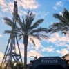
I really like this park. The B&M Flyer's queue area looks really cool albeit simple, lovely colours there. Landscaping is not so good, you should definitely work on that. Better tree selection, careful use of elevation and textures, and a good mix of low and high foliage.
Liampie
Offline
I really like this park. The B&M Flyer's queue area looks really cool albeit simple, lovely colours there. Landscaping is not so good, you should definitely work on that. Better tree selection, careful use of elevation and textures, and a good mix of low and high foliage. -
 Mr. Coaster
Offline
That transition in the bottom right corner of the flyer screen is making my insides hurt just by looking at it.
Mr. Coaster
Offline
That transition in the bottom right corner of the flyer screen is making my insides hurt just by looking at it. -
 Andrade
Offline
Many Thanks for all good comments and recommendations!
Andrade
Offline
Many Thanks for all good comments and recommendations!
______________________________________________________
Let the speculation begin...
Coming soon...
DDPWF1001313.2 -
 Austin55
Offline
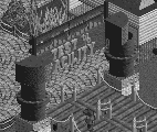
That picture is creepy as hell.
Austin55
Offline
That picture is creepy as hell.
I love the stuff in the first post. I see a good amount of potential there. It kinda makes me think of an younger belgianguy or 5dave somehow.


Tags
- No Tags