(Archive) Advertising District / Keanes building space
-
 21-June 12
-
 Keane
Offline
Hi everybody!
Keane
Offline
Hi everybody!
I'm new to this site. I used to play this game 4 or 5 years ago, but then I stopped. And if it was't for some meddling kids, I probably wouldn't have started this game ever again.
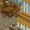
So here are some screens from some try outs. It will be, at some point in the far future, the mainstreet of a new park.

(I'm planning to place a carousel ride on the red dirt. )
So what do you think? It should have, or at least a little bit, a French look. -
 turbin3
Offline
Very nice, I love the 2nd screen. A carousel would fit very good
turbin3
Offline
Very nice, I love the 2nd screen. A carousel would fit very good
Looking forward to more! -
 Dimi
Offline
Nice to see another Belgian! Have you been on another forum as well?
Dimi
Offline
Nice to see another Belgian! Have you been on another forum as well?
I love the screens, very nostalgic. Don't be afraid to use a little more colour though. -
 Turtle
Offline
Yeah I really really like the second screen. Lovely use of height to create a nice enclosed space. Your roof lines could use some more interesting features to break up the shapes, though. Things like towers, and attic windows and things..
Turtle
Offline
Yeah I really really like the second screen. Lovely use of height to create a nice enclosed space. Your roof lines could use some more interesting features to break up the shapes, though. Things like towers, and attic windows and things.. -
 highroll3r
Offline
yes nice atmosphere so far. i dont really like the grey building though. i duno weather its the squareness or the balconies. it doesnt compare to the other buildings imo. nice vibe so far.
highroll3r
Offline
yes nice atmosphere so far. i dont really like the grey building though. i duno weather its the squareness or the balconies. it doesnt compare to the other buildings imo. nice vibe so far. -
 Ling
Offline
The lack of tables and the offset poles holding the "umbrellas" up in the seating area is the main thing I notice... Also the arch in the first picture could be thicker (where the walls are).
Ling
Offline
The lack of tables and the offset poles holding the "umbrellas" up in the seating area is the main thing I notice... Also the arch in the first picture could be thicker (where the walls are). -
 pierrot
Offline
Looks really promising Keane. you should change the color of flower though, It looks bit lifeless atm.
pierrot
Offline
Looks really promising Keane. you should change the color of flower though, It looks bit lifeless atm. -
 Cocoa
Offline
that some good looking building you got there. the theme might be a little plain though... add some zest to spice it up
Cocoa
Offline
that some good looking building you got there. the theme might be a little plain though... add some zest to spice it up
-
 Xeccah
Offline
This is extremely atmoshperic, you hit the balance between complexity and simplicity perfectly.
Xeccah
Offline
This is extremely atmoshperic, you hit the balance between complexity and simplicity perfectly.
Kudos to you, Keane! -
Ruben
Offline
Nice to see another Belgian! Have you been on another forum as well?
If I'm not mistaken, you should check TNB for that.
Nice stuff man. Looking forward to more of this.
-
Keane
Offline
Thanks for all the comments.

The first building in the Portuguese part of the park and also the station of a water coaster. It is a bit grey, but castles aren't exactly that colourfull. However, does anyone has any tips to make it look less grey / black? -
 trav
Offline
Sorry but it doesn't look very Portuguese to me. It looks far too cold to be Portuguese, not enough white, too much grey/brown.
trav
Offline
Sorry but it doesn't look very Portuguese to me. It looks far too cold to be Portuguese, not enough white, too much grey/brown.


Tags
- No Tags