(Archive) Advertising District / Gnome Country
-
 13-August 12
-
 BelgianGuy
Offline
So here's what we had been doing in the final week of H2H6, me and K0NG literally busted our asses off to no extent to get this done knowing we'd get a DQ but just to not end with a forfeit wich unfortunatly happenned due to a very poorly timed and placed blackhole in the park. Also I wanted to do this topic so J K and Walto can get the respect they deserve for mythos!..
BelgianGuy
Offline
So here's what we had been doing in the final week of H2H6, me and K0NG literally busted our asses off to no extent to get this done knowing we'd get a DQ but just to not end with a forfeit wich unfortunatly happenned due to a very poorly timed and placed blackhole in the park. Also I wanted to do this topic so J K and Walto can get the respect they deserve for mythos!..
Note: All of this was mostly built in the last week so all you'll see is subject to improvement since we now have more time to actually get it up to our personal flavour...
on to the actual screens now:
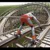
Entrance area:
Kiddie rides and more intense flats always go great together...
Transportation is a must!
And to the actual main coaster!
I hope you all enjoy and we'll try to get this released as soon as possible, and I assure you it'll get finished...
Greets BG and K0NG
again JK did a monstrous effort and he should also be recognised so I would like that everybody that checks this topic and responds here also takes the time to check out mythos since that was the adversary of this park... -
 Ruben
Offline
Now this looks promising.
Ruben
Offline
Now this looks promising.
Too bad you didn't get it in for match 3, but definitely looking forward to the release. For some reason it gives me the same feeling as those weird combi-parks by Liam (Eftel towers, Knotts derrie vliet etc.). It all looks very refined and detailed for a last minute build, but I guess that was also possible because of the moderate concept.
Yup. I wanna see this get released. -
 trav
Offline
I think there's far too much path in the 3rd screen. Apart from that it looks pretty good
trav
Offline
I think there's far too much path in the 3rd screen. Apart from that it looks pretty good -
 Pacificoaster
Offline
I like the earthy and whimsical atmosphere this is producing. I especially enjoy that dragonfly. However, I think you should extend the queue underneath the dragonfly because as of now it is just a load of path. Other than that i really like this so far. I'm intrigued to see what kind of B&M looper it is. Personally I think this is the perfect opportunity for a wing rider with some key hole elements through things in nature.
Pacificoaster
Offline
I like the earthy and whimsical atmosphere this is producing. I especially enjoy that dragonfly. However, I think you should extend the queue underneath the dragonfly because as of now it is just a load of path. Other than that i really like this so far. I'm intrigued to see what kind of B&M looper it is. Personally I think this is the perfect opportunity for a wing rider with some key hole elements through things in nature.
Although it's a shame that this wasn't released for H2H, I think that it could turn into a really nice design accolade. Nobody wants to forfeit but think of this as an opportunity to add some more details. Keep it up guys. -
 J K
Offline
Really nice work guys. I cannot wait to see the finished result. Lots of little details everywhere and with more work this will be a really nice concept.
J K
Offline
Really nice work guys. I cannot wait to see the finished result. Lots of little details everywhere and with more work this will be a really nice concept. -
 Dimi
Offline
I like it a lot. The first, second and third screen all have a warm atmosphere. I like the use of the different umbrellas and steep castle roofs. Unlike trav I love the plaza in the thirds screen. However, I feel like even though you might have a clear theme, I can't really tell what style you're going for. The architecture in the first screen almost reminds me of the Efteling, while the house in the second screen looks slightly western, and I can't figure out what kind of style the building with the green roof in the third screen is supposed to represent. Also there seem to be too much different clashing colours, and some weird colour choices in general. For example, I really don't like the bright red gnome's hat, the yellow roof for the kiddie coaster (btw why make the kiddie coaster dull green when everything is else is so colourful?) and some of the mushroom's colours (especially the green and black ones), the green roof and orange mushroom in the third screen and all the different shades of green on the other than that very well executed dragonfly. Finally, the foliage looks very unfinished/rushed in the second screen and also very uninspired in the last screen. The park sure looks very promising, but I think it could still use of a lot of improvement, refinement and maybe a bit more ideas and imagination.
Dimi
Offline
I like it a lot. The first, second and third screen all have a warm atmosphere. I like the use of the different umbrellas and steep castle roofs. Unlike trav I love the plaza in the thirds screen. However, I feel like even though you might have a clear theme, I can't really tell what style you're going for. The architecture in the first screen almost reminds me of the Efteling, while the house in the second screen looks slightly western, and I can't figure out what kind of style the building with the green roof in the third screen is supposed to represent. Also there seem to be too much different clashing colours, and some weird colour choices in general. For example, I really don't like the bright red gnome's hat, the yellow roof for the kiddie coaster (btw why make the kiddie coaster dull green when everything is else is so colourful?) and some of the mushroom's colours (especially the green and black ones), the green roof and orange mushroom in the third screen and all the different shades of green on the other than that very well executed dragonfly. Finally, the foliage looks very unfinished/rushed in the second screen and also very uninspired in the last screen. The park sure looks very promising, but I think it could still use of a lot of improvement, refinement and maybe a bit more ideas and imagination. -
 Liampie
Offline
I think the theme has much more potential than you're shwowing in your screens. Sometimes it looks a little generic. It doesn't have to, because the theme is seriously awesome. I'll judge the screens for what they are, however. It's looking very cool. The butterflie are great like Milo said, and I really like the foliage and coloured toadstools in the second screen. Lovely. If you can add more ideas and make the aesthetics more coherent and flowing, asses will be kicked.
Liampie
Offline
I think the theme has much more potential than you're shwowing in your screens. Sometimes it looks a little generic. It doesn't have to, because the theme is seriously awesome. I'll judge the screens for what they are, however. It's looking very cool. The butterflie are great like Milo said, and I really like the foliage and coloured toadstools in the second screen. Lovely. If you can add more ideas and make the aesthetics more coherent and flowing, asses will be kicked.
Thanks for showing and good luck on finishing! -
BelgianGuy
Offline
Welcome to Imaginaerum!
this will become a full scale park with references to the RD rounds as a testament to the team.

to reply to previous comments:
yes the screens shown are very rushed in parts and I know this shows, I do plan on getting everything up to the level I want it before releasing now I have more time. -
 ScOtLaNdS_FiNeSt
Offline
Looks so much better then what i seen before and what i seen before was so good lol. Cant wait to see this released.
ScOtLaNdS_FiNeSt
Offline
Looks so much better then what i seen before and what i seen before was so good lol. Cant wait to see this released. -
 Six Frags
Online
I like how everything flows so well in your style BG. There are barely sharp edges noticeable and each area or piece of scenery/theming kind of blends into the other.. I think for the most part because of the open path style.. Great work!
Six Frags
Online
I like how everything flows so well in your style BG. There are barely sharp edges noticeable and each area or piece of scenery/theming kind of blends into the other.. I think for the most part because of the open path style.. Great work! -
Liampie
Offline
I love the round window thing in the first screen. Fantastic. Rest of the screens is good too, looking forward to seeing more.
Park name inspired by Nightwish? -
 Louis!
Offline
The foliage in the last screen is terrible. The oak trees and other 'standard' trees really don't fit one bit. Station building is great though.
Louis!
Offline
The foliage in the last screen is terrible. The oak trees and other 'standard' trees really don't fit one bit. Station building is great though. -
 Cocoa
Offline
I really love that first screen. second screen is also good, but not quite as much, although the diagonal station bit is a pretty neat idea.
Cocoa
Offline
I really love that first screen. second screen is also good, but not quite as much, although the diagonal station bit is a pretty neat idea.


Tags
- No Tags