(Archive) Advertising District / Cae-Maen Leisure Park
-
 24-November 12
-
 Xtreme97
Offline
Xtreme97
Offline
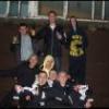
On November 24th 1992, Cae-Maen Leisure park opened to the public in south-east Wales.
20 years on it has become an important thrill destination in both Wales and the UK.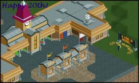
"Brilliant Park..."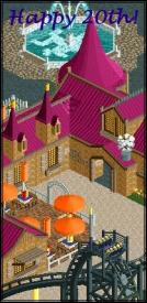
"Fantastic Restaurants..."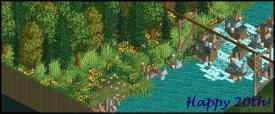
"Beautiful Views..." -
 chorkiel
Offline
I'm not too sure about your use of 1k ruins. Other than that, that screen is wondertastic.
chorkiel
Offline
I'm not too sure about your use of 1k ruins. Other than that, that screen is wondertastic. -
Xtreme97
Offline
Thanks for the feedback guys. I'm afraid this is all I'm going to show right now, but I'll update when I get 3 new pictures.
-
 Mr. Coaster
Offline
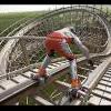
It might just be unfinished, but the area surrounding the sign in the first screen looks really bare, like you didn't really put thought into the flowers. But otherwise I like it a lot.
Mr. Coaster
Offline
It might just be unfinished, but the area surrounding the sign in the first screen looks really bare, like you didn't really put thought into the flowers. But otherwise I like it a lot. -
Xtreme97
Offline
The right side of the first screen is unfinished. Just try imagining some trees and bushes in the background.
I'll post a better shot of the restaurant in the next update. Thanks for the support guys!
-
 Ruben
Offline
Btw is that sign at the park entrance some sort of advertisment for the new ''Pyromaniac the ride (coming to set your house on fire this season!)''?
Ruben
Offline
Btw is that sign at the park entrance some sort of advertisment for the new ''Pyromaniac the ride (coming to set your house on fire this season!)''?

-
 Fizzix
Offline
^I was thinking more along the lines of a Dark Knight ride. Really charming man, I like.
Fizzix
Offline
^I was thinking more along the lines of a Dark Knight ride. Really charming man, I like. -
Xtreme97
Offline
Yeah, it was originally for a Dark Knight Rises themed coaster, but I'm going to change the theme so I can make a Dark Knight design.
-
 SixFlagsTexas1994
Offline
Those are fantastic screens
SixFlagsTexas1994
Offline
Those are fantastic screens ...but then I became distracted by your avatar...
-
 posix
Offline
Nice.
posix
Offline
Nice.
First two screens are in dire need of foliage, third is full of it. Struck me as kinda funny.
Suggestion: Increase scope. Allow more air, more space, don't miniature things. -
 Liampie
Offline
Nice indeed. I like the architecture in the second screen. This colour scheme is always a winner and made it interesting with the customized windows. The paths are a little messy though; with so much colour going on, I wouldn't recommend this orange path texture there. Also the light brown path sticks out too much in my opinion.
Liampie
Offline
Nice indeed. I like the architecture in the second screen. This colour scheme is always a winner and made it interesting with the customized windows. The paths are a little messy though; with so much colour going on, I wouldn't recommend this orange path texture there. Also the light brown path sticks out too much in my opinion.
I think you should add more colour to the first screen. The tan+pink combo is great, but underdeveloped in the first screen. You might want to add some other pink stuff on the roof here and there, to break up all the grey and to make the centre tower look less lonely.
Lastly, I fully agree with posix. -
Xtreme97
Offline
Thanks everyone! It's really motivating to read the comments
Liam, after reading your comment I think I'll try and implement that colour scheme more in the park. I'll definitely act on what you raised about the paths and change the white-tan path, though I'm going to keep the brick path as it's only used with that building in the seating areas.
Posix, I'll take into consideration what you said about the space and scope of the screens, thanks
-
 Arjan v l
Offline
Certainly lovely screens ,also never realized that purple and tan works so well together.
Arjan v l
Offline
Certainly lovely screens ,also never realized that purple and tan works so well together.


 Way more creative too.
Tags
- No Tags