(Archive) Advertising District / Nyoka
-
 10-March 13
-
 Maverix
Offline
New design, no messing around, time to get serious.
Maverix
Offline
New design, no messing around, time to get serious.
New: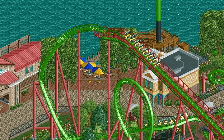
Updated Dump Post: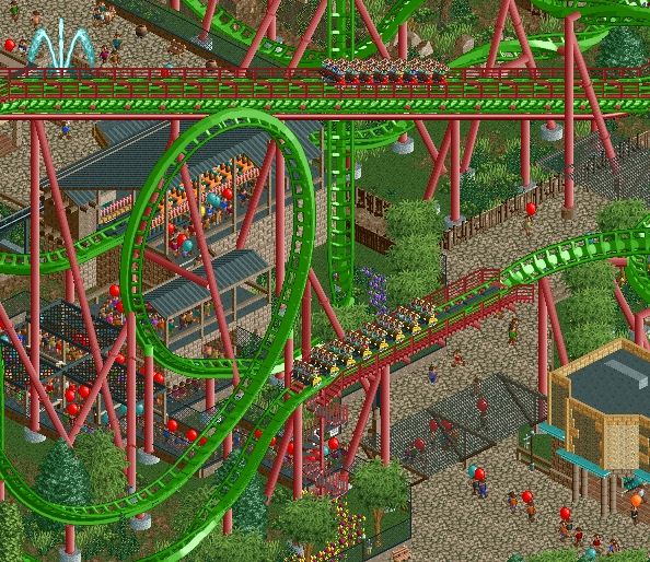
Enjoy!
Also - All three trains yellow or mixed colors? -
 nin
Offline
This looks awesome! I love the coaster's color scheme, really nice to see a new pairing of colors not often used.
nin
Offline
This looks awesome! I love the coaster's color scheme, really nice to see a new pairing of colors not often used.
I don't really get why the footers on the pathways are colored brown, I don't think it's helping in any way, and I personally like the contrast the gray would give along the pathways.
In the first screen I don't care for the color/texture combo of the building behind the lift hill, as that vanilla texture doesnt look great, and I don't know how I feel about the blue. I think the umbrellas at the tables may look better striped instead of "in fourths" as they are now. -
 Liampie
Offline
These screens are really good and definitely a step up from your previous designs. The station looks like a weak spot, though. Ugly, dull and beyond uninspired. The tan+aqua building in the first screen is great, you should use those colours in more places and especially in the station since it's one of the most important buildings on the map. The station should be a main feature of the theming and not some cheap shed.
Liampie
Offline
These screens are really good and definitely a step up from your previous designs. The station looks like a weak spot, though. Ugly, dull and beyond uninspired. The tan+aqua building in the first screen is great, you should use those colours in more places and especially in the station since it's one of the most important buildings on the map. The station should be a main feature of the theming and not some cheap shed. -
 robbie92
Offline
Looks like someone is reaching a new level in their parkmaking skills...
robbie92
Offline
Looks like someone is reaching a new level in their parkmaking skills...
Looking at the first screen, though, your large Liampie trees are looking too square at the top. I'd play around with making them look a bit more natural.
I agree with Liam on the station too. Exaggerate and have fun with it! -
 Austin55
Offline
I likkkkke it.
Austin55
Offline
I likkkkke it.
I feel like you're maybe overusing the kumba (?) roof. There is so much of. I do it to, though. Another addition that may be more challenging, is to introduce some more variation in terrian. Right not it looks like all the path is on the same plane, hills and stairs are interesting.
I'd double what nin said about the building behind the lift and what liam said about the other building.
looking good man. -
 ScOtLaNdS_FiNeSt
Offline
Very very nice Mav... Try and touch up the station a bit though. Thats the only thing letting this down.
ScOtLaNdS_FiNeSt
Offline
Very very nice Mav... Try and touch up the station a bit though. Thats the only thing letting this down.
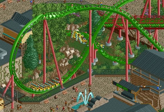
Also see the tower in the screen is that a doubledeck obvservation tower and have you built those stairs so peeps can get into the top deck of it, If so good job. -

Disney Imagineer Offline
Ah, I love this. Such a good looking area in general. Love the buildings and the coaster. Great work!
But what are the two little yellow pieces hanging from the beam in the first pic for? Also, not sure I like the angled pathing around the drop tower's base. -
 Arjan v l
Offline
Come on Maverix, you can make a better station building, i'm sure.
Arjan v l
Offline
Come on Maverix, you can make a better station building, i'm sure.
Mixed colors for the train would be nice i.m.o.
Does that lifthill support have to stick through the loop?
Isn't there another way?
I also agree with Nin about the footer.
No complaints about the rest though, looks great! -
 BelgianGuy
Offline
I'd say don't forget to add details to the waterfront if you're going with a big body of water, it might aswell have some stuff going on in there, maybe even take a look at atlantis resort for some water details...
BelgianGuy
Offline
I'd say don't forget to add details to the waterfront if you're going with a big body of water, it might aswell have some stuff going on in there, maybe even take a look at atlantis resort for some water details...
otherwise looking great but as usual the station looks rather boring... -
 FredD
Offline
I don't like the station neither, especially the colors of it. But all the rest looks goods.
FredD
Offline
I don't like the station neither, especially the colors of it. But all the rest looks goods. -
 zburns999
Offline
I like this a lot, Maverix! Seems to be some of your best stuff. Two suggestions if I may: first of all, I agree with everyone else about the station. From what I can see of it, it looks very uninspired compared to everything else. Not sure what I'd change other than to maybe have another go at it and try a different style. My other suggestion is in regards to the vine-covered building next to the exit of the dive loop. I think that maybe using some of those ruins/rocks or a similar item to make a rocky facade would be cool. As it is, the flat and nearly bare wall seems odd placed so near to the track.
zburns999
Offline
I like this a lot, Maverix! Seems to be some of your best stuff. Two suggestions if I may: first of all, I agree with everyone else about the station. From what I can see of it, it looks very uninspired compared to everything else. Not sure what I'd change other than to maybe have another go at it and try a different style. My other suggestion is in regards to the vine-covered building next to the exit of the dive loop. I think that maybe using some of those ruins/rocks or a similar item to make a rocky facade would be cool. As it is, the flat and nearly bare wall seems odd placed so near to the track. -
Maverix
Offline
Thanks for all the replies everyone!
The station shall be reevaluated and adjusted. I don't want to change it to drastically though, but it will definitely see some improvements.
Other than that most of what's left for this is refinement and extra special detail work which I'm going to take my time on. I shall be requesting some testers soon however so stay tuned!


Tags
- No Tags