Fiesta! / Warner Brothers Movie World Orlando
-
 24-March 13
-
 Austin55
Offline
It's long been my dream to build this park, I attempted it a while back, and now I'm doing it again, but I'm much better now. I'd like to get a spotlight with this...
Austin55
Offline
It's long been my dream to build this park, I attempted it a while back, and now I'm doing it again, but I'm much better now. I'd like to get a spotlight with this...
LOTS of unfinished work... It's a Fiesta for a reason right?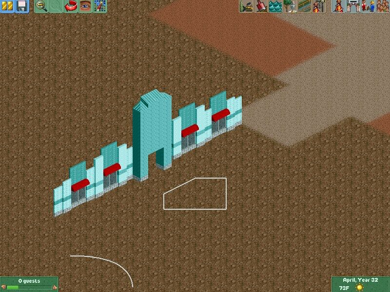
Hall of Justice- The entrance to a B&M hyper, the parks main ride.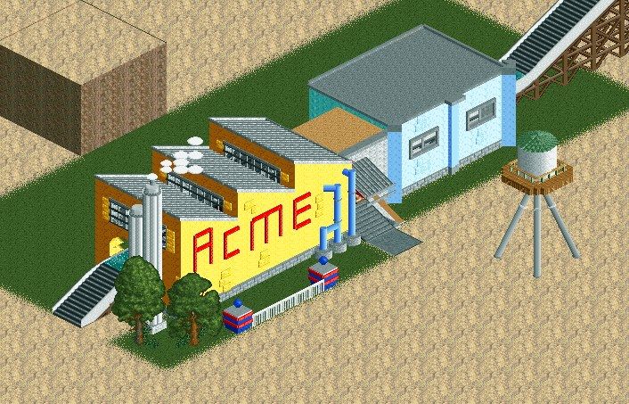
ACME rapids station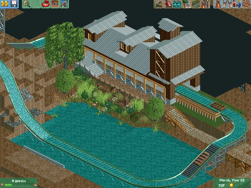
Wild West Falls Station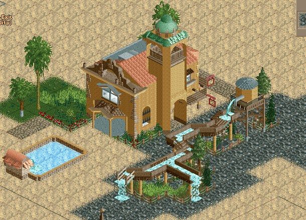
Mission in the wild west area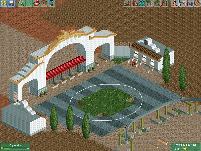
Main Entrance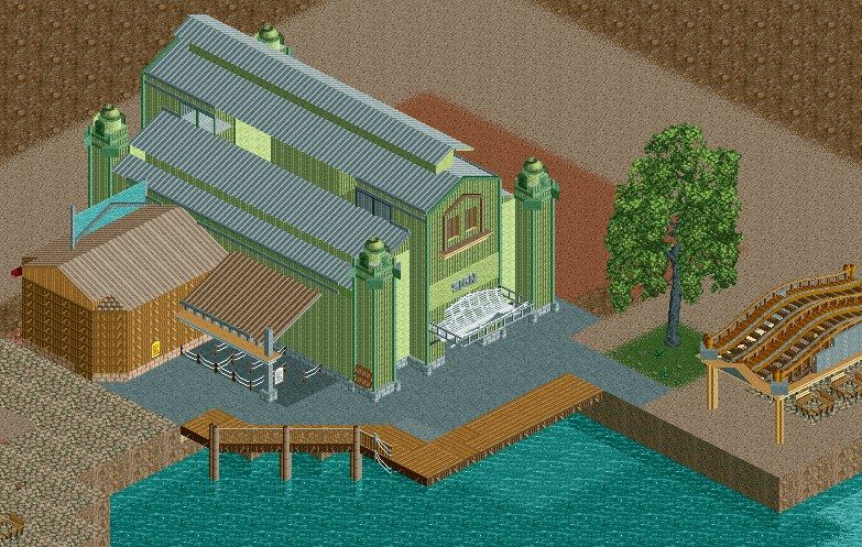
Theming and show building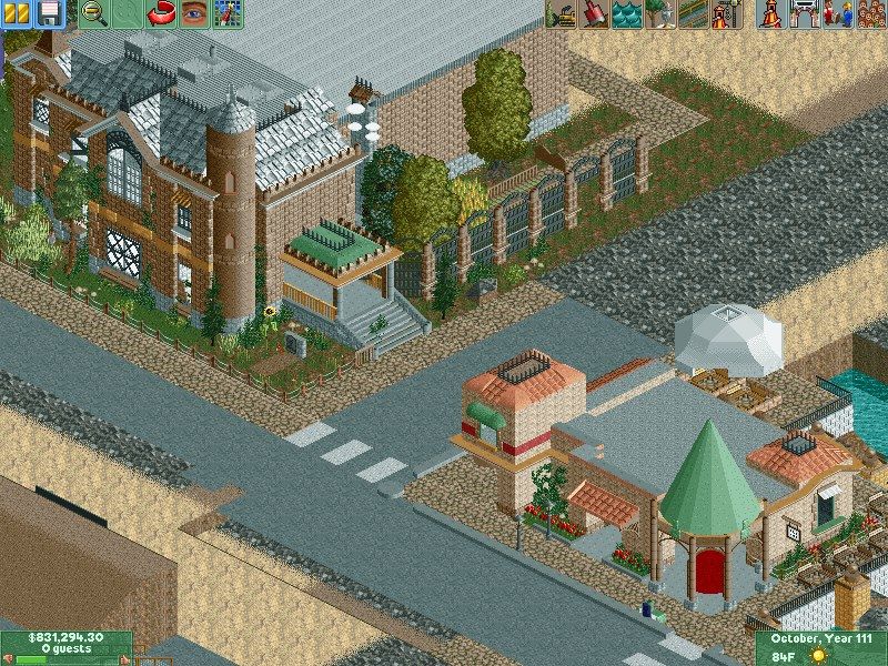
Haunted Mansion and restraunt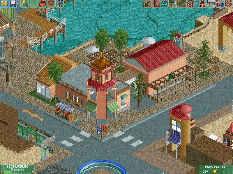
Some theming, I've torn most of this out and redoing a lot of it.
Here's a Bonus screen, not of Warner but of a duo project with Louis based on Kemah Boardwalk.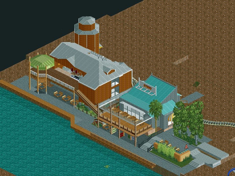
HOPE YOU GUYS ALL ENJOYED AND HAPPY FIESTA EVERYBODY WOOO! />
/>  />
/>  />
/>  /> /> /> /> /> /> /> /> /> /> /> /> /> /> /> /> />
-
 Dark_Horse
Offline
I love all of the WBMWO screens except for the Wild West station. Such a huge texture clash you have going on there. The last screen (of Kemah) just seems so textureless and bland.
Dark_Horse
Offline
I love all of the WBMWO screens except for the Wild West station. Such a huge texture clash you have going on there. The last screen (of Kemah) just seems so textureless and bland. -
 Xeccah
Offline
Austin, to be honest with you, in order to reach that next level or that high-scorer you want, you're going to have to in some places step it up in the technicality and composition department. For example, in your first screen, if you'd use some of those 1K posted signs as ultra thin details (see DCA or Parque Warner to see what I'm talking about ) the screen would be a lot better as a whole. Otherwise, it's great, and I love the use of texture in the fourth, seventh, and eighth screens.
Xeccah
Offline
Austin, to be honest with you, in order to reach that next level or that high-scorer you want, you're going to have to in some places step it up in the technicality and composition department. For example, in your first screen, if you'd use some of those 1K posted signs as ultra thin details (see DCA or Parque Warner to see what I'm talking about ) the screen would be a lot better as a whole. Otherwise, it's great, and I love the use of texture in the fourth, seventh, and eighth screens. -
 JJ
Offline
I like the tower on the second to last screen but I feel the rest of the building doesn't stand quite up to the quality of that. You are getting better, but each part of a building seems to be at different skill levels to the next, so it doesn't give quite a coherent look. IDK. I do like it mostly though
JJ
Offline
I like the tower on the second to last screen but I feel the rest of the building doesn't stand quite up to the quality of that. You are getting better, but each part of a building seems to be at different skill levels to the next, so it doesn't give quite a coherent look. IDK. I do like it mostly though
-
 FK+Coastermind
Offline
Some of this is soooo beautiful and atmospheric, and then some is just blocky. i guess i would say try to mix up some of your building forms, and maybe vary your landscape. That might help you get away from big buildings on larger flat land plots.
FK+Coastermind
Offline
Some of this is soooo beautiful and atmospheric, and then some is just blocky. i guess i would say try to mix up some of your building forms, and maybe vary your landscape. That might help you get away from big buildings on larger flat land plots.
LOVE the mission and the haunted mansion. Amazing atmosphere and variety of details.
FK -

Disney Imagineer Offline
Austin my dude! I didn't know you posted this. I've been asleep, heh.
This is so awesome. I think you've got something really great here. Not sure if I like the building color in the last picture though - the white roof with the gold walls, I think you could use a better combination. Also I'm not sure the cobblestone works. But I love everything else. -
Austin55
Offline
Another night, another building. At this rate, 1 building a day, 3 days per coaster, and about a half a day for the in betweens, I should be finished with the park by fall
 I wish.
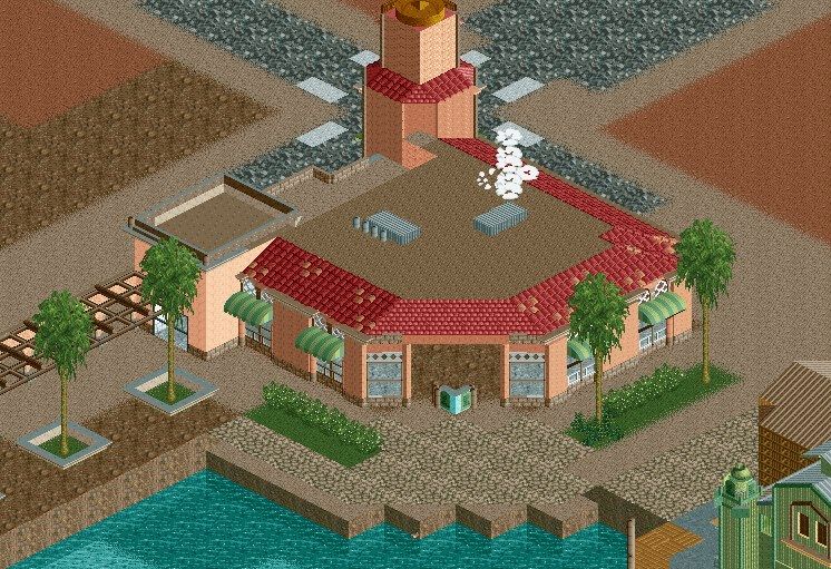
-
 Cocoa
Offline
that mission is excellent. have you considered trying some stained glass where the white glass is though?
Cocoa
Offline
that mission is excellent. have you considered trying some stained glass where the white glass is though? -
 Louis!
Offline
What I find odd about your work sometimes is how good some buildings can be, and how bad others are. It's really weird.
Louis!
Offline
What I find odd about your work sometimes is how good some buildings can be, and how bad others are. It's really weird.
The great buildings are great. Exceptional even. -
 chorkiel
Offline
Some of this is is just fantastic. But, like Louis pointed out, you also have some weaker buildings. I hope you'll eventually revisit them before submitting.
chorkiel
Offline
Some of this is is just fantastic. But, like Louis pointed out, you also have some weaker buildings. I hope you'll eventually revisit them before submitting. -
 Chocotopian
Offline
I like that little wooden water channel thing! I think that's my favourite screen. Very nice job with the details in screen 8, like the street cart and the white fences for the netting (very clever use of that). I'd agree that some of the buildings don't quite match up to the others in terms of aesthetics, but I'm hoping that's just because they aren't complete with their detailing yet.
Chocotopian
Offline
I like that little wooden water channel thing! I think that's my favourite screen. Very nice job with the details in screen 8, like the street cart and the white fences for the netting (very clever use of that). I'd agree that some of the buildings don't quite match up to the others in terms of aesthetics, but I'm hoping that's just because they aren't complete with their detailing yet. -
 Steve
Offline
Steve
Offline
I was thinking the same. The first few screens really lack but the rest are excellent. It's like two different people built it, even.What I find odd about your work sometimes is how good some buildings can be, and how bad others are. It's really weird.
The great buildings are great. Exceptional even.
I'd suggest looking at redoing the ACME station, and the splash boats station because they are mediocre in comparison to the rest (which actually does look like its on its way to being spotlight quality!). Nice stuff dude! -
Dark_Horse
Offline
I actually really like the ACME station. It's so cartoonish in appearance that I think it actually works.
-
Airtime Offline
Good start on the superman building. I really like that.
I quite like the shape of the splash down's station but I think it's missing little details?
4, 5, 6, 7 and 8 all seem very Warner Brothers. Great job on them.


Tags
- No Tags