NE Olympics '16 / Rejected flag designs
-
 20-June 16
-
 Liampie
Offline
I'm sure there have been more flag designs than those we've seen here, and maybe it'd be cool to see them.
Liampie
Offline
I'm sure there have been more flag designs than those we've seen here, and maybe it'd be cool to see them.
Here is everything I have. Ranging from super ugly and quick paint mock ups to more serious proposals, for both my own country and for Louis's teams since he outsourced the job to me.
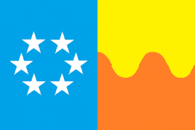
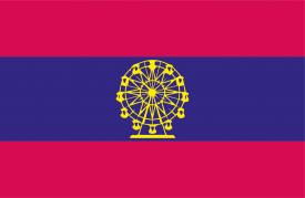
Just playing in the very early stages. I wanted six stars to represent the players. Very ham-fisted symbolism. The wavy line would symbolise roller coasters. Cheesy.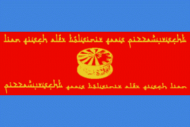
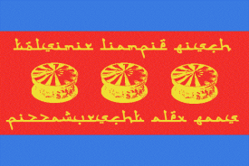
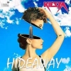
I'm very happy with the design Fisch and Alex made for Parkmenistan, but I really like my own proposal as well. Looks like it could be Central Asian country...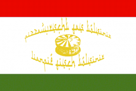
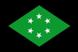
Another variation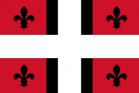
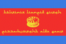
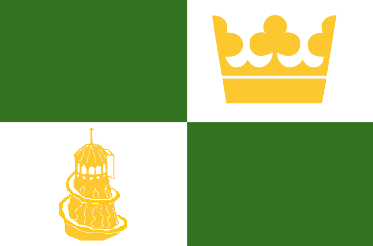
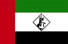
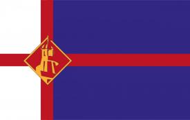
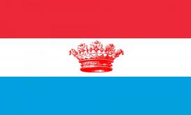
Just an experiment for making a flag that seems like a European monarchy kind-of country, and using it as an emblem on another flag to indicate colonial history. Just like how the British flag pops up in many Commonwealth flags like Australia, New Zealand and formerly Canada. This design was shit and vastly inferior to the final design but I kept this idea -
 inthemanual
Offline
inthemanual
Offline
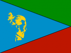
Cocoa, Stoksy, and I joked about our country being Manbunistan before settling on Timbabwe, so I mocked up this flag with a man bun emblem.
-
 Jaguar
Offline
Jaguar
Offline
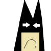
This is pretty much our only prototype...
There's not much of a difference considering the fact that I made this the day before the contest started.
-
Liampie
Offline
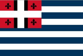
Top left is great, ][. Bottom left looks like a fascist regime emblem. Quite nice. The ones in the middle and on the right though... Never liked Picasso. Glad you went with something simple.


![][ntamin22%s's Photo](https://www.nedesigns.com/uploads/profile/photo-thumb-221.png?_r=1520300638)


Tags
- No Tags