Micro Madness 2019 / MM3 R1 Group O - inthemanual and hoobaroo win
-
 07-April 19
-
 bigshootergill
Offline
bigshootergill
Offline
Blazingly Cool Concept: Atlas Bulwark
Funky Innovation Award: Petty Squabble
Archy Masterpiece: RIP Holland
Nighty Night Crown: Burg Barenfels
My vote goes to: ITM and Hoobaroo
-
 RCT2day
Offline
RCT2day
Offline
1.) hoobaroo - Amazing. Very, very creative. What's more, it's convincing, like was actually two different planes built up from. The architecture was very good (not the best in this bracket), but the creativity knocked everything out of the water. Underground area was a nice surprise. Very much looking forward to seeing what you do in the next round. 9/10
2.) ITM - love the different levels and colors and architecture, but not sure if there's a story here or it's just jumbled thoughts or reference something? Regardless, it's pretty good and shows skill. 6.5/10
EDIT: I get it now. I write all my reviews before reading anything else so that explains it.
3.) Version1 - this is a big step in the right direction for you. It looks like you were patient with this and thought about colors, architecture, etc. I like the night mode choice, it seems to have offered some color accents where this structure would normally be lacking. However, like above, it lacked anything dynamic. Well done, keep it up. 6/10
4.) JimmyLaessig - beautiful little architecture and great atmosphere and cool shop interiors, but that's really it. Colors didn't exactly jump off the screen. And there wasn't anything...dynamic?...about the micro. Not to sound harsh, but I got nothing more from opening this park than looking at the overview. I think this style lends itself to a large scale park rather than a micro. 5.5/10
-
 dr dirt
Offline
dr dirt
Offline
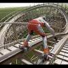
1) A Petty Squabble - Very nice, very imaginative. I'm not sure I've completely understood what everything means, but it's existing in the right spot between "I get this" and "I have no clue." The coaster station with a palette is my favorite part, very cool idea and works seamlessly. The curves look great, especially with the waterfall there. The palette itself was very cool and funky.
2) Burg Bärenfels - I thought this was rather lovely; the fire-lit windows were easily my favorite thing in the entry and really added to the atmosphere. The miniature scale was fantastic and didn't look forced at all. I thought it was a close race for second, but this one felt classy, well constructed, and interesting.
RIP Holland - I didn't know the backstory here, so I'm glad you shared it here. I think it was the best architecture work we saw in this group. The interiors were also a clear highlight, as well as the details along the storefronts. I think where it missed second place for me was that the layout of it as a whole doesn't make for a strong micro composition.
Atlas Bulwark - Hoob, excellent work. This solidifies that you'll make for an excellent builder to have around the site. Great idea and the rotated buildings were phenomenal - and the whole rotated area for that matter. It also had a good composition that suits the micro size well. For me, it missed my second place vote for some of the execution not quite nailing it. I think that'll come with time, and as someone mentioned, could make for a threat in the competition.
-
 CedarPoint6
Offline
CedarPoint6
Offline
ITM- I have very little idea what's going on fort he most part, but it's pretty. Love the impulse going up through the various curved platforms. The layering works really well here. The paint palette is one of the nicest stations I've seen in quite a while. Would have been cool to see the tilting ride work. On the whole this one is one of the most composed pieces of the contest so far.
hoobaroo- Wow! This is really well put together. The vertical ocean and the buildings on their sides are pretty convincing-- good work on the object selection here. Almost wish there was more of that, though the cutaway was a nice substitute. Made for a decent amount of movement and things to watch. Your entry was a surprise, having not been familiar with your work, but now I'm especially excited to see more.
V1- Your entry is surprisingly atmospheric. The palette works well here. Only probably was there wasn't anything to watch beyond enjoying the architecture. I think you could have done well to do some frozen staff or something to tell a story with the map. Or to help identify some of the areas. You don't need a big coaster or ride, but just some of those details to help the placemaking would have certainly helped.
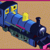
Jimmy- I recognized the area immediately upon opening the map. Very nice architecture, pleasant indoor theming, and great to see the ride. I guess the disappointing thing about micros is that it is so size limited, because more than anything I'd really just like to see more of Pirates. But I'm going back to Europa this July and this park made me happy because I remembered my time here last year and it makes me look forward to my upcoming visit. Amazing what a little recreation like this can do.
-
 FK+Coastermind
Offline
FK+Coastermind
Offline
This was an incredible match, but for little ole me, an easy vote. Timmy crushed this with my favorite micro of r1 (thus far). Creative, artsy, very well done in it's composition from the straight lines and isometric angles as well as the smooth, curved elements of the coaster and platforms, the bright and unique color palette. Last MM you showed that you could be artsy and weird, this goes to another level of artistic composition and thoughtfulness. I'm hugely inspired by this, and the idea of doing whatever you want in a park because it feels right, not because reality dictates. Well done.
Second vote went to Hoobaroo, who nailed it with a great Micro concept. This is what MM is all about, exploring something crazy and unique on a small scale where it doesn't have to be composed across hundreds of tiles. This was fun, bright, and really well brought together. Some rough edges on execution, and I think some object making could have improved some of the tricks, but lots of props and a second vote for concept.
Jimmy, as with Faas in his group and me in my first MM, this is just a pitfall of Micro Madness, a small 'piece' of a park has trouble competing with a dramatic, fantastical concept. This micro is very well done, amazing archy, but it just felt so flat compared to the others, and lacked the activity or content necessary to be successful against the others. Tough luck, as I think this would have won in another group, but that's the luck of the draw. Well done otherwise.
V1, this was fun and clever, and definitely some of the best work i've seen from you, but similar to Jimmy, lacking the drama and intensity of the other parks. It just needed some second element to push it beyond and create activity on the map. I do love the idea of a mini-park used to capture an almost grand scale in a more manageable area, so well done.
Overall, as said, great group, everyone should be proud of what they made.
-
 Iron Rattler
Offline
Iron Rattler
Offline
1. ITM - While I don't think I'm as enamored with the concept as others are, the composition and aesthetics are just top notch for me. The conceptually strong platforms are gorgeous, and the palatte is so warm and lovely. Which brings me to the palette station which is just amazing. Really wish we could have had you in a bigger role in H2H, but you kill it at micro madness.
2. Hoobaroo Awesome concept, the sideways buildings were great and the way you worked it with the coasters was great. While the architecture is not the most exceptional, the color choice added a lot to it. I think the underground area might have been a little weaker, visually and conceptually, but great stuff. I want to see what else you have in store for us.
3. Jimmy Laesig - Great architecture, and even better interiors, but not the most dynamic concept for a micro madness. It doesn't help that I don't know Europa park, so there probably are a ton of great details that have gone over my head. I do wish you used a different texture for those flat brown roofs. Unfortunate though, cause I think this entry would certainly go through in different groups.
4. Version 1 - It's odd. This feels simultaneously much larger and smaller than some of the other micros. The palette was a great choice, as it does support the atmosphere. Like a few other micros, this one is held back by a lack of movement to hold the viewers attention.
-
 FredD
Offline
FredD
Offline
Wow, first of all... this group is sick! All 4 micros are really, really good and it's sad two won't go through. Imo they all deserve to go through. It was really hard to chose on who to vote.
1. JimmyLaessig - Pretty much the cleanest and detailed micro in this group. It's maybe a safe choice you went for, but the execution is close to perfection. Archy is awesome and it looks very atmospheric, the Piraten cut-out is also cool. The great execution made it more appealing for me than the other micros in this group.
2. Hoobaroo - Well what a way to come in! Really original idea and the execution of it isn't bad either. I love the sideway water and buildings, really neat. Archy is a working point for you imo but the color choices are good. Really fun micro to look at!
3. V1 - Pretty clever idea to use a small scale to make a large castle on a small surface. It looks cool and surely it's some of the best stuff you've done. I'd love to see you go further in this contest, a shame this group was so damn hard... The palette is great btw, really sets the mood.
4. ITM - I'm maybe an outcast for placing it so low, but as I said this group was so hard and there's for every micro something to say to go through. The layers of path are cool, very nice shaped. Technically it's also pretty good and the chicken shops on both ends of the coaster are hilarious. However, then there's stuff I just don't understand... Like the floating windows near the house on top?! Is that supposed to be there?! And if so, why? Same question about the two extra supports of the Edge of Reality thing... It's a good micro, but just not my cup of tea.
-
 Sulakke
Offline
Sulakke
Offline
Fantastic match-up.
1. ITM - Funny, creative, clean and above all, well crafted. I didn't like the floating windows, though.
2. Hoobaroo - Awesome concept and pretty good execution. The architecture was a bit funky, but it worked. I thought the underground scene didn't add too much though.
3. JimmyLaessig - I almost voted for this one. The architecture was great and I love The Netherlands, but the two entries above were just a bit more impressive. I felt like this idea was too big to execute on a micro. Right now, the cropping is a bit awkward. I can't remember that Piraten in Batavia had a drop?
4. Version1 - Nice idea and pretty good execution, but a micro needs motion to be interesting.
-
 MrTycoonCoaster
Offline
Version 1) Architecture of the castle was beautiful, I loved the colors that combined with the atmosphere of the castle, well foliage and distributed.
MrTycoonCoaster
Offline
Version 1) Architecture of the castle was beautiful, I loved the colors that combined with the atmosphere of the castle, well foliage and distributed.
I just think I missed a ride.
Hoobaroo) Colorful, warm, atmospheric, loved the loop of diving right next to the park.
Concept is very good, classic, and it's so fun. The underground part is good for me, i liked it.
Jimmy) Everything is a charm, well organized, good architecture of the buildings and nice colors. Did you enjoy the 225 tiles.
Manual) What can I say more? I loved everything, the station, the platforms, colors, the layout of the micro, the ride at the top was 10, really nice work. -
 Tolsimir
Offline
Tolsimir
Offline
Ok, I realized that the review style takes a lot of time so I'm cutting it down a little, sorry!
Hobaroo:
Concept+Realization: Awesome micro, the idea is refreshing and executed very nicely. You added great elements to underline the change of perspective (dive loop, car ride, even the rock on the edge (maybe my favourite piece of the micro). Only the underground part is not support the outside concept it's "just cave".
Visuals: Stylewise it's a little unrefined. It is like "generic fantasy". Don't get me wrong, it still looks awesome! However!! Only from one angle. The starting angle is flawless. the little city part is absolutely great, perfect detailing. A 180 degree turn only offers blank walls though. Sideways building is great too.
Credibility: Obviously I'm not judging the realism here. But as I said, underground cave and upper world don't fit together so well.
Great debut, can't wait to see more from you, especially since it seems like you are favouring to build in fantasy!
Inthemanual:
Concept+Realization: Arty I'd say. It doesn't seem to take itself very serious, still it is technically top notch level. I'm not lurking aroung on discord a lot so maybe I'm loosing too much. I mean I like what I see, but this micro seems to be more about inside jokes and cool visuals.
Visuals: So I continue here. The organic forms are incredibly well done. The station is awesome the bare area around it not so. I'm not a fan of the palette though, it's very saturated. Although that orange is sexy. Those perspective tricks on the walls don't work for me.
Credibility: There is nothing to say on this point for a bizarre creation like this.
Refreshing looks, great forms, strange RCT.
JimmyLeassig:
C+R: This micro is the proof that an awesome micro does not need any extraordinary ideas. This is well grounded realism and I really like it. I have not been to Europa Park but that doesn't matter. I'm liking what I see. It's a pity though that you can only tease the splash boats (clearly due to the format).
Visuals: Archy is on top. The diagonals are perfect. Street detailing is top notch. I can't find anything that I don't like. Only the missing inside view on the brown building is a little downer since all other insides are so awesome.
Credibility: Thank you for your effort on the interiors! Finally a park where they incredibly believable and not cheap, they really add a huge lot to the micro. I'm in love actually. The diagonal restaurant is my favourite. Nothing to complain.
Top notch work! I'm astounished to rank this at the top, wouldn't have guessed it from the overview.
Version1:
C+R: The miniature is a really cool idea and well done. Actually, the foliage is what results to be the most convincing. Still, like everybody else said already it's missing motion. Nonetheless nice idea to circumvent the micro constraints!
Visuals: I'm not sure why you chose the nighttime palette, it adds nothing to the concept and now it seems to have the same effect why they turn off the lights in clubs, so that you look prettier
 The castle doesn't need it though. Structurewise it's fine. I especially like the effect that the central tower is illuminated though. As said, foliage looks great, too. What I don't like is the barren land on the sides.
Credibility: The castle has realistic proportion and structure. Only the windows on the houses seem a bit out of proportion. But still the miniature effect is sold effectively!
Since you are always so pessimistic about your own work I'll end with some warm words. You are improving the last months, this is no exception. I think if you feel a little more confident in your work and try out more stuff it will result in good work! This is an example that you can build something refreshing by stepping out of conventions!
Final vote first place Jimmy, second place is tough between Hobaroo and ITM. Both deserve my vote, in the end I'll go with ITM because his entry shows more quality in all places while Atlas only shines from one angle.
-
 Jappy
Offline
Jappy
Offline
Right, quick thoughts! Gonna try to keep this short:
A Petty Squable: Not gonna lie, didn't get the idea behind this for some time. After I did, I really did start to like it more. About the effectiveness to convey the idea, it sorta didn't ork for me. But I liked the execution and it deserves a win.
Atlas Bulwark: From NE's resident new fantasy player, Hoobaroo, comes a very strong first entry. And it's better than the first screens he showed earlier! I loved the creativity and the execution of the sideways archy, but more could be done with it I think. Some more little details perhaps?
RIP Holland: This shows a potential strength of MM, namely tons of detail and interiors! I'm a sucker for European realism and loved this entry! But I do however thought it was playing it a bit safe.
Burg Bärefels: V1 delivers a great micro in a different scale then usual, and its very well executed. The night theme adds another atmosphere. Sadly however, since it lacked movement it couldn't really keep my attention for that long.
-
 posix
Offline
All good entries, but hoobaroo's steals the show for me. Where have you been before? Love the perspective shift.ITM, perhaps the best custom palette this year. Like the daringness of it. Also have a thing for a well themed impulse. Well done.V1, this looks like a very solid effort. Not sure the darkness did it well. Sorry to see you in such heavy competition.JimmyLaessig, I think a micro is just not where you want to build this kind of project.
posix
Offline
All good entries, but hoobaroo's steals the show for me. Where have you been before? Love the perspective shift.ITM, perhaps the best custom palette this year. Like the daringness of it. Also have a thing for a well themed impulse. Well done.V1, this looks like a very solid effort. Not sure the darkness did it well. Sorry to see you in such heavy competition.JimmyLaessig, I think a micro is just not where you want to build this kind of project. -
 Gustav Goblin
Offline
Gustav Goblin
Offline
Late review!
inthemanual- Interesting! I must admit, I'm no modern art analyst, so this one is a bit confusing to me. I understand the concept behind the coaster and how it represents Bick and Bock's argument, but I don't get anything else. Why is the station a palette? What does D.A.R. stand for? Ant Farm? Tuna Fish? This doesn't detract from the park, but it definitely comes across as an abstract work of art. If that was the approach you were going for, you did a good job.
JimmyLaessig- I wasn't expecting much from the thumbnail, but this is one of the more underrated micros IMO. I love the towering main street feel, and the level of detail is incredible, especially in Piraten in Batavia. Going for the hot take here; this one's my second favorite of the group.
Version1- This one got a chuckle out of me when I first loaded it up! It's honestly weird thinking of this one as a micro, since it just looks like a regular map at half the size. The castle is very well made, and the foliage is impressive considering you only had shrubs and bushes to work with.
hoobaroo- Amazing! I love the backstory, and the park is just as vivid. You can never go wrong with layering. I especially love how Higgs interacts with its surroundings. Favorite park of the group!
-
 Liampie
Offline
inthemanual: Looks fantastic, I always love it when people seek out a fresh aesthetic, and you accomplished that very well. Theme was cool as well, although it seems a bit shallow and with too much randomness. I would've embraced the NE meta theme you seem to have going a bit more. Good clean execution overall and points for originality.
Liampie
Offline
inthemanual: Looks fantastic, I always love it when people seek out a fresh aesthetic, and you accomplished that very well. Theme was cool as well, although it seems a bit shallow and with too much randomness. I would've embraced the NE meta theme you seem to have going a bit more. Good clean execution overall and points for originality.
Jimmy: I've never been to Europa Park, but I know what their Dutch area looked like so I recognized it right away. Great clean execution, especially the diagonals are impressive. I won't fault you for the achy not looking Dutch, because that's EP's fault. Good to have you back!
Version1: it's so dark I can barely see what's going on. You pulled off the micro scale well for the most part, but the windows look huge, and as a result the castle doesn't look solid enough. I would've looked into other solutions, or requested a custom object. The (metaphorical) highlight for me is the foliage, great job with the scale and texture there. It's more convincing as a real forest than most normal scaled RCT foliage. Good effort overall but it lacks punch.
hoobaroo: making a good coaster on a map with a non-standard perspective is really hard, as is evident by one of my favourite micros from the past, Orbital by JiMeMo. They easily become nonsensical and randomly shaped spaghetti noodles. You solved it beautifully with the tiny drop and the half loop, it just works. You nailed the horizontal architecture and landscaping too. The clock tower is so simple, but so so clever! The way you made the water shows a good awareness of textures and how to use them. I feel like you could've done more with the cave, but overall the map is very well designed and executed.
1. hoobaroo
2. inthemanual
3. Jimmy
4. Version1
Excellent match. -
Liampie
Offline
 Group O - Results
__________________________________________________________
Winners
inthemanual: 36 + 22/2 = 47 points
hoobaroo: 28 + 31/2 = 43,5 points
Eliminated
JimmyLaessig: 10 + 14/2 = 17 points
Version1: 1 + 8/2 = 5 points__________________________________________________________
Inthemanual and hoobaroo proceed to Round 2.
JimmyLaessig is eligible as a replacement for Round 2.
Congratulations to the winners! -
 Steve
Offline
Trev, solid stuff my dude. Had to give you the first vote due to the the incredibly curved platforms with the coaster driving through them. Very great feature and overall I think the narrative was pretty funny, even if it wasn’t the most obvious.
Steve
Offline
Trev, solid stuff my dude. Had to give you the first vote due to the the incredibly curved platforms with the coaster driving through them. Very great feature and overall I think the narrative was pretty funny, even if it wasn’t the most obvious.
Jimmy, you nabbed my second spot. I think this was a great example on how to do a low key micro well. Great details on the structures and overall warm atmosphere. There was nothing not to like here. Impressed by this and hope you have a full park in the wings. -
 KaiBueno
Offline
KaiBueno
Offline
Brief comments from KaiBueno! (Disclaimer - I'm renewing myself to the community and know very little of you, your parks, styles, etc. My views are framed from what I see as I open it, with a twisted 2005 perspective of wazzup.)
Atlas - Love it. Opened my eyes to the *New* RCT2...love the edge of the world bit, clever use of perspectives and scenery! The carve out view of the underground was fun to see.
Squabble - The multiple layer of decks looks great, orange color included. Will need to look at the shuttle some more, but overall pretty fun.
Holland and Burg - still life....still getting used to it in these parks, and will probably warm up to it eventually. This round was earlier in the week, but I still think this style doesn't "compete" as well as with micros with rides, just like my macro micro and old stylings can't either. -
 CHE
Offline
CHE
Offline
Highlights
A Petty Squabble: palette station
RIP Holland: interiors theming
Burg Bärenfels: church
Atlas Bulwark: sideways building
Tags
- No Tags