H2H9 / H2H9: Round Robin - R1M2 - Cereal Killers vs Manual Laborers
-
 28-April 21
-
 alex
Offline
alex
Offline
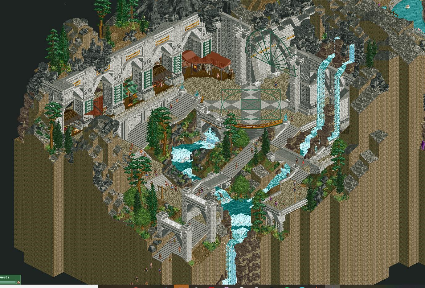
There is some really bold structural design in Gauntlegrym which I absolutely loved, but I felt at times it was lacking some life and atmosphere - maybe needed another detail pass in some places. I thought the ride design and integration into the landscape was really well thought out. You created a strong sense of depth in places with the way slides or track would pass through and around these massive pillars. The crystals felt a bit meh - very small, all a uniform size and scattered around quite sparsely - had you clumped them and mixed with some bigger objects to create some larger forms it would have looked more striking I think. Love the wheel/chain combo.
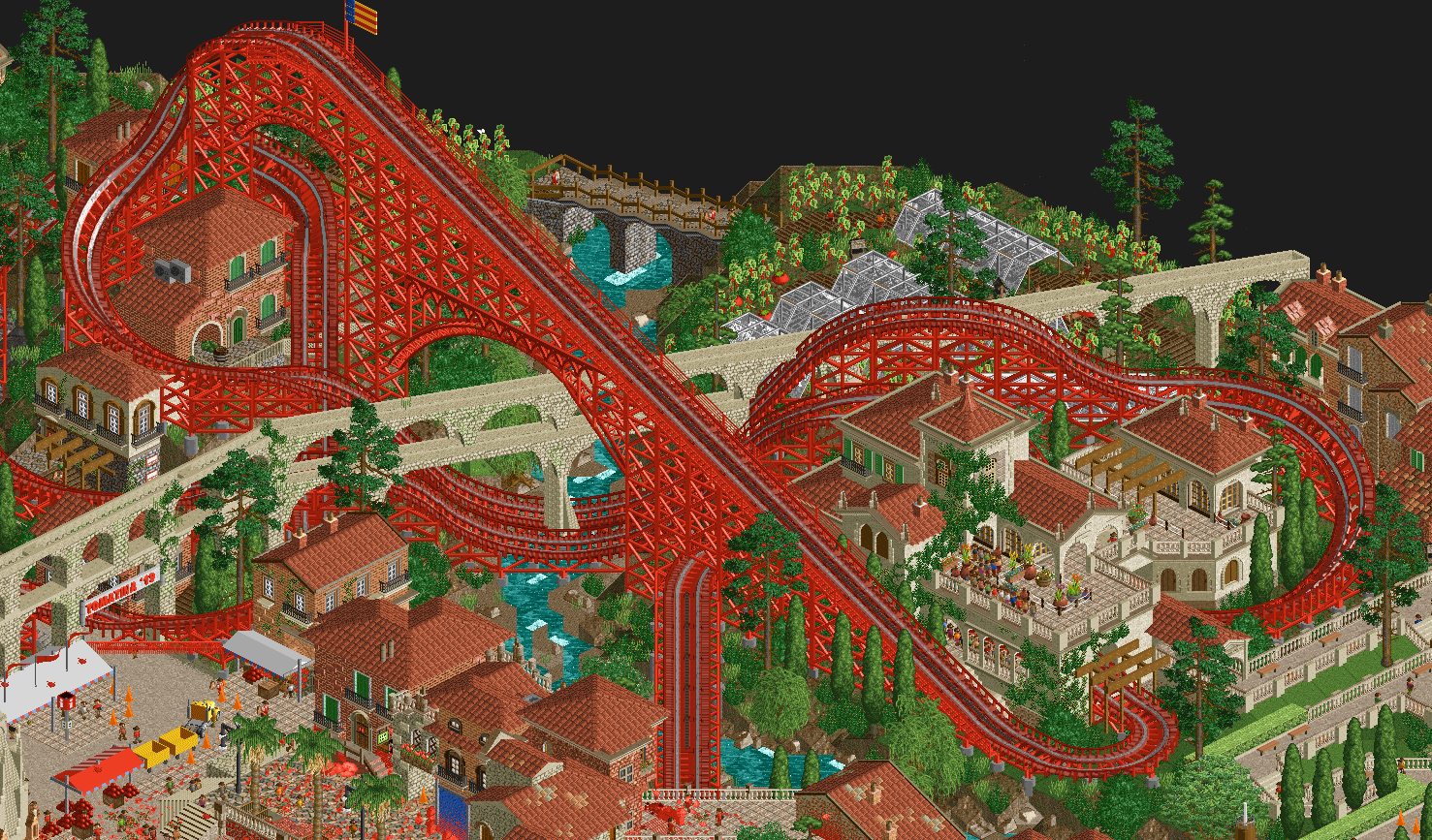
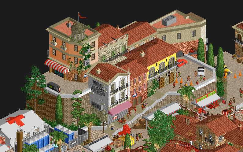
Tomatina was quite a contrast in that it felt very lively (a little too lively in places to totally enjoy the aesthetic but it was on theme I suppose). Some of the architecture was outstanding, all the subtle imperfections worked into the forms and detailing of buildings give so much life and character. But it was also hit and miss with quite inconsistent texturing - detailed brick textures clashing with very flat deco pieces - the church is the prime example of this. Ride-wise it was fine, the last half of the coaster is kinda just a wobbly loop with a couple of nice interactions dotted about in typical H2H fashion, but it didn’t detract or feel forced.
Quite a tough call but in the end I voted Tomatina, because whilst the technical quality was hit and miss, it did feel like a complete package wheres with GauntleGrym I felt there was something missing to bring it to life. Great job by both teams though. -
 robbie92
Offline
robbie92
Offline
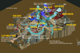
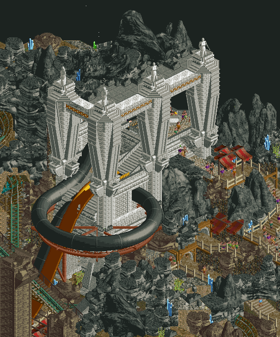
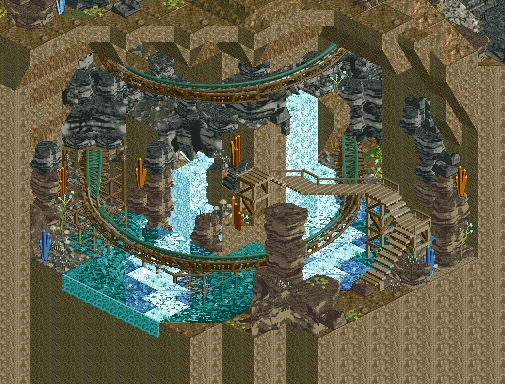
Gauntlegrym: I really appreciated the boldness in the moves of this, from the monumental scale of the entrance to the entire idea of pairing a high-level fantasy concept with something along the lines of a more mundane realistic concept. In fact, the novelty of the concept really hit me at the first viewing and got a good surprised laugh out of me when I saw the waterslides. The viewing experience from the entrance to the park itself was great as well, with this sense of a whole new world opening up to the viewer. The park itself had some really strong bits but also had some moments that really detracted and took me out of the world that the entrance had so expertly created. For example, while the slides at the edge of the map felt engrained into the world with substantial and well-designed station platforms, the slides in the middle felt like an afterthought and having them right in the middle made their lack of ornamentation even more apparent. I'm assuming that the water park itself is meant to be entirely in a cave, which is why it's lacking foliage, but the rockwork is just so dense and dark (and the crystals dotted around as smaller single elements rahter than more focused clumps) that the park itself felt really dark and devoid of the same atmosphere as the entrance promised. Crystalis and the layering all around it is an absolute high point; it feels complex and organic but it never loses legibility. Plus, the smaller worldbuilding details like the crystals and the forge chain are all expertly done. Overall, this is a really solid start to Round 1 for you guys (if a bit predicatable based on the building history of some members on your team hah) and I can't wait to see more!
La Tomatina: At first viewing, I was in two minds about this park. On one hand, the immediate realization that you were doing something based on Bunol was super exciting and felt like one of those amazing concepts that I was shocked no one had really approached yet; it felt obvious in a good way to base a strong H2H park off of. On the other hand, I was feeling a bit cynical over another European town with a woodie going through it coming from a Liampie-led team. However, despite this early cynicism, the thoroughness of the worldbuilding detail in this really won me over. To get the quibbles out of the way, yes, the church feels undercooked for being the focal point of the town and yes, the aqueduct hurts my head from certain angles. The woodie being bright red is a bit of a bold choice but one that I think helps elevate it more than if it was brown; it really brought a sense of whimsy to the map. Speaking of the woodie, the initial drop sequence and the interaction with the aqueduct is fantastic, though the end seems to be a bit more rambling and slower than it needed to be to pack a punch. Smaller details like the tomato-stained tarps, the tomato trucks, the gazpacho fountain... all of it added to something that felt deeper than an initial viewing and really reinforced the world of the village.
I had to sit on this one for a couple days but I ended up going with Tomatina, as I felt like it went a bit deeper than Gauntlegrym. Did it attempt to go as deep? Not quite, but what it did set out to do, it did it excellently, while Gauntlegrym ended up not quite reaching the potential it set out from its premise and entrance. Still, both are parks to be incredibly proud of!
-
 posix
Offline
posix
Offline
Match Conclusion

The poll is now closed.
The Cereal Killers have won this match with a score of 42-37 .
Creators
Cereal Killers"La Tomatina"
Liampie
RWE
Manual Laborers"Gauntlegrym"
inthemanual
ottersalad
Shen Kitchen
Coupon (F)

The Manual Laborers have used their one-time deadline extension for this match.
-
 Liampie
Offline
Liampie
Offline
Thanks for the reviews and votes, y’all! And thanks to the Manual Laborers for a cool park and the tough opposition!
The making of
RWE had the concept, and I gladly jumped in with him. For how much of a cliche me doing European places is, I don’t actually do it all that often. This was a nice opportunity for me to get back into that ‘comfort zone’; quotes because it’s not necessarily easier. RWE and I mostly worked on the weekends, with the odd hour and here and there. We were well on track to have a finished product, but things still got tight on the last day, also as OpenRCT started acting up for me and I had to deal with a lot of instances of the game freezing and me having to dig up an autosave. I would’ve liked to polish some more things, and add some things that are currently missing; I initially had Roomie’s dancing peeps ride on the square, but it fucked up the invisible maze ride so I had to get rid of that… With more time I would’ve made it work, and I also would’ve liked to have peeps sliding through the tomato pulp on their belly. Ideas like that were ready to be implemented. Deadline stress also resulted in the harvesting handyman not functioning optimally and the opening screen being in a weird spot. Whatever, in the end this park is 95% what it was intended to be and I’m satisfied! Was a lot of fun to build. Mamarillas gets the bulk of the credits for the cereal box design.Inevitable dot map following later.
Addressing criticism
I think a lot of the criticism for our park are fair and understandable. There are also some I don’t agree with, or that I think are worth discussing, which I will do below.
I do wish there was a little more variation in the buildings towards the center of the town, but on the outskirts that problem does kind of go away.
Quoting BarnNID because he’s the first to bring it up, and this is more of a general observation rather than a Tomatina-specific talking point. The town, the architecture, it’s the backdrop to the real subject of this map: the festival, or in other words, it’s the canvas. There’s a bit of a double standard going on for these canvases. If this were a park set in the woods, I doubt many would complain about the lack of variation in the foliage, or in other cases the lack of variation in the rockwork, whatever your canvas is. Why can’t architecture be somewhat of a neutral backdrop just like trees, rocks, flat terrain, water or void? Actually, I think that in most of the examples I mentioned, too much variation would be undesirable!
I think the architecture in the center of the town could have used some more variation in color. The little street going uphill at the map edge is by far my favorite section in terms of archi, and i would've liked to see that same color variation in the rest of the architecture, as it gets a bit washed out in the town center. I tried recoloring some facades there to white and it already improved it a ton to me.
The hill’s architecture is different by design. The somewhat circular cluster of buildings sitting at the heart of the map is the old city centre, with parts of the old city wall still being visible around the perimeter. The architecture around the hill is historically extramural and more modern, hence the different look. That said, I agree that the old core could’ve used a ‘modern’ building here and there as an accent.
As for painting buildings white… We contemplated what style we should go for. The actual town of Buñol is rather bland. Spain is super diverse, and we went with a different look that’s not accurate but visually more interesting and less cliche; a more red brick heavy look like the village of Albarracin.
We sampled inspiration from all over Spain though, so now that I’m talking about it anyway… The cathedral of Toledo:

The aqueduct of Segovia: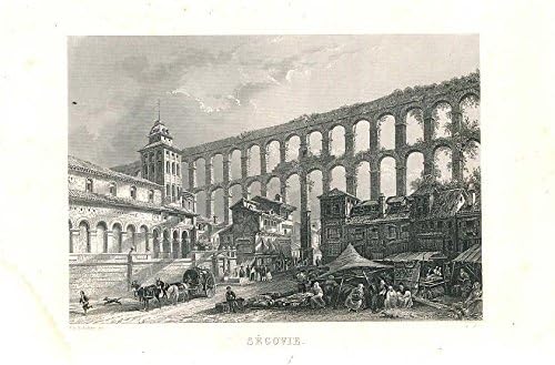
Maybe use a red t-shirt shop to give them all red t-shirts though, that would've finished it!
Maybe open the map again and revisit that statement... If you let the map run for a bit, more and more shirts will turn red.
- some really nice use of the 1/2 diagonal objects [...] on the other hand, some really unnatural, almost forced use - the aqueduct comes to mind. While I like the idea and it is a bold move, it awkwardly intersects the coaster at multiple points and seems tacked on rather than intentionally planned around. I think a regular diagonal aqueduct would've worked better here.
How would that work though? The coaster is diagonal, so you can't cross it with a diagonal aqueduct. Diagonally the other way would have it run parallel to the river, which is also a tad weird. Believe it or not, the half diagonals on this map are only there because we figured it was the best angle to to cross there. Personally I'm a fan of the heavy interaction here. Three tracks of coaster crossing, an aqueduct, and a river, all framed by the arched supports. Something folks and strokes

- not quite clear what the water car-ride is themed to. Is it a car wash?
After the festival, people also have to wash off the tomato pulp, and this ride represents that. It's kind of part of the whole ritual. And apparantly, there's also specific pool (with its name given to the ride) where some people specifically go to do this. Should've replaced the cars with splash battle cars, I think this is a case of a placeholder making it into the final save.

- architecture throughout is very pleasant but does feel a little stock standard and generic European. Not sure I'm really seeing anything particularly interesting or regionally specific
Spanish architecture is just bland perhaps. Personally I would not mistake this for French or Italian though!
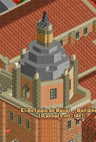
I have no idea what happened with the grey dome on the church, it's such a sore thumb when next to the rest of this. Just plop a dome object on there.
Impossible, due to the off-grid footprint of the dome; it’s 4x4 (in quarter tile units), sitting on a 5x4 base. The dome had a normal quarterblock geometry at first, but negative feedback from my shitty teammates with bad taste convinced me to at least try octagonal geometry. That didn’t turn out well and I left it halfway during this transition, hence why the dome itself is asymmetrical now. I’m too old school to care. I think the dome looks good even in its current squashed state.
That said, I wanted to make a half diagonal balcony fence object so that I had a nice fence/trim around the tower, never got around to do that. You may also notice that the dome is floating, forgot to fill in the gaps.That yellow vehicle is hefty though.
Guilty!
Tomato eating contest and drop tower smashing tomatoes? Brilliance.
Two things you got wrong!
 First one you should've deduced from the sign and the jury walking around, as well as the actual massive sizes of the tomatoes on display. For the second one, we are to blame! The pole is not random tomato smashing machine, it's a greased up pole that participants have to climb up. When someone is able to grab the ham that's sitting on top of the pole (I ate the one in our park before we submitted, was hungry), the signal is given that the tomato fight can begin. The nearby clock that looks to be plopped onto the building is no coincidence, for it starts ticking as soon as the ham is grabbed - exactly one hour of tomato mayhem. Although the pole was included in the readme/cereal box, we should've done more storytelling here.
 -
 Six Frags
Offline
Six Frags
Offline
Maybe open the map again and revisit that statement... If you let the map run for a bit, more and more shirts will turn red.
Opened the park again, let it run for like 30 mins on Turbo setting, but don´t see a difference with when I opened the park.. I see you placed 4 t-shirt huts there, so maybe the execution was flawed, as probably only a few buy an actual shirt. Maybe better to have an enclosed section there with only guests with red t-shirts
-
 Faas
Offline
"it's a greased up pole that participants have to climb up. When someone is able to grab the ham that's sitting on top of the pole (...) the signal is given that the tomato fight can begin."
Faas
Offline
"it's a greased up pole that participants have to climb up. When someone is able to grab the ham that's sitting on top of the pole (...) the signal is given that the tomato fight can begin."
You can't make this shit up. I love random folklore like this. -
Ge-Ride
Offline
I couldn't vote on this one because I honestly couldn't decide which one I liked better.
-
 Milo
Offline
Milo
Offline
Although it was relatively close in the end, this match felt a little more clear cut for me in comparison to the other matchups.
La Tomatina:
I think the meanest thing I have to say is that this feels like an above average Grand Tour entry. There's nothing inherently wrong about that but it's where the comments about it feeling safe or samey in comparison to the last contest are coming from, and I happen to agree. Like The Good Death, this establishes a lower bar than its competition but executes it at such a high level that it's impossible not to consider it the stronger of the two. All of the little technical micro details like the tomato carts, peeps fighting and the little theming touches to highlight the tomato juice on walls really gel together to create a fun map. The main coaster was well integrated into the map and had a fun layout. Perhaps a more fairground style temp coaster(s) would have felt more realistic but I always enjoy a good semi-realism take on a theme like this. The varying density with the concentration of the peeps in the central city and the quieter outlying farmlands really sold the theme. I didn't love some of the more forced elements, like the half diagonal aqueduct or how the coaster was so perfectly framed by the town wall ruins but that's a minor gripe. The coaster colors didn't bother me and was actually a highlight and the supporting rides were fine, they didn't really add or detract much. Liampie and RWE worked very well together here and I don't see much to dislike, I just opted to vote for the more bold and ambitious theme. I liked the cereal box and am curious to see if that becomes a running gag for the season.
Gauntlegrym:
Right off the bat I'll say that I think it was a mistake showcasing the entrance for the screen. Coupon's section near Crystalis might have been a better representation of the map and I would have preferred to have the entrance remain a surprise. Like I said on Discord, not having a ride or slide interact with even the interior side of the entrance was a huge missed opportunity and it almost prevented me from voting for it. Other things like the lack of a wave pool, the inconsistent slide execution and the lack of guest interaction with the cutaways showed that time was a major factor. The fact that this came together as well as it does after just a couple weeks is remarkable though and I admire the ambition. This really feeds into my soft spots for both a fantasy theme, plus waterparks so I think it is safe to say that certainly swayed my vote. However, the majority of the slides were excellent and Crystalis and the other supporting flat were well themed and felt appropriate for the map as a waterpark+. The rockwork did stand out but for the most part it didn't bother me, I rarely have an issue with the artificial rockwork look and I think it makes it feel more like a themed waterpark than standard landscaping options. I also think the rockwork was a bit of a band-aid fix for some of the gaps in between sections that helped the map feel more consistent with the added bonus that it helps with the cavern feel.
Overall both parks were very good and both teams should be proud. I settled on Gauntlegrym pretty quickly and I am happy to see it remained competitive despite the flaws and being somewhat undercooked. I am looking forward to seeing what both teams come up with moving forward with a little more time.to devote to the future maps but it's clear Liampie knows how to manage his team and his time with an efficiency that is tough to beat.
-
 Fisch
Offline
Fisch
Offline
I voted for La Tomatina as it just seemed like it was a better execution of the underlying concept. I found Gauntlegrym to be more adventurous and daring but I think you were really missing more time in the end. Nice work though by both teams.
Here's my video review: -
 Kumba
Offline
Kumba
Offline
Congrats to Liam on your 10th H2H win! A heck of a milestone and one I hope to reach this season.
Funny thing... I suggested doing La Tomatina to the Tile Inspectors, but they wanted to do a flooded Venice park instead...
-
Liampie
Offline
Funny thing... I suggested doing La Tomatina to the Tile Inspectors, but they wanted to do a flooded Venice park instead...
Haha, idiots!
-
 ottersalad
Offline
ottersalad
Offline
Little late to the game on this one. Figured I'd give some background and ideas on what we had in mind here.
Originally the idea of the park was to be a Dwarven mine that ran out of ore, and when searching for a new vein, they sprung a huge leak that flooded the cave. From there, the dwarves decided to make a water park with the cave! We drew a lot of inspiration from various sources like DnD, Skyrim, brutalist architecture. Some bits of inspiration included:
We began building out with the original map shape being based on this sketch/map by inthemanual:
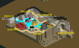
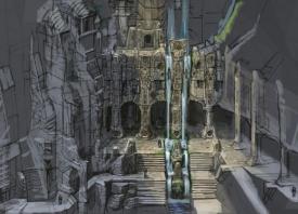
This map shape focused heavily on massive sculptures at the entrance to greet guests to the mine. We struggled with shapes/ideas for the sculptures and moved Jens over to Pirates! where he made the Kraken. I struggled mightily with how to do the entrance area while maintaining sightlines for the viewer and also how to integrate architecture carved into rock walls. So I initially did stuff like this:
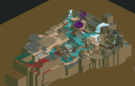
But the rest of the park layout felt very clunky and had no flow. Sooooo with two weeks before the deadline we basically nuked everything except for the ferris wheel arch tunnel and the mine train I built early on in the process and switch park layouts to:
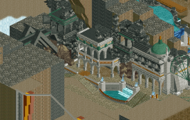
At this point, I'll be honest I felt a bit burned out with the build after having what little was on the map get destroyed and having to start from scratch. For reference.. here is where we were 2 weeks before the extension deadline:
But I will say the last two weeks were quite intense. I really enjoyed working with inthemanual, and shen, and coupon. If we had settled on this park layout from day 1, this would've been a lot more fleshed out. But, I am still proud of what we accomplished.
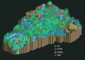
Here is a map of who did what:
Again, a little late, but congrats to the Cereal Killers on winning the matchup. Knew it would be very difficult knowing I'd probably be going up against Liampie.
-
 In:Cities
Offline
In:Cities
Offline
Awesome write up man. Love seeing the process behind it. Really have to commend you for all your hard work on this. I really enjoyed this park quite a bit. Your test architecture for it is spectacular
-
 Cocoa
Offline
Cocoa
Offline
i still can't believe that's what it looked like two weeks before due, and i was in the discord. thats some fucked hard work
-
 inthemanual
Offline
inthemanual
Offline
Awesome write up man. Love seeing the process behind it. Really have to commend you for all your hard work on this. I really enjoyed this park quite a bit. Your test architecture for it is spectacular
He had a lot more spectacular tests that he's not showing too. -
 Scoop
Offline
Scoop
Offline
Cereal Killers:
So.... When I first saw the screenshot for this park I thought I was going to hate the park in comparison to it's competitor, but then I opened it and I was pleasantly surprised. Is there a lot of Red? Yes. Is it Ugly as hell? Yes. But there is still a certain charm to it. And I'm not afraid to say that it "grew" on me. The wooden coaster layout is fantastic and quite possibly the best of the round. I think a darker combination of Reds would have done the trick in terms of maintaining a balance in color, but the flow and interaction of the layout is phenomenal. This park suffers from a bit from repetitive architecture, even if it is technically accurate some variation could have helped greatly.
I'm not sure who let this spire go through without being cut from the map, but it is not good. it really contrasted from the rest of the building which worked great. This park also has example of how-to and not-to-do half diagonals. The corner with the winding road uses it best with the subtle deviations from the grid. The biggest culprit of bad half diagonals is the water channel going through the wooden coaster. Because there is not perspective in rct, these longer bits of half diagonals look funky.
Here are some amazing details:
Like I said. This layout slaps. Along with the station.
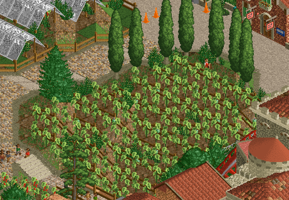
The fact that he actually harvests the tomato plants is Genius!
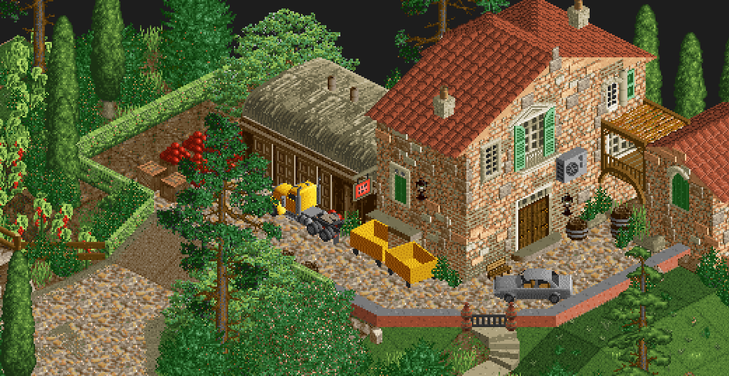
Also in a similar vein
My favorite little slice of the park.
All in all this may be in your face with the color scheme but it's still a very enjoyable park.
Manual Laborers:
Grundle Groin
has so much potential. That front entrance and directly behind it is Gorgeous. Then after that the whole park kind of becomes a mess for me. The architecture that's there is really cool and the water slides for the most part are very well executed (except for that quarter pipe thing. You'll kill people on that one lol) The landscaping is what kills it for me. The rock work is super repetitive and very messy at the same time. There are many areas where it looks unfinished and textures clash. Since the focus of the park is it's landscaping I have so many quarrels with it.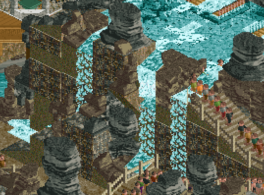
Here is a great example of the clashing textures. for the walls the builders should have either gone all in with the wall pieces or figured something else out. Personally I would've gone with the second option because of how much noise those wall objects create. I also wasn't a big fan of the coaster. It kind of falls under the same category as mzima falls in where it feels like a coaster just to have a coaster. Although this does fit the theme a bit better and makes sense in context. I think a different color for the track would've helped seeing that it tends to blend in with the rest of the surroundings, not including the water.
Let's move on from being negative and look at some nice bits from the park!
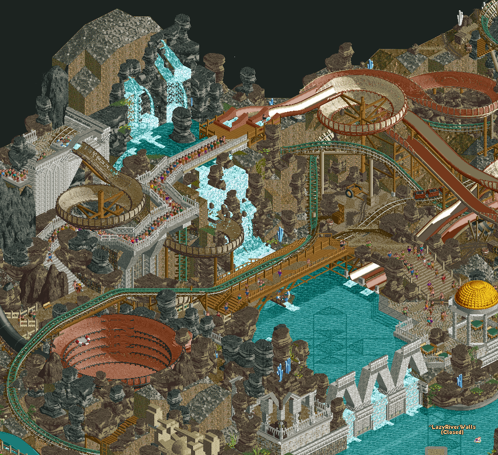
I quite like this area a lot with the water fall and terrace of water.
obviously the entrance slaps
This cutaway is pretty cool.
I had to give La Tomatina the vote because of it's clever use of new objects and the very welcoming atmosphere!
-
 FK+Coastermind
Offline
FK+Coastermind
Offline
Coming back for overdo reviews:
I think this was a really interesting matchup and I'm hard pressed to say how I would have voted if I wasn't part of one of these teams. Our park presented a pretty straight forward approach to H2H in what would prove to be a less-than straight forward H2H given all the unique and different styles we've seen thus far. But, the style and approach is done so well that is has that charming, warm rct vibe that makes it really captivating, add with some clever execution and new objects. By comparison, I think the ML park is far more daring and has some damn impressive and refreshing visuals, particularly the entrance area and the tower with the two giant slides. The concept and the ideation within the park is really stellar. Ultimately, where I think it fell short is that final round of polish and shine, and I'm guessing this just comes down to timing. There were parts that felt like the bones of an incredible scene, but missing some of the final layers of smaller details to bring it to life. Also, the style of rockwork and construction made it imperative that that final layer be perfected, otherwise there are parts that feel a bit too chaotic and hectic. I think with just a day or two more, this might have been a round toper. As it is, a great piece of rct and something that I truly enjoyed exploring, so thank you to all the builders!

Tags
- No Tags