H2H9 / H2H9: Round Robin - R4M2 - Cereal Killers vs Adventurers Club
-
 06-June 21
-
 Liampie
Offline
Liampie
Offline

Round Robin

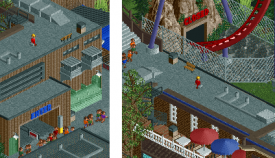
 Uncanny Valley
VS

 Croaked!Voting Rules
- The poll will stay open for ~72hrs.
- Do not vote unless you have viewed both parks in-game.
- Everyone may vote except members of either team. Any illegitimate votes will be ignored.
- Voting is monitored by the admins, who can see names behind all the votes. This is to improve fairness.
-
 Mr.Brightside711
Offline
Mr.Brightside711
Offline
Sigh... CK... Yall making fun of realism in everyway you can and I fucking hate it!
You have my vote... reviews coming later.
-
 Ulvenwood
Offline
Ulvenwood
Offline
Alright, I've made up my mind.
CK:
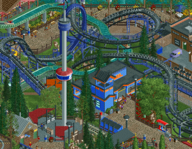
Very refreshing to see a park with an NCSO- like FPS. I like the amount of rides put into the park without it feeling too crammed. Well, to be honest, it is a little crammed, but not in a way that it bothers me. All of the layouts are splendid. Two nitpicks I have are the wingcoaster keyholes which the coaster flies past and the flume which makes it to some bends in a fashion that is a bit too fast. Nevertheless, the car ride, the Looper, the Dive coaster, all have superb layouts and path/park interaction, it's very well done. The support work is top-notch, on every single ride. The park may look a little simplistic, but the longer you look at it, everything falls into place and it makes for a killer entry. The archi is a bit lower-level perhaps but the rides definitely make up for that.
AC:
My favourite club/team so far. Unfortunately, they let me down a little this time around. I really like the idea for this park, but it just feels so unfinished and unpolished to me. Some parts are very well executed, but some parts are not. There is a lot of untouched areas, sand and blacktile embracing this park as if it is doomed. My thought is that you guys had a great idea but struggled to finish it properly before the deadline. Some of the builds are incredible and very creative and unique, but for me it looks unfinished and too glitchy to come close to CK's park.
My vote goes to the cereal killers, well done.
EDIT: I heard AC hit the tile limit. Bummer. -
 CoasterCreator9
Offline
CoasterCreator9
Offline
Uncanny Valley
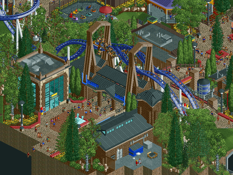
What a creative concept. I really hope people spend time with this one to realize the potential it holds. I love the shock value of a seemingly generic park being...this. I'm at a Loss for words. I can figure out a few of these, but I'm genuinely wondering how some of this was managed. The first thing I noticed was the wing coaster - thought that was odd, but maybe I was seeing things...nope, wait... Then I noticed more and more and I gotta say, I'm charmed by the creativity and humor involved.
I really love all the illusions and little easter eggs. Fun to stumble across and fun to try to wrap my head around. I won't share any specific mind blowing ones, but some of my favorites were among the trees and paths, aside from the rides themselves. Genuinely super creative and fun stuff.
I think what I love most about this park is that, true to the theme, it really made me second guess every detail of the park. What would otherwise be a solid, generic style park became so much more, and I really appreciate that.
I've tried to highlight a few of my favorite scenes that don't give away too much; definitely take the time to watch the rides in this park, it's worth it. I love the verticality of the area with the tower ride and the log flume, makes the landscape an interesting one.
Lovely architecture, very charming stuff.
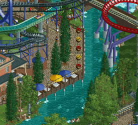
Not the best screenshot, but trying to avoid spoiling too many fun things - I love the waterside features of this park - very atmospheric and fun.
Croaked!
That damn object limit. I can tell there is a lot of ambition here, and what's been done is commendable - but I think both the time constraints and game constraints got the better of you. It's a bit tough to read throughout and feels quite rough around the edges. I'm going to focus on the positives - I think you guys know what happened here and I know that's a tough feeling.
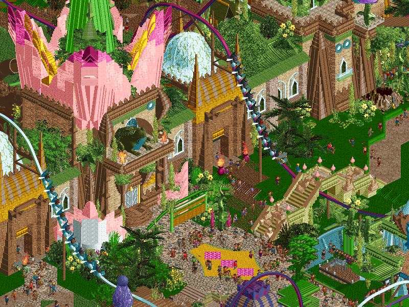
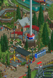
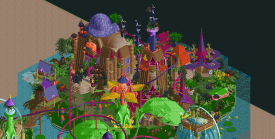
This is crazy ambitious. Building at such an altitude is a monumental task, even in OpenRCT2. I'm a big fan of the coasters, they're surprisingly massive for such a park. I do wish they dueled a lot more than they do. I also really appreciated the weeds and underwater features. I think as a whole the underwater section is far weaker than that above, but had it been fully realized I think it was on the right track indeed. The sculptures above water are quite well done; some bits are hard to read, but the flowers and the way things have been integrated into the architecture is quite well done.
The storytelling is also quite impressive; notable use of rides as scenery to provide that mouseover text. Quite well done, and definitely a strength of this park!
In the end, it's tough to overlook the rough spots. It's still stunning what you guys were able to put out here, and it's a damn shame the object limit didn't help at all.
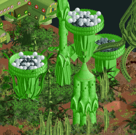
Love the egg pods, I could tell immediately what they were. Maybe a little out of scale, but I don't really mind that at all.
One of my favorite bits - wish the coasters directly dueled a little more, but I enjoyed the layouts regardless.
While certainly not without flaws, I loved this area quite a bit - the worm, the snake, the way the rides interact with the theming. Really well done in general.
-
 ottersalad
Offline
ottersalad
Offline
Well done to both teams! As usual, I'll share a few pics of stuff I enjoyed.
Uncanny Valley
From the start, I'll be honest that I didn't quite understand a lot of the jokes and visual gags and saw this as a simple realism park which made me think this was slapped together quickly. But, whoops, I was wrong! The more I looked at this, the more I noticed weird stuff happening. And as CC9 said, I don't want to spoil too much, but the execution of these tricks made me go "WTF?" a few times! Kudos. Otherwise, this was a very fun entry, but I think the architecture was a bit bland and was in stark contrast to what we see with Croaked!
Apparently you guys really love bathrooms.. but why a row of ugly portopotty's lol
Looks like someone got lost
Lastly, this perspective trick was really neat.
Croaked!
Damn shame you guys came up against the clock on this. It was a majorly ambitious park to pull off.. it's absolutely massive, and its almost 1.5 parks worth of content, so you guys should be proud of what's here. The architecture is so unique and lovely. Spent a lot of time viewing each building and how varied the styles were for each one. The dueling coaster for me were a bit hit or miss.. wish they interacted more, but the moment where the trains blast out the other side of the fallen log/tree was top notch.
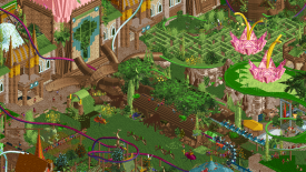
Also, this building was really cool. Not sure if it was a temple or something? But this corner of the park is arguably one of the better parts of the map. Bold and colorful and unique.
Overall, I think it's still a tough vote.. but I think readability with the split levels not being sectioned off properly (im assuming there would've been glass walls outlining the "underwater" bits) and the unfinishedness of Croaked is why I'm voting for Uncanny Valley.
-
 In:Cities
Offline
Object limit tends to put a damper on the whole "go big or go home" mentality it seems.
In:Cities
Offline
Object limit tends to put a damper on the whole "go big or go home" mentality it seems.
Congrats to CK for putting out a wonderful park
No ragrats -
 chorkiel
Offline
chorkiel
Offline
Croaked: It's very unfortunate that you hit the object limit. The blacktiling was a bit offputting. That was particularly a shame because the map was otherwise fantastic. Really loved the different esthetics you were able to create in this theme. Great sculptures too.
Uncanny valley: this park isn't really made for me as I'm not as deep into real world parks and coasters as many of you are. So a lot of the jokes are probably missed on me. Regardless, I thought the idea was really clever and there were still plenty of jokes I understood and thought were funny.
-
 deanosrs
Offline
deanosrs
Offline
Croaked: I had to really work to "like" this park; I really do like it, but it wasn't easy. There's a lot of glitches - they've always bothered me more than they do most, I get the impression - the missing black tiles around the edge, it even took me a couple of minutes looking at it to work out the sea floor aspect. On opening, the "Guests can't reach the exit of..." messages are a small distraction. Once I got there, and I figured out what I was looking at, I really did like it. It fell for me just short of full immersion, because of just silly, minor details (the guests trailing in and out was another). I ended up finding that I enjoyed this park a whole lot more when I max zoomed in. There's so many distractions going on, but that allowed me to see all the details in the architecture, rides. I was really able to immerse myself then in what you guys created, which is fantastic, a lot of fun, and packed full of detail. All the insects buzzing around are done really well; small things like the path, inversions and speed of the bees. Beetle joust is pretty funny. Drifting lilypads has a lovely little station that isn't overly busy. I love watching the bloomer spinning cups. My fav architecture section is around the orange frog. That dude looks like he has it made over there.
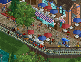
Uncanny Valley - sorry, I would not have got that this was some kind of park parody. The raleroad derailing onto the looper, the walmart, cliff cars has an arrow going the wrong way, there's some abandoned log flume cars down the river, the ride years are cranky, the bumper cars never bump?... that's pretty much all I can spot. My guess is there's a lot more. But it doesn't really matter. Because all of that is on top of what is just a really nice little park. Really nice. Everything is done super neat. The only thing that bothers me is how the looper goes around the loop. The coasters otherwise are all finished to such a high standard. The stations, support work, queues are all top notch. I absolutely love the little coke stands. Weird thing to like I know! Sometimes it's the little things. I absolutely love the 3 buildings in the walmart section next to the looper, and the little supply yard they have behind them. The gift shop outside Raven works so well too. We can see just enough of it that it just works. The design of this park left it slightly open to another park blowing it away by hitting perfection, but it set the bar super high and definitely high enough to win my vote over croaked.
You have all got insanely better at RCT2 than when I was last around. I don't know how you're doing half the stuff in these parks. It's awesome. Thanks for entertaining me with these two parks!
-
 Steve
Offline
Steve
Offline
All right, Match 1 is out! I mean, Match 2? Match 1.5? What's going on? Wait, am I in Uncanny Valley right now? Did Liam just fuck up the match order for some weird viral marketing on his park or something? That's cheating. Please ban this guy.
Anywhoozle, yeah, hey this Uncanny Valley is well, uncanny. At first glimpse I was like "well this is fucking boring" and then the longer I looked the more I wanted to slug Liam in the face. There's a lot of clever perspective tricks and mind-fuckery going on that I am quite jealous of. Will I let that influence my vote? Yeah, for sure, you bet. Nah, just kidding. Or am I? See, I am the Uncanny Valley of New Element members. Every step I make is both a mystery and likely a trick unknowingly against myself. At any rate, I have to give props for whoever made this because they had the balls to approach Liam with a realism park in H2H, where I'm guessing he promptly turned them around and smack them on the ass until they made it weird enough for him to agree to.
As for Croaked! well, it's the there. Looks like they added the "!" for the extra flair of not winning (guys if it didn't work for Pirates! then why'd you think it'd work for you? Drowned won and it didn't have the exclamation, c'mon). Clever but horrible name aside, there's some fun stuff here. The general premise is actually really fun, too. Really liked the stump with the rotating platform and that whole area, really. Good use of totally fucked up objects in general. Is this the disaster bench? Feels like one I guess. Well, if nothing else, good job on finis-- oh wait, wow.
-
 Faas
Offline
Faas
Offline
I voted for Uncanny Valley over Croaked! because I really liked Uncanny Valley, and really disliked Croaked!.
I adored the meta in Uncanny Valley, and how it is still a well designed theme park (refreshing!) without the little tricks.
I'm not a fan of multiple levels in parks, except for when it is a micro. First of all because it makes it impossible to rotate the park, and second of all because it is really hard to make out the different levels from an isometric perspective. Croaked! was not an exception to that.
Apart from it looking unfinished I thought this to be clashing in colour, textures, etc. It was really hard to focus on the cool small details and buildings there were. RCT is like marketing in the sense that I hate when it is multi-leveled.
Lastly, I would like to remark that it is interesting that these two parks matched up, because one makes full use of, and profits from, the isometric perspective, while the other seems to fight against it and suffers from it.
-
 Camcorder22
Offline
Camcorder22
Offline
Been out of town for a while, time to try getting back on the reviews wagon.
Uncanny Valley was a perfect example of a "gimmick" executed to its fullest potential. Instead of just shock value that wore off after a couple seconds, the concept, while immediately clear, also urged you to dive deeper into the park. I loved that some of the weird details on the rides were immediately visible, while others took awhile to find. Many I didn't find for a good 15 minutes into viewing the park, even after looking at a ride once and thinking it was "normal". Some of the most fun and interactive experience I've had viewing a park in a while. Concept aside, it was an above average realism park full of life and charm. Honestly we've had so few American style realism parks in this edition that it even felt refreshing.
I applaud AC for building a series of parks that can be described as "ambitious", although in this case it finally looks like you bit off more you could chew. To start with the good, on a micro level much of the archy was fantastic and felt very fresh and unique. Other moments such as the big flowers and underwater plants were great as well, and the single rail coasters were a good motif. Black tiling aside, I think overall there was just a bit too much messiness and unfinishedness to earn my vote. I'm sure a lot of it would have been remedied with more time to get around the object limit, but it feels like planning and building process for this may have been an issue. Nonetheless, there's plenty of good on this map to proud of, and its a colorful addition to a solid lineup of parks by your team this season.
-
 RobDedede
Offline
RobDedede
Offline
Here are my reviews for the match!
Uncanny Valley:
Right off the bat, I must say my first reaction was that I thought the park was a bit bland. However, as I viewed the park longer and longer, closer and closer, I realized just how great it really is. It's subtly very well executed, even ignoring the fun, uncanny hacks (right up my alley BTW!). The architecture and ride designs are nice and pleasant. The hacks and shenanigans really take it a step up though. If not for them the park would have not gotten my vote. When I saw Liam draft several "old guard" realism builders, I thought to myself, how are they going to fit into today's crazy meta? Well, this is the answer. It's ingenious honestly. Great job!
Croaked!:
Alright, so I feel like this park is oh so close to being one of my favorites, but in the end its unfinished state and lack of readability unfortunately dragged it down a little bit in my opinion. The choice to go with a swampy/underwater/frog theme is really novel and was done pretty well on a micro level. In terms of macro, I did like the ride choices to be sure, however, the park is just quite messy. I'm sorry if I sound harsh, I don't want to come across as mean
 I just found it to be hard to read in most areas above the water even though bit by bit it was really nice. So yeah, I think this park definitely could have used quite a bit of refinement but there are a lot of good elements and ideas which I admire. Good job and a valiant effort from AC once again!
The Cereal Killers get my vote this round, but both teams once again did a good job!
-
ottersalad
Offline
When I saw Liam draft several "old guard" realism builders, I thought to myself, how are they going to fit into today's crazy meta? Well, this is the answer. It's ingenious honestly. Great job!
Dirty American Realism never dies
-
 wheres_walto
Offline
wheres_walto
Offline
Mrs Walto reviews r4m2
Hi everyone, it's Mrs. Walto here! I wanted to type out an introduction because while Mr. Walto (hehe) does an excellent job of transcribing my commentary I wanted to provide some footnotes/overall thoughts. And now I realize I have nothing additional to say, so oh well, here's the review. Go Inspector Tiles!!!
Uncanny Valley (before knowing what it is)
- my first impression is I don't understand what this has to do with cereal
- this is cute, very cohesive
- little train station, cute little maze, I wish there were more big rides
- it's cute... (thinking of things to say) ...there's nothing wrong with it but I'm fuckin bored
- someone who has a very high skill level made the most basic park possible
- sorry cereal people, I must be missing something
- I like the little go kart track, cliffside cars, that's cute
Croaked?
- your adventure club journals never make sense, we must do different drugs, definitely someone is on mushrooms, and that's not a bad thing
- WOAH what the heck is this??
- wtf is this line of peeps, omg are they ants
- so I gotta ding them points for unfinished work
- oh look a little frog king, imma name him Freddy
- this is very chaotic, I don't know that I like it. It feels very fairy land
- that rook looks like a nipple
- spider eggs? I don't know
- I see the whimsy, better use of maze than the other team
- I like this lily pad
- oh look a little honey bee floating around. Is that a custom ride?
- oh the little spiders! I think I'm getting better at reviewing the parks. Before I was a little noob with no insight, but now I can identify custom tiles. One might say that I'm... a tile inspector (slaps thigh and laughs uproariously)
- I like elements of this but it feels like they ran out of time
Uncanny Valley (after learning what it is)
- I wanna see what's wrong, I'm gonna try to find stuff
- hey they're smoking! That's me!
- I'm still not really seeing what's wrong
- this long queue is probably wrong
- labyrinth? do they ever get out? That's probably something wrong?
- oh the enter is the exit, that's funny
- little construction man on the roof, haha busy schedule today.. I love a good easter egg
- strollers. okay.
- I feel so dumb aha I wish they made this more obvious
- the clock has a bowtie? Or is that two hands? Is it a penis? A big fat cock and balls?
- ya know, for the layperson it's not going so hot trying to find stuff, and that's making me angry
- I'm upset because I don't know what's going on. It's like the popular girl in high school whispering about me but I can't hear them
- oh wait! The logs disappear and reappear. The trains overlapped!
- I like this park, want to love it because it's super creative, but it's just a giant in-joke that I don't understand
-
wheres_walto
Offline
Croaked
- obviously it's unfinished, I'd be interested to hear what happened. It seems curious to me that a park can hit in-game year 271, touch the object limit, and still seem such a mess. Ambitious ideas are great, I admire that a ton, but proper planning and execution are what turn great ideas into great parks
+/- I find the overall look quite unattractive. It's definitely alien, props there, but the composition makes very little sense and the object use makes me feel like you wanted to challenge yourselves more than anything
+/- the underwater section had so much potential, I thought your concept art in the journal was mind-blowing. My first thought in this section was Subnautica: it's colorful, larger than life, and pretty scary to imagine
- the colors are just not there, I can't ever get a grasp on what I'm looking at
+ the tree trunk is great. Not sure why it's rotating but that's an excellent use of object
Uncanny Valley
+ I warmed up to this one, my initial thoughts were pretty cynical. It felt like you made a bad park on purpose as a way to make a joke of the entire contest, but after spending more time I came to appreciate the thoughtfulness and creativity required to make something like this. You have to really love the game on a deep level to notice some of the problems around the park, you have to be a savant to build them
+ I like that the spots aren't all easy jokes, the trick with the shrinking coaster trains is really clever, some of the perspective tricks around the park too. The trick with the train on the coaster tracks is cool as well
+ the rct itself isn't groundbreaking, but it's very well-executed small-scale realism. In the past, some parks have leaned on gimmicks to compensate for lower quality, but that's not the case here. The gimmick makes a somewhat boring (by H2H standards) realism park much more engaging and interesting to explore
+ I spent a lot of time looking around because I kept noticing things. I love how much of the uncanniness is subtle, it forces you to look harder and think about why it feels off
Sadly the incompleteness of Croaked made this an easy decision, I want to reward the more ambitious idea, but it just didn't come together for me. Uncanny Valley feels very much like a second act to Diamond Heights from a few seasons ago, it feels to me like an expression of love for the game, with a nostalgic building style and tons of spots poking fun at the quirkiness of the game itself, theme parks in general, and our community. It managed to put a smile on my face, great job guys.
-
 AvanineCommuter
Offline
AvanineCommuter
Offline
Croaked! by the Adventurer's Club
- I won't speak much of the unfinishedness because we all know that you all know that it is there. Very unfortunate but there is still some great moments and ideas at play throughout the park, so I won't focus too much on the unfinished state.
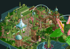
- Firstly, a very very ambitious park to take on two full levels like you did. The overall macro is pretty nicely done and I particularly like the overall forms that you were able to achieve with the lily pads. I appreciate the quirky architecture and object usage, particularly within the beautiful sculptures like the giant flower, the leaves and vines and plants throughout. Really cool and interesting work. Loved the Jack-in-the-pulpit. Sometimes the texture and object choices do clash a little too much, as it definitely has a "disaster-bench" vibe about it, but I think the quirky aesthetic works for the most part.
- I enjoyed some of the unique custom rides throughout. The spinning log is really cool, unfortunate that the cars are stationary (I'm sure time constraints were at fault here). The jousting beetles is such a cool concept and looked really great in game, well done there!
- I am glad someone decided to tackle metabolist architecture in RCT, and in a unique fantasy theme too. I think the vision and ambition was there but the execution did leave something to be desired. I actually think the metabolist style would've perfectly suited Stardust Circuit, but the beautiful sketches you had in the readme does make we wonder what this pairing of metabolist + lily pad kingdom theme could've been.
- I didn't care for the two dueling coasters. The layouts were very untethered and sprawling, with only a few cool moments of interaction (the dual launch through the log was great!). A more focused layout with the duelers could've been really nice in this setting.
- Flying bee cars? Brilliant and beautiful CTR!
- I see the nice effect of the custom glass object to mimic the water cutaway, such a cool effect! Really wished you had the object slots / time to wrap the entire lower level, that would've been such a wow factor here.
- My favorite bit of architecture is that massive central building with the flower crown. In that instance, all the crazy textures and colors and shapes come together really really nicely to create a unique aesthetic. Some of the other buildings around the map kind of miss the mark in comparison, as there definitely seems to be some variation in the quality of executing the theme.
We all know how stressful H2H deadlines can be, and I've had my fair share of unfinished parks due to time constraints. It happens. I appreciate the ambition and vision and the concept (really cool, something I would like to have been a builder on!). I hope the builders can still be proud of having creating something unique and quirky despite the setbacks.
Uncanny Valley by the Cereal Killers
- Aesthetically this park was quite boring, and I think that was the builders' intention. Overall the park feels really drab and lifeless. Visually I'm not attracted to this park at all, but that is just personal taste. However, I'm pretty sure that was the goal and the focus was really on all the neat little tricks scattered throughout, which makes exploring the park really quite interesting and engaging for the viewer!
- I think the concept is quite clever, in the same vein as Diamond Heights and Billy Wonka, and it was really well executed in the little details. I'm sure I'm missing more than half of the little hacks and tricks throughout, but what I could spot made this park really fun to explore.
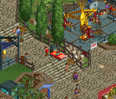
- Some of the cute little details that I could spot: the WTF labyrinth maze. Arcade / restroom swap. Misnamed entertainers. Previous H2H teams. Wonky loop. Teleporting Raven and wonky inversions. Glitched Topspin. Train directions. Flipped stands and ticket booths. Ride manufacturers. Car crash speed going nuts. Guests in backlots. Strollers at the back of the park? Mountaineer trains shrinking!! Probably my favorite hack.
- The layouts for Raven and Looper are quite nice and really fits well with the park and its surroundings.
- Working fast pass queue for the Raven? Not sure how you did that, nice!
Overall, this park was quite clever and achieved its goal really well. Definitely a park that's to be appreciated by those in the community from a detail and idea standpoint more than the aesthetic and actual typical parkmaking perspective. Definitely not a park that's in my personal taste, but it was well executed for the intended goal and concept. It's a very different, subtle approach to H2H parkmaking that I think can be risky, but ultimately paid off in the end due to your opponent having had an unfinished park.
Vote: Cereal Killers
-
 Lurker
Offline
Lurker
Offline
Uncanny Valley:
I just love the concept here, it was so much fun looking through and spotting all of the "Wrong" things about it. A great way to make a fairly standard park interesting and fun for H2H. The rides themselves were also quite well done with good layouts.
Croaked!:
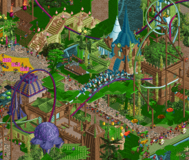
It's a shame the object limit got in the way of this, it's a very ambitious concept with some great moments. The acolyte temple was my favorite area, loved the colors used there. All of the fish and insects were a nice touch that added a lot of motion to the park as well. One thing I did have trouble with was readability, I struggle to make out details in a lot of this park. -
 Jappy
Offline
Jappy
Offline
Croaked:
Well someone here is a fan of Disney's Amphibia. Great show, and a great idea for a park! If it's totally unrelated, than no matter, still a really cool idea.
What can I say, I love the creative idea and it's a really ambitious map. sadly however, that seems to have bitten it in the ass I'm afraid. Some great ideas, and great archy in this, making use of the natural shapes from flowers and plants. Also love the different bug CTRS in this. The beetle jousting must be my favorite!
I'm afraid it's also a bit messy, sometimes it's hard to make out the different levels and things seem to blend in each other. I'm sure the unfinishedness has something to do with that.
Uncanny Valley
On first sight, a stereotypical, bland Dirty American realism® park. Take a closer look however, and things are not what they seem, with rides doing weird shit, coaster cars disappearing, miniature trains doing weird shit, vanishing foliage and perspective that's playing mind tricks. What a great idea! It invites the viewer to take a longer look to make sure he/she really discovers all the little things that are hidden in the map. i've looked at it for 20min and I'm sure I still didn't find everything.
My main gripe is that the environment chosen for this experiment might've been a little bland. I completely understand why it's a standard realistic park environment, but it's a shame not to have it tried it in a more themed environment. But I guess that would've distracted from the initial concept perhaps.
-
 Cocoa
Offline
Cocoa
Offline
uncanny valley: I have to say, I probably would not have found 75% of the shit here without discord guiding me. Guess I'm just ridiculously unobservant! On the surface level, its a perfectly fine if relatively uninteresting realism park. A couple things are nice, like the schwarzkopf track in particular, and the gatekeeper entrance. a lot of it is just good realism, perhaps not the most exciting stuff in the world. on the deeper level, of course, there's a lot of really neat subtle stuff that people have already mentioned at length, and all that kept me in the park for a really long time, up there with the longest this h2h-- so kudos on that. I hadn't seen the aquarium mentioned yet, and I particularly like the backstage area which is accessible and called "the grove". theres a good amount of funny things and some tricks which i genuinely do not understand, like the Looper loop. I also probably would not have even noticed the trees if it hadn't been pointed out! I'm sure theres more I haven't even seen yet, after two long hard looks...
croaked: i can imagine you guys are beating yourselves up about this more than any criticism I could give, so I won't. There's still a lot of great stuff here, especially texturally-- I think you guys have really gone hard on unique and fascinating new ways to build in rct this competition and I'm really loving it so far. the giant lotus flowers are awesome and I really love the underwater stuff too. Its great to see a properly spread out single rail also- i was getting sick of the same old realistic cramped ones. this one is elegant and swoopy and vibey. my favorite bits of archy on the map were probably the underwater house and the small lilypad off to the side with the drop tower on it- really psychedelic and totally crazy and novel. I would never have been able to build anything this wild and off the wall. love it for that.
uncanny valley is a good park, but croaked almost had a shot at it, honestly. It was tougher than I thought it was going to be to choose. unfortunately (well, this depends on your perspective...) it seems like cereal killers might snag another fortuitous win! liampie, the king of conniving...
-
 alex
Offline
alex
Offline
Croaked
pros
-theme park on lily pads - wonderful crazy idea
-joyful energy
-i liked the bold use of the bright green, and in general the colours were great
-liking the creativity in the architectural forms
cons
-base layer appears a bit bare - i think the sheer size of the map isn’t doing you any favours here
-i think you overcrowded it a bit with peeps
-sometimes a bit difficult to see whats going on - a bit chaotic
-the single rail coasters were fun to watch but felt lacking in presence (i think mostly because of how thin the track is)Uncanny Valley
pros:
-such a good concept and clever way of inviting the viewer to spend more time combing over the details
-Loved the choice of setting - I have to disagree with the comments saying its a shame it was a generic theme park - to me the total normality of the backdrop is as key to the concept as the weird double take stuff. Also it’s just refreshing to see a nicely built amusement park in h2h.
cons:
-its an annoyingly good idea and i’m a bit jealous quite frankly
Tags
- No Tags