H2H9 / H2H9: Round Robin - R5M1 - Logan's Run vs Scream Queens
-
 11-July 21
-
 Cocoa
Offline
Cocoa
Offline
droomvlucht:
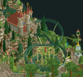
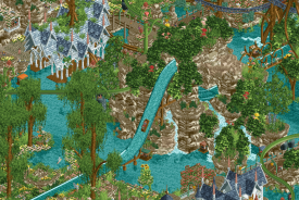
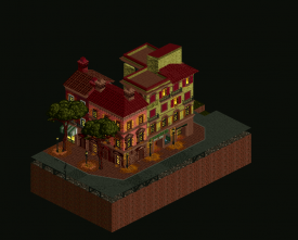
first thought: this park is so long! love it. this park is messy but in a ridiculously fun and vibey way. I always love when parts of real parks are sort of magically reinterpreted, and this seems to happen to efteling more than any other park, understandably. Perhaps my fondness for this park then reflects the fondness I have for the actual droomvlucht and the other inspirations here. I think the craft is pretty much excellent throughout the park, with all the dreamlike elven architecture. the tree-spinner spaghetti bowl at the back of the park actually works for me, because I can imagine myself in the shoes of a peep here and how magical that would look. I'm not exactly as convinced by the cliffsides around it, especially all that bush spam. I only would have liked the actual droomvlucht ride to have been pushed to way more prominence as it drives the narrative of the map-- as it is, its colors hide it away and it fades into a blur, rather than serving as the thread that the viewer should have used to navigate the park IMO. still a great park.
bellum:
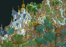
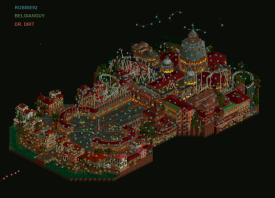
some of the best architecture of the contest, and in general, probably the best attempt at this sort of thing I've ever seen. the fading lights are beautiful and the giant dome is amazing. I love the smaller buildings around the front of the map and all of the angels&demons narrative elements throughout. The wingrider is, I think, almost good. I like the bits of narrative the ride has, and some of the layout is elegant, but some of it is a bit awkward. And similarly, the dark ride is almost good-- I love the showscenes I can see, but it ends up feeling quite empty as its so large and so much of it is invisible. in the end, I left this map wishing there was more to see-- maybe not necessarily interiors, although of course that would be nice, but just juicy bits of narrative to sink my teeth into and hold me in the park longer than one cycle of the wingrider.
it was a very close call in the end, but I went with droomvlucht. Probably one of the closer matches of the contest for me.
-
 posix
Offline
posix
Offline
Match Conclusion

The poll is now closed.
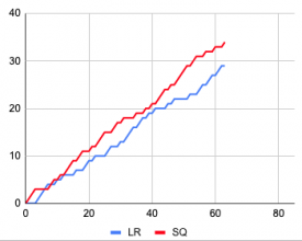
The Scream Queens have won this match with a score of 34–29 .
Creators
Logan's Run"Droomvlucht"
Six Frags
Jene
Mr.Brightside711
Scream Queens"Bellum Aeternus"
robbie92
BelgianGuy
dr dirt
-
 Liampie
Offline
Liampie
Offline
Dammit Steve, why couldn't you beat dirt? Now we're both in peril again. Congrats though, Scream Queens!
Great match, again. Rob, love seeing you build so much! Hans, also good job. Some of your very very best work, almost up there with Forum.
Very interested in seeing who-did-what maps for either park.
-
 CoasterCreator9
Offline
CoasterCreator9
Offline
You guys definitely put up a strong park to go against - great work.
Let me preface this by saying I haven't got a clue about Droomvlucht; so I recognize that a lot of the content here might be relatable and important to the real ride, but may go over my head entirely.
The entrance area (including the thumbnail shot) is possibly the highlight of the park for me. There's something about the big, imposing wing coaster and the unique supporting that is quite charming and fun. The rockwork and foliage around the entrance is also among some of the best in the park in my opinion. Working a little further back, I also enjoyed the Elfensplash area. There are some really fun visually impressive moments such as the big drop and the castle/mansion/thing atop the hills. The fairy lift was a funny little feature. The back half of the map lost me a bit; it sort of became a jumble of trees and track and birds flying around...all just a little too much for me. I actually don't mind the way you've done the foliage here, but I think that compared to the balanced foliage and landscaping in the front of the park, this went to the other extreme. It almost felt like two halves from different parks. Very impressive never the less!
I've highlighted a few of my favorite spots below; the park is full of these moments, but I limited myself to three.
-
 BelgianGuy
Offline
BelgianGuy
Offline
I saved my review for after match conclusion cuz i don't like doing them for our own matchups while voting is still in progress but here goes.
First off great park that instantly sells the reference material in the best way we've seen to date. love all the details and the aesthetic that was presented here. individual bits where stellar and not overdetailed to a point where it became cluttered again.My only gripe with this park is honestly the macro, every single bit isolated is stellar and i truly mean that cuz i've loved the efteling since i went the first time a few years ago and it's also a favourite ride of us with the kids wich is a big bonus for us. but then i zoom out and the macro left a lot to be desired for me personally, a bit too much of repeated aesthetic choice, the center area with the spinners again if you look at the individual bits is stellar, but in the grand sheme it was a see of 2 colours almost that felt very very messy if you weren't zoomed in on the details wich hurt it i think.
Great matchup, really glad we won cuz otherwise we'd have been out of the season for good so this makes it anyone's game still. Even though we won, i expect all of you to keep your chins up fellas as you delivered a really great park and a more than worthy adversary. Well done!
-
 Sulakke
Offline
Sulakke
Offline
Droomvlucht
I don't have much to add to the things that have already been said. The entrance with the wingrider flying above it was awesome. I love the custom supports with flower pattern here. It's a great opening scene. The rest of the custom supports on the wingrider was a bit hit or miss for me though. The coaster looks undersupported and some support shapes don't work well. The castle architecture in this area and on the rest of the map was great and I loved the sparks you added to the top ornaments. Adds so much atmosphere. Like Liam said, you should have left out the refrences to other Efteling themes, although it didn't really hurt my appreciation of the park.
I didn't like the landscaping at all, sorry. The flowers were great, if a bit worn out perhaps. The rocks, trees and jungle bushes didn't look good. Also, I think the composition (both color and placement) of the park could have been a lot better. Especially the areas that heavily rely on landscaping are really hard to read and look awkward in places.
Overall, I'm not sure yet how much I liked this park. I spent a lot of time on the park and there's a lot of life and things to explore, but at the same time it costs a lot of energy to figure out what is what.
Bellum Aeternus
The architecture was really well done. The cathedral was impressive and with the new object made by Alex you managed to make it clean too. I especially love the smaller architecture around the canal. Really captures the atmosphere of Rome well. The lightning effect and accompanying palette make this park stand out from other European architecture heavy maps and I think the effect was executed really well. I love the canal walls too. The half diagonals add a lot here. My only gripe regarding the architecture are the glitching windows, which wouldn't be too hard to avoid.
The main reason why I voted for Droomvlucht is because the storyline in this park was not well developed. There were some little scenes here and there, but the story was not clear to me. The execution of a concept is essential in any H2H park in my opinion. Another letdown for me was the fact that the majority of the map was lifeless and, therefore, the coaster felt out of place too. Why didn't you add more rides? I don't give much about interiors, but it felt strange that there were some really nice cutaway catacombs, but no cathedral interiors. The points above make me wonder if the park was unfinished?
-
 Steve
Offline
Steve
Offline
Boys, I just don't know if I have any more Steve Reviews left in me. I started big at the beginning and stretched myself too thin. Maybe it's a sign of things to come? Maybe my RCT career is finally dwindling. Maybe being H2H captain is my parting gift to NE. Maybe I am throwing in the towel. Is this sounding as somber to you as it is to me? *violins start crooning in the background*
Nah, just kidding losers. You're stuck with me. FOREVER. Well, maybe not forever. I have a kid coming soon, so, fuck, maybe this is goodbye. I'll stick around as long as life will allow though, because clearly someone needs to be Robbie's punching bag and it might as well be me. Although hey, I'll take it as a compliment that Eric is so scared of my team he feels the need to throw the guy with the highest rated Spotlight of all time at me.
Anywhoozle, what can I say that's already been said? I'll try to be quick: Queens, great map. Overall great idea with the lighting effect. I don't think it could've been done much better. I thought the central "square" with the two long "halls" flanking it on both sides was in both a macro and micro sense, pretty perfect. There were other instances where this succeeded like others have mentioned in screens, but also other instances where it did not. If I'm honest (and here's a fine how do you do: I am!) I am surprised to see Rob having such a significant share since there were quite a few of said instances where I thought for sure a less experienced player did some architecture. Chalk up to lack of time or any other reasoning, not a huge miss for me anyway. You get a pass from me, Robbo, and I still love you and need a hug. Can you just stop building parks now like you used to? Stupid OpenRCT2 rejuvenating the community. Who's in charge here? posix? Liam? ...no really, who's in charge, I don't even know anymore.
-
Liampie
Offline
One of the more exciting matches to watch. LR almost made a comeback on a few occasions.
-

mrs_walto Offline
Bellum Aeternus
I know I’ve been behind on my reviews - so sorry. But I’m back in action, back from vacation, and ready to get caught up on some RCT. <3
I muttered out loud, “what the fuck, that’s really fucking good” as soon as I opened it. Right now, I'm looking at the main plaza and honestly I'm just super impressed. I feel like the backlit columns add a really nice element of color and a real pop to the overall design. I really appreciate the object interaction with the roller coaster as well - something I always look out for when I’m reviewing now that I’m a self-proclaimed RCT reviewer.

Now, looking at the outer village, I really love the consistency of the design like I feel like that's the one thing that for me and my parks that I struggle with... getting like a cohesive design of like different buildings and houses and I have to say the tones of the reds, the windows that were used I feel like it's just a really crisp design and I love the use of the holiday light object that's one of my favorites so kudos to the team on that. I have to say I really love the columns on the main building. The little touches, like the custom scenery around the Basilica at the top is really interesting and that’s just a testament to the design capabilities of the team. The angels/spirits as a custom track design in the air is also super creative. I also love the little Italian police helicopter floating around trying to get everything so there's a lot of fun stuff to love about this park. I think for me it just feels a little chaotic and I wish there were more things to see inside the buildings, but overall the design work is really well done. The satanic ritual in the basement is one of my favorite parts.
Droomvlucht
I feel like I just want to float away when I hear the custom music for this park so first I just have to say hats off to the team because I really like the music. It has a very dreamy feel to it like you feel in the front half of the park, like you're in a fairy tale, which given the context of this park I really appreciate. I feel like it's a child's storybook come to life! Looking at the castles, the very distinct architecture and design, like the gold tops...I think it really adds something and I also really love the integration of the green roller coaster with the foliage was a lot of interaction to be pleased about for sure. The front half is really great. The back half has some fundamental issues.
I was just sort of confused when looking at the forest and the dual coasters. I can kind of see the peeps walking around in the forest but overall it just feels so bland in comparison to the other part of the park. I think if you wanted to make a forest park I would put some brighter colors and I'll just feels like it blends in together. I appreciate the interaction in the trees though I think that's a really neat way to do it but I would just say it feels too unfinished.
-
 Turtle
Offline
Turtle
Offline
I liked both of these parks, the standard this H2H is just so stupidly high.
In the end I think the right park won, but i'm not surprised by how close the vote was.
Droomvlucht -
A great park here, but one that I thought had a couple of fairly large drawbacks I couldn't get over. I don't know the theme, but as a dreamy fairyland it comes across pretty well. I'll get my drawbacks out of the way - the shape of the park didn't read super well to me - felt like a long valley, with huge coaster at the front, low stuff in the middle, then huge coaster in the back. I almost feel like ramping everything up front to back, leading uphill to the palace and centerpiece coasters might have felt more natural. The second thing is that it overall felt messy. Not sure if it was the objects used, or the density of them, but there were a lot of places where I couldn't tell what was going on. I feel harsh holding this against the park, as overgrown fairy forest was obviously the goal, but one area this definitely didn't work for me was the dueling coasters. Couldn't see the coaster for the trees, kinda thing.
Bellum Aeternus -
This felt like a huge park built to showcase a single idea - the lighting. And that idea was good enough, and was built well enough, that it worked for me. Definitely a risk, there are going to be people who will see it as a gimmick, or won't like the way it looks, but I thought it was really clever and looked great. I agree with Liam that I was kinda expecting there to be a bunch of inside scenes on the map, and I came away feeling like it was slightly surface level (ridiculous, but that's the standard that has been set). However, the surface of this map was far superior to most maps, and left me pretty wowed overall. Great idea, great execution, and enough to grab the win for me.
-
 robbie92
Offline
robbie92
Offline
Glad we could eek out a win on this one, and thanks for the feedback! I don't necessarily disagree that there was a level of something missing to the park, as we really just ran out of time to execute this to the degree that we had wanted. In between work obligations and family obligations, I'm proud of what BG, Dirt, and I were able to put out in the time that we had, and while there was a layer of missing narrative underground, we wanted to make sure that the surface level was complete. I'm always a bit antsy about the "unfinished" label these days considering the free time it takes to really complete these parks, and I was hoping having it at least look finished would be enough, but guess it wasn't, hah.
In terms for the concept, we were initially heading with a completely different idea (that I won't spill in case it appears in future seasions), but ended up pivoting due to a lack of inspiration on my end. I dug into a few old concepts and found this sketch for a design I attempted multiple times as a newer member (around 2010-2011ish, I guess):
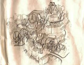
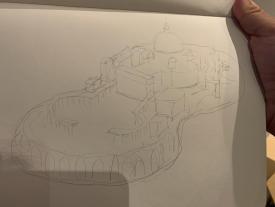
The general concept of the design was always Roman environment + Illuminati subtext (ie Angels and Demons), but there wasn't a ton beyond that idea. Regardless, I started with trying to figure out what to do for the map, and settled on sketching out what basically ended up the map shape, with a vaguely hourglass map mimicking the general shape of St Peters Basilica and Square:
The general concept of the map stayed basically the same for the entire build, with the only big deviation being the downscaling of the underground stuff in order to save time to finish the park; I had also looked into trying to do the interior of the church to some degree, but again ran out of time to really flesh it out properly and left it empty rather than half-assed. Also, it was a bit of an experiment for me in scale, as my own build scale would've put the church larger than the map; everything got downscaled slightly so that the church and square dominated the map but weren't the only thing featured.
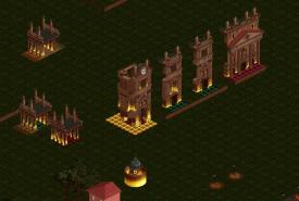
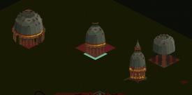
As far as the lighting went, it was a bit of a whim from me after looking at some inspiration pics. What started out as just a minor addition to the church ended up becoming a bit of a raison d'etre for a lot of the build for me; I wanted to push how far we could go with light and shadow on the map. Alex and Roomie both helped out with object experimentation for the scattered light on the walls, and Alex became a huge help when he did the pieces for the dome based on a suggestion from BG to use angles of megalite support. This map wouldn't have been possible for me without the scenery manager, with the church, dome, and colonnade all extensively using the copy/paste tools:
BG did amazing work with the coaster layout and supports, and also did some absolutely amazing architecture on the waterfront, along with the waterfront edge. He also did the vast majority of the underground scenes and cutaway portions. Dirt was a last-week addition to really help with the dirty (heh) work, doing the peeps for us, adding and naming staff, and generally some detail cleanup. He also did some great work in really coalescing the general vibes and atmospheres that we were taking from my design idea and came up with a great narrative around it (which evidentally didn't quite make it in to the extent we wanted); his readme and description for the park gave us a really good framework to add as much of the narrative ideas as we could. He and BG also did a lot of the story bits like cars dotted around the map, though I'm quite proud of my half-sunken taxi at the lip of the trench where the coaster enters the church.
Here's a dot map of who did what:
Anyways, I've gone on long enough, but I just wanted to say thanks for the feedback, and while this didn't quite accomplish everything it was intended to, I'm still quite proud of this release and a lot of my work in the park, and I know that my partners can say the same!
-
 CedarPoint6
Offline
CedarPoint6
Offline
That's a great breakdown, Rob. Enjoyed seeing how that came together.
Here's a video review for both parks:
Tags
- No Tags