Park / The Dragon
-
 06-January 13
- Views 2,231
- Downloads 424
- Fans 0
- Comments 15
-
 42.69%(required: 65%)
Design Submission
42.69%(required: 65%)
Design Submission
Casimir 70% Roomie 70% Airtime 50% Jonny93 50% Liampie 50% Louis! 50% posix 50% 5dave 45% Dimi 45% Goliath123 40% Loopy 30% nin 30% Wanted 25% RMM 20% pierrot 10% 42.69% -
No fans of this park
-
Download Park
424
-
Tags
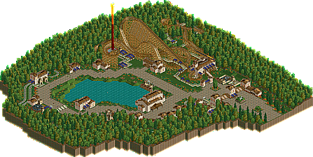
![park_3805 [NEDC4 9/15] Caelipotens](https://www.nedesigns.com/uploads/parks/3805/aerialt3439.png)
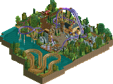
Judging from the overview ofcourse (no LL yet).
But the difference of the votes are surprising.
RMM Offline
what really separates a 35 from a 10, you know?
Anyhoo, I felt the layout was nice, but could've been so much more and flowed a lot better, a simple spruce up of the layout would have resulted in better votes. The surroundings aren't very good, but it's your first LL project, keep working at it and you'll acchieve what you set out to do here.
Really? There are a lot of different possibilities between something that just misses bronze quality and something that's totally rubbish. This piece of work isn't worth an accolade yet, but that doesn't mean every aspect of it is shit. If you actually do think this is complete rubbish and could hardly be worse, then giving an honest 10% is ok, but if it's just because you don't really make a difference below 50 it's not, in my opinion.
I thought this was a nice first attempt to LL. The coaster layout was pretty good, but apart from that everything was very simple and boring. There was no clear theme, the architecture was ok but way too repetitive and uninspired, same for the foliage and the paths. For example, why do you use the purple awning literally everywhere, and why is the border of the map filled with nothing but dense forest? Please keep playing LL, you got the basics but next time think of a better concept and try to be more creative in order to make it more interesting.
Airtime Offline
It was a little sparse in areas but enjoyable.
My main suggestion is to make things more compact and fill out the map you have more. The map was quite large with not enough in it.
I did like it though.
As for the map size, I was planning to add another coaster and expand the map to make it seem less stretched out but I knew I would run out of inspiration before I would finish so I kept it as it was. I'll take all of these criticisms into account for my next LL project.
Anyway I'm glad some people liked it and I hope I can please more with my next LL project.
What made you play LL instead of RCT2 in the first place? If you want to make parks like this I recommend RCT2. LL is a great game for doing extensive themes, with mindblowingly strong atmospheres. I cannot force you into a certain style, but if you play LL take advantage of those qualities. Trying to emulate classic players like Natelox, RRP and Posix can teach you a lot about how to pull off badass themes. What I usually do when doing themes in LL, and what it seems you did here, is to define some sort of formula (like "make all buildings yellow with wooden roofs OR brick with orange tile roofs, red flowers along crazy paving paths") and use that for an entire area. Once you get the hang of making nice compositions, the next step is to make the formula more complex and allow more deviation. A 'formula' sounds really unimaginative, but it's an easy tool for (learning) pretty parkmaking.
As for this particular design, I think it would've been close to design if you made it twice as compact, with some more variation in textures and colours and the coaster integrated into the surroundings. But it is promising.
edit: This post is not very well written for which I apologise.
speaking of nate, please give me the link to ouest's ad thread
RMM Offline
really. either it's a design or it isn't.
i've said it before. the percentage and the remarks alongside the percentages don't correlate well. there are times where i feel a design deserves a 40, but after taking a look at the remarks alongside, i second guess myself. i feel it deserves a 40 and then seeing 'i didn't like much in this submission' (i think it's at 20?) throws me off. when judging a park i've started to go by the gold, silver, bronze brackets and not the actual percentage. when my vote falls under the accolade notch, it becomes extremely hard to distinguish a 40 from a 20.
so, yea, i stand by what i said.