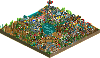
Park / World Amusements Rome
-
 01-October 09
- Views 3,782
- Downloads 725
- Fans 0
- Comments 24
-

-
 63.85%(required: 60%) Silver
inVersed 80% nin 80% SSSammy 80% Xcoaster 80% Kumba 75% zodiac 70% Katapultable 65% Fr3ak 60% posix 60% CedarPoint6 55% geewhzz 55% 5dave 50% Nokia 50% Six Frags 50% chapelz 40% 63.85% -
No fans of this park
-
Full-Size Map
-
Download Park
725
-
Objects
358
-
Tags
Similar Parks
-
Mediteraneo
-
Storybrook Glen
-
Park Asterix
-
Dream World Indoor
-
The Amazing Adventures of Spiderman
-
Dinotopia
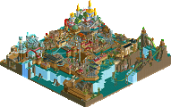
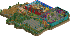
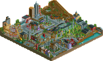
Casimir became an active member of the RCT Community through the German site RCT-world.com six years ago. After becoming familiar with egg_head and being introduced to New Element, Casimir went from strength to strength, becoming a member of RCT Majesty, and also a member of the Head-2-Head 5 winning team, the Hurricanes. A few months later, Casimir brings us his first solo Accolade, World Amusements Rome! Read On
i gave the joint highest score, and i stand by it.
Xcoaster Offline
I liked it quite a bit. I'm looking forward to the continuation of the chain in World Amusements Berlin.
Also, there were approximately 900,000 logos made for this; the creators should post some of the others that didn't quite make it, since they were all nice.
i've been waiting for this:]
i'll post more thought later on after i download and view it.
congrats buddy
Also special mention for 5daves logo. It is awesome.
Congratulations on the win, Casimir!
An example of this would be the train being off of the map. Normally you wouldn't see this in a solo park because you can pick the size of the park on your own. Anyway, some of the buildings were great and I really liked th Flying Machine in the Asia section, although when you showed it in the AD I thought it would be for something on a grander scale than that
Congrats
inVersed Offline
I wouldn't think that this is even bronze.
Just being honest.
Of course, that 's just my opinion....I could be wrong.
Edited by K0NG, 01 October 2009 - 11:21 PM.
Congrats Casimir!
Oh and glad you guys like the logo, although I'm not too fond of it
"MFG"
I know and understand, that not everybody here might be fond of my building style, nor of the park itself.
Some of the mentioned flaws are based on the fact, that this actually is a former contest park -> no chance to change the size or expand it afterwards. And I built too much to restart it when I decided to send this in.
What there is, is in my opinion the best what I could acheive, concerning the limited choice of objects, space and, back then, my own ability to express myself RCT-wise.
Another four independent acknowledgments go to Kumba, who really did save and push my interest in RCT by drafting me during H2H5, to J K, who always was eager to give me advice, take a look at my work and to support me. The other two belong to 5dave for that badass logo (omg, that's just cool!) and to SSSammy for his excellent writeup. Really great work!
Oh my, what an Oscar-like speech this has gotten already... well... I'm just proud that three years of working, waiting and feelings like despair about the game and it's limitations finally did pay off.
See ya in WoA-B
Edited by Casimir, 02 October 2009 - 10:41 AM.
1 – A big item for me has always been path elements and from the overview, it looks to be very hit or miss. For example, there is a large section of brown pathing by the water that has no lamp, benches or bins yet in others, I feel there are too many lamps in such a small area. In particular are around the double wide stairs. I know the game sees that as single wide paths thus placing lamps on both sides but when you place lamps on both stairs, you now have four lamps for two tiles. Since it was such a short stair (1 Tile in length), place them at the top and bottom of the steps on each side.
2 – I notice on some of the stairs you place the 1/8 tile bricks directly on the path. Because you were missing brick object with the slant on the bottom side of the object, it distracted the look. A prime example of this was on the exit of the woodie. I think you would have been better off placing those object next to the stairs vice on the stairs.
3 – Speaking of exits, the exit from the woodie is poorly placed and as 5Dave stated, it looks like it goes outside the park. Also, it looks forced in that you were boxed in and had no choice to have the exit go against the back side of a building. Not a final impression you want someone to have leaving a ride
4 – You already explained this but I think it was a mistake to have rides and paths lead to map edges for this park. It works great for designs as it gives the feeling that the design is part of a bigger picture (ie. park). You can also get away with it in contests where you are limited on map size. Even though this was originally part of a contest, the end result was this was now a solo with no constraints. IN this particular application, it caused more confusion for me.
5 – I think you tried too much variation for this size map. The areas are not big enough to fully immerse yourself in the theme. A map this size (IMO) would be limited to 1 or 2 themes at most.
All that said, there are things I did like.
1 – Even though it is being used like crazy now, the flower beds with the side friction track had a nice twist in that it looks like you used what looks to be log flume track under it along the waters edge. Gives a nice rounded bottom next to the water.
2 – The dragon looks impressive although not as detailed as others have been.
3 – Some of the architecture is very well done and offers a nice sense of balance.
Overall (again I still need to see it in game), it looks like a fun little park and congrats on finishing it. That alone deserves credit as I feel that is the hardest part of any project. If I can offer one piece of advice, continue to develop you own style. When I first looked at this, it looked like a group park as the styles didn’t have the consistency throughout to bring it all together. This can be as simple as consistent pathing elements throughout the park. Again, congrats
James