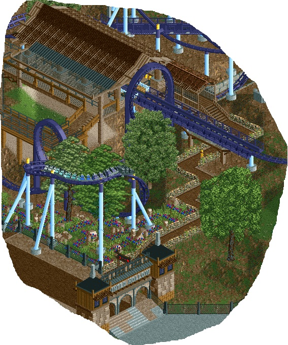
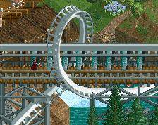
Screenshot / Schwarzkopf Looper
-
 18-July 14
-
Schwarzkopf Design
-
1 of 4
- Views 2,534
- Fans 2
- Comments 19
-
Description
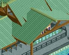
Started a side project to my main solo park; it's a schwarzkopf looper design. Obviously unfinished.
[Not sure about the flower colour; originally had red and yellow but that didn't really go with the dark/haunted/forest theme but I'm not sure if I like the darker colours]. -
Full-Size
-
2 fans Fans of this screenshot
-
Tags
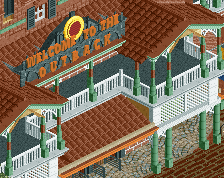
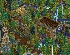
very nice, lovely interaction with the path and landscaping. i like the idea of using the mesh fences like that. be sure to vary the colours you use though, with the theme you're going for brown ofcourse makes sense, but seeing different shades of it would help a lot.
The flowers definitely shouldn't be the same color as the coaster. I might try orange.
Not a bad start. I agree with the flowers, and it's a little too unfinished to get a real good feel for it, but what you have is pretty solid so far.
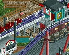
I'd love to see more of this layout. I applaud you for not using giga track though, that's really overdone as very few Schwarzkopf coasters actually used that type of track.
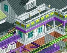
Way too brown... I might swap up the station roof to be just a metal roof, and you can keep the wood roof over the queue line. Agree on brightening the flowers. Layout and such looks brilliant though.
the floating station needs some more supporting, also the line of black rooves looks a little weird and forced...
Thanks for the responses.
I don't know what I was really thinking randomly using the black metal roof; I should have just used the netting there. I understand the comments about too much brown but I'm more relying on the foliage and coaster to provide a colour contrast. I'll play around a little more with the colours of the flowers.
Interesting that you say Coasterbill because I was seriously considering using the giga track after looking at Revolution and Shockwave POVs. But I'm glad that I kept it; although I wish the brakes were a little more subtle.
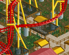
honestly i love the way the brakes look here, it blends in really well with the catwalk
There's something about this that's just really nice. I can't put my finger on it, because there are so many things that shouldn't work here, but it does. Idk.
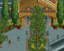
Great start. Favorite parts are the gate and high variation with the coaster. It almost seems to come out of hiding and run over the the entrance, then dip back out of sight. Really focus on the foliage here since it could give you that spooky forest feel, especially if you want to go for the aforementioned dipping in and out of sight (would be a really cool effect to have it drop into dense and dark foliage) and maybe throw in some cobwebs and giant spiders. Go to town with the dark spooky theme, there's so much potential. Consider throwing in magenta and orange in there as well for a little color that's still feels appropriate.
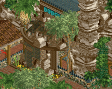
This is just a more updated picture of the type of foliage that I'm going for to give some better context:
In a way that dive through the trees reminds me of a more exciting and probably less painful version of Revolution at SFMM.
Incredibly fun...
make those steep wood roofs gray instead of black. they'll still look black without looking like a black tile.
Why the yellow poles? All they're doing is glitching.
The yellow poles were supposed to represent lights. They look fine from a couple of angles [not this one evidently] but wasn't really sure how else to portray it without the glitches. The supports are already on the outer edge of the actual track tile so any further out and they'd be too far away. I could of course just get rid of them...
I wouldn't try to include lights unless you have catwalks to accompany them. Also the supports should probably be centered on the tile, i.e. using the half- or full-tile pieces.
One little parkmaking method that could add some spice to this would be to use the path to literally frame and accentuate the curve of the ride. Round some edges, make the planter pop out a bit, just do something to emphasize the movement of the ride with the movement of your path, and they'll work together rather than act as two separate elements.
I love the turn around those trees.