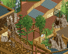
The actual architecture and details are excellent. What's off for me is the macro elements. It feels like you have a couple of real well done buildings, but their relation to each other is unfocused. The foliage is very good, but it's also very sporadic. Recent foliage trends have really shown the power of heavy, dense foliage clusters with expanses of lighter, grass landscaping. Cleaning up your paths, your foliage, and some of the minor details on your archy will help this feel like cluttered and chaotic.
I know you changed that corner steep roof piece on the station, but while the original steep wooden piece you had looked out of place, the two pieces hacked over each other looks messy. Play around with either using a tower or some edge ornamentation to take up that space. One of the most important skills for a parkmaker IMO is figuring out how to make something work without the right pieces to do it. Not compromising your building cause you don't have what you need, but being innovative to fix the problem with what you do have.
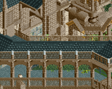
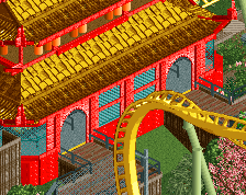
It's clearly Rob inspired but still, I love this. Incredible. I'd say easily gold standard and maybe even spotlight if you can make a park of this high caliber.
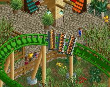
I like this more than BGA. It's a lot more ballsy. The green supports shouldn't look good, but they do. The architecture should be a complete mess, but it looks very nice. Keep it up.
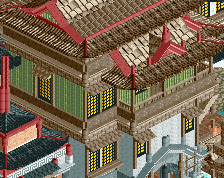
Really high detail, but in my opinion lacks a level of cleanliness. I think that Steve and Fk hit the nail on the head. Too many path textures all performing the same function really detracts from separating park from surroundings [where you don't want this to happen] and I think that a consistent path type would help a lot. Additionally, as Fk said, the details themselves are stunning but the overall picture is quite messy, which makes the overall screen quite chaotic.
Lol i never said that this better than. I built it and i really like it. But leave rob out. You guys only see this "finished" pic. From rob you saw much more high quality then one pic.
I could do the foliage less wild but i want to build it like this cause it should be a bit like hymalya feeling. Adventure,rocks,cliffs and so one .
I don't see any resemblance to Rob. I'd rather make a comparison with Sey. But all of that is irrelevant, it's Pizza work... I'm quite impressed. The area is flawed and unfinished, but it contains some really good elements and I love the scale. It's fantastical in places, but still credible.
Let's do an old +/- list. + I dig the coaster's colours. Original and unlikely, but I think it works + Landscaping: not necessarily perfect or almost perfect, but again, original. It's a unique blend of textures and colours that's incredibly soft on the eye. Supports blend it magically well + Architecture is either too chunky or too flimsy, but again, it's unique. Reminds me of an Asian interpretation of Rivendell. - Path textures are terrible. Seems like you didn't consider all textures to pick the best, but just went with a default path texture out of habit. I think LOTR paths would work well. They're darker and have more contrast. You need some contrast because the architecture's colours are a bit flat. If you don't know which paths I mean check out Corsair Veredian - I like large plazas and placing the tower in the middle is a great idea, but the implementation is poor. At least get rid of those ugly fences. Where's the theming? You don't need anything large, but you need something to tie it to the rest of the area. - The grey queue fences are a terrible choice. They blend into the path in some places, clash with brown wooden fences in other places, and sometimes are even combined with the same fence type but in black. Too many fences syndrome
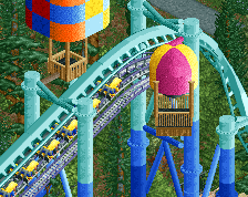
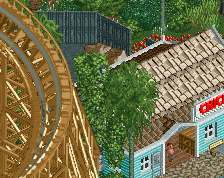
I'd either swap out the cars you have on the drop tower for regular ones or make the tower an Intamin. Those cars only work for Intamin 2nd gen towers.
This has no resemblance to robbie's screen whatsoever, apart from the fact that it's asian.
Sorry, but if this is what is going to happen everytime someone posts a screen with a theme that robbie has done then I don't want to be a part of this site anymore.
Pizza is a fantastic up and coming member who has posted an incredible screenshot, one which is almost full size and full of content and half of these comments are utter shite.
I'm not just talking about this screen either, I'm talking about all screens in general. Too many screens are being posted with shitty comments and desperate attempts at humour. If you have nothing to contribute to this site except off hand remarks and don't have respect for the time people put into creating these screenshots then why bother visiting this site?
/rantover
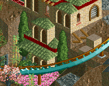
Pizza, this is some brilliant work. I love the use of colours, both in the architecture and on the coaster. The coaster looks nice and flowing and the layout of the surroundings seems well thought out. I'd suggest recolouring some of the queueline fences as you can't see some of them that well. Great support work too. Looking forward to more.
 07-October 14
![screen_1259 katakiuchi [B&M,2015]](https://www.nedesigns.com/uploads/screens/1259/1259.png)
![screen_2651_katakiuchi [B&M,2015] Entrance/Plaza](https://www.nedesigns.com/uploads/screens/2651/2651_thumb.png)
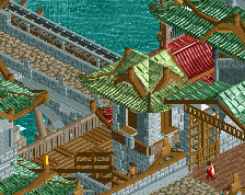
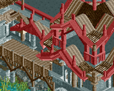
The green ornamented structures look awesome, but I feel like they're way too big for their purpose.
http://prntscr.com/4u0n9j <- right link
^you just linked to a file on your own computer. We can't see that.
I can see it.
The actual architecture and details are excellent. What's off for me is the macro elements. It feels like you have a couple of real well done buildings, but their relation to each other is unfocused. The foliage is very good, but it's also very sporadic. Recent foliage trends have really shown the power of heavy, dense foliage clusters with expanses of lighter, grass landscaping. Cleaning up your paths, your foliage, and some of the minor details on your archy will help this feel like cluttered and chaotic.
I know you changed that corner steep roof piece on the station, but while the original steep wooden piece you had looked out of place, the two pieces hacked over each other looks messy. Play around with either using a tower or some edge ornamentation to take up that space. One of the most important skills for a parkmaker IMO is figuring out how to make something work without the right pieces to do it. Not compromising your building cause you don't have what you need, but being innovative to fix the problem with what you do have.
FK
Sephiroth Offline
Wow Rob looks like you're making a lot of progress on BGA.
It's clearly Rob inspired but still, I love this. Incredible. I'd say easily gold standard and maybe even spotlight if you can make a park of this high caliber.
Only thing I really don't like is the rail color. I'd go with the darker red, the color you have now is a bit to bright imo.
Otherwise very very nice.
I like this more than BGA. It's a lot more ballsy. The green supports shouldn't look good, but they do. The architecture should be a complete mess, but it looks very nice. Keep it up.
robbie, why are you putting sub-par screens on your alt again?
it's better than BGA but that's not saying much given simply how bad that park really is.
Holy shit leave robb out of this
This is really great stuff i voted 100% i love the colours everything is great, just like pizza
Wow. Too many path textures in the queue line, but otherwise, wow. Great stuff here.
Really high detail, but in my opinion lacks a level of cleanliness. I think that Steve and Fk hit the nail on the head. Too many path textures all performing the same function really detracts from separating park from surroundings [where you don't want this to happen] and I think that a consistent path type would help a lot. Additionally, as Fk said, the details themselves are stunning but the overall picture is quite messy, which makes the overall screen quite chaotic.
I could do the foliage less wild but i want to build it like this cause it should be a bit like hymalya feeling. Adventure,rocks,cliffs and so one .
But thanks guys for your support
disneylhand Offline
Seems like an unnecessary amount of track leading into / out of the batwing.
It looks really cool, but I do have the feeling I have seen this all a dozen times before the past years.
Let's do an old +/- list.
+ I dig the coaster's colours. Original and unlikely, but I think it works
+ Landscaping: not necessarily perfect or almost perfect, but again, original. It's a unique blend of textures and colours that's incredibly soft on the eye. Supports blend it magically well
+ Architecture is either too chunky or too flimsy, but again, it's unique. Reminds me of an Asian interpretation of Rivendell.
- Path textures are terrible. Seems like you didn't consider all textures to pick the best, but just went with a default path texture out of habit. I think LOTR paths would work well. They're darker and have more contrast. You need some contrast because the architecture's colours are a bit flat. If you don't know which paths I mean check out Corsair Veredian
- I like large plazas and placing the tower in the middle is a great idea, but the implementation is poor. At least get rid of those ugly fences. Where's the theming? You don't need anything large, but you need something to tie it to the rest of the area.
- The grey queue fences are a terrible choice. They blend into the path in some places, clash with brown wooden fences in other places, and sometimes are even combined with the same fence type but in black. Too many fences syndrome
Voted 70%. Lots of potential
I'd either swap out the cars you have on the drop tower for regular ones or make the tower an Intamin. Those cars only work for Intamin 2nd gen towers.
This has no resemblance to robbie's screen whatsoever, apart from the fact that it's asian.
Sorry, but if this is what is going to happen everytime someone posts a screen with a theme that robbie has done then I don't want to be a part of this site anymore.
Pizza is a fantastic up and coming member who has posted an incredible screenshot, one which is almost full size and full of content and half of these comments are utter shite.
I'm not just talking about this screen either, I'm talking about all screens in general. Too many screens are being posted with shitty comments and desperate attempts at humour. If you have nothing to contribute to this site except off hand remarks and don't have respect for the time people put into creating these screenshots then why bother visiting this site?
/rantover
Pizza, this is some brilliant work. I love the use of colours, both in the architecture and on the coaster. The coaster looks nice and flowing and the layout of the surroundings seems well thought out. I'd suggest recolouring some of the queueline fences as you can't see some of them that well. Great support work too. Looking forward to more.