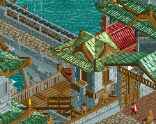
To be clear I wasn't referring to Robbie what so ever. I was just referring to how I have seen the Asian theme done a lot lately and I've had my portion of it. I remember it being awesome in Zippo's with the new roofing but I'm just waiting for someone to do something radically different with this theme once. But saying it's Rob inspired is a load of bullsh*t indeed. It's inspired by the general consensus of how to do an asian theme.
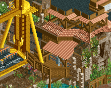
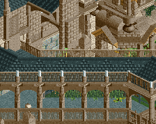
The station and queueline look really nice, the roofing especially is done really well.
However, I'm really not a big fan of the architecture on the left of the screen - it just seems like an afterthought without much purpose, just to fill the space, and because of that lack of purpose, the building has no identity. Instead, you've purposely given it a mismatched identity with a mismatch of colours and textures that just brings the overall quality of the screen down.
I'd question if you actually need the architecture there, and if you do, go simpler!
I'm sorry, I had the same reaction. I actually double checked who posted this because I wanted to make it was _not_ Robbie.
Whatever, the screen is impressive. Moreso where your ability to build this came from. You can only copy that much.
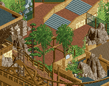
I think it needs more dirt or jungle texture rocks to give the landscaping more dominance. It's not playing a big enough role for me. Especially near paths where it's pretty much non-existant.
Also perhaps some flowers? Use them with caution though.
I also feel as though everything is very separate from one another: the ride, the architecture, the queue, the main path. There's little interplay. Maybe interweaving some stuff is something that could be interesting to you.
The scale is so inconsistent, and I don't know how that isn't bothering anyone else. The lower section of one tower has fences/short walls that should be able to be seen over, and right below those fences is a doorway that is shorter than the fences. on the lower portion of the screen, the restaurant roofs are 6-8 clearances above the ground, and the shrine nearby is only 3-4 clearances above ground.
Almost everything in this screen is beautiful on it's own, but they don't cohere to each other at all.
Also, there's a shitton of ghost fog objects in the tunnel to the drop tower and on the far right of the screen. the remove scenery tool might be able to help with that, but be careful not to destroy anything else.
Being the first one to make a comment about rob on this screen I feel I should explain myself.
It absolutely is NOT rob's work, Pizza has his own style here. Pizza DID do a REALLY GOOD job on this.. But there is certainly no denying that many of the same objects are being used both here and in BGA, in similar themes. Therefore in my opinion, YES, the two DO look similar upon a quick glance. In my opinion this does not detract from Pizza's fantastic work here. Keep it up.
I will agree with earlier comments stating that the 'macro' elements are off. Individually each piece is constructed rather well (some very, very, VERY well), though on a whole the entire thing seems bland and lacking cohesion, like you googled "asian architecture", built the top 5 or so results, and linked them together with path. That's not going to cut it, you need to fully develop an area. Give each thing a meaning, a history, a story.
Architecture doesn't make a good park, cohesion does.
I want to echo the comments about scale. The station entrance is to die for, and directly to the left is another nice little building whose entrance is as high as the railings on the station entrance. I'd really think about adjusting either one to be more consistent with the area.
Regardless, each structure is fantastic. If you had posted a much smaller screen of any part of this area it would have scored higher I believe, but this worked out in your favor because this archy is your best and the area as a whole deserves to be your best too. The more constructive feedback you can get the better.
Regarding the layout of the area, it seems that I would expect a little more symmetry in where buildings are put. Right now it seems a little random, which is a big no-no in the culture you are trying to recreate. This style of archy in a city would be the prominent nucleus, the political and spiritual epicenter. As such, I would think of courtyards, gardens, statues, and again, symmetry. keep it up though, don't be afraid to re-work or start things fresh- this deserves it.
 07-October 14
![screen_1259 katakiuchi [B&M,2015]](https://www.nedesigns.com/uploads/screens/1259/1259.png)
![screen_2651_katakiuchi [B&M,2015] Entrance/Plaza](https://www.nedesigns.com/uploads/screens/2651/2651_thumb.png)
To be clear I wasn't referring to Robbie what so ever. I was just referring to how I have seen the Asian theme done a lot lately and I've had my portion of it. I remember it being awesome in Zippo's with the new roofing but I'm just waiting for someone to do something radically different with this theme once. But saying it's Rob inspired is a load of bullsh*t indeed. It's inspired by the general consensus of how to do an asian theme.
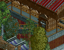
I love this. This is kinda messy but looks so good. I wouldn't change a thing.
The station and queueline look really nice, the roofing especially is done really well.
However, I'm really not a big fan of the architecture on the left of the screen - it just seems like an afterthought without much purpose, just to fill the space, and because of that lack of purpose, the building has no identity. Instead, you've purposely given it a mismatched identity with a mismatch of colours and textures that just brings the overall quality of the screen down.
I'd question if you actually need the architecture there, and if you do, go simpler!
I'm sorry, I had the same reaction. I actually double checked who posted this because I wanted to make it was _not_ Robbie.
Whatever, the screen is impressive. Moreso where your ability to build this came from. You can only copy that much.
I think it needs more dirt or jungle texture rocks to give the landscaping more dominance. It's not playing a big enough role for me. Especially near paths where it's pretty much non-existant.
Also perhaps some flowers? Use them with caution though.
I also feel as though everything is very separate from one another: the ride, the architecture, the queue, the main path. There's little interplay. Maybe interweaving some stuff is something that could be interesting to you.
The scale is so inconsistent, and I don't know how that isn't bothering anyone else. The lower section of one tower has fences/short walls that should be able to be seen over, and right below those fences is a doorway that is shorter than the fences. on the lower portion of the screen, the restaurant roofs are 6-8 clearances above the ground, and the shrine nearby is only 3-4 clearances above ground.
Almost everything in this screen is beautiful on it's own, but they don't cohere to each other at all.
Also, there's a shitton of ghost fog objects in the tunnel to the drop tower and on the far right of the screen. the remove scenery tool might be able to help with that, but be careful not to destroy anything else.
Being the first one to make a comment about rob on this screen I feel I should explain myself.
It absolutely is NOT rob's work, Pizza has his own style here. Pizza DID do a REALLY GOOD job on this.. But there is certainly no denying that many of the same objects are being used both here and in BGA, in similar themes. Therefore in my opinion, YES, the two DO look similar upon a quick glance. In my opinion this does not detract from Pizza's fantastic work here. Keep it up.
DAT STATION DOE.
Lovely.
I will agree with earlier comments stating that the 'macro' elements are off. Individually each piece is constructed rather well (some very, very, VERY well), though on a whole the entire thing seems bland and lacking cohesion, like you googled "asian architecture", built the top 5 or so results, and linked them together with path. That's not going to cut it, you need to fully develop an area. Give each thing a meaning, a history, a story.
Architecture doesn't make a good park, cohesion does.
I want to echo the comments about scale. The station entrance is to die for, and directly to the left is another nice little building whose entrance is as high as the railings on the station entrance. I'd really think about adjusting either one to be more consistent with the area.
Regardless, each structure is fantastic. If you had posted a much smaller screen of any part of this area it would have scored higher I believe, but this worked out in your favor because this archy is your best and the area as a whole deserves to be your best too. The more constructive feedback you can get the better.
Regarding the layout of the area, it seems that I would expect a little more symmetry in where buildings are put. Right now it seems a little random, which is a big no-no in the culture you are trying to recreate. This style of archy in a city would be the prominent nucleus, the political and spiritual epicenter. As such, I would think of courtyards, gardens, statues, and again, symmetry. keep it up though, don't be afraid to re-work or start things fresh- this deserves it.
I voted 80% just for the coaster color.
and this now
 best man !