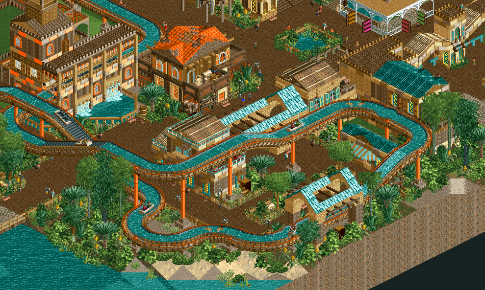
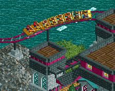
Screenshot / The Cry of the Swashbucklers
-
 23-December 15
-
Treasure Islands
-
2 of 13
- Views 3,311
- Fans 0
- Comments 23
Community Forum Software by IP.Board
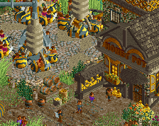
not enough log flume layers 0/10
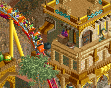
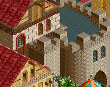
Definitely your best work, everything comes together pretty well here. The integration of cso objects with the default supports is really nice as well.
Thanks. It's a hell of a lot easier to use the default supports with cso footers, way less time consuming!
Looks great, really loving the support work.
Wow this is great. Colours are unconventional but unmistakably your style. (so don't listen to inthemanual )
)
There is a method to my madness, but you'd need to see the rest of the area to understand, so I'll leave it as is and perhaps change colors in the later stages of the park if testers suggest me to do so.
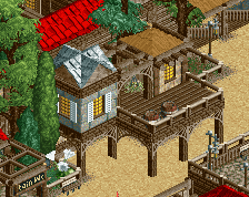
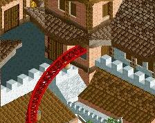
Yeah, I've got no problem with the colours. I think the orange really works with the tropical feel. The log flume looks great too - sturdy, but not overly metallic looking, which again fits well with the theme. With some suitable pirate music, I'd say this area would be brilliant!
Good atmosphere. I feel the textures are a bit in-cohesive so it feels all a bit too random. Like you've got corrugate, mud and brick walls which don't really work well together.
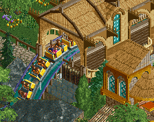
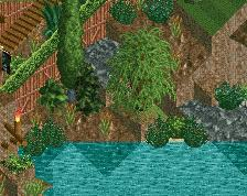
They can see it from the log flume
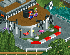
Booyah!
Very nice! The structures, flume, foliage, details, supports and spacing are so satisfying to look at. The colouring on the buildings could use a little work, and the edge of the map kind of takes away from the atmosphere.
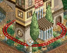
Hmm, map edge. But really quite potent. Has a strong classic NE vibe to it and good colour choices. If you develop this style a bit I smell greatness.
Really nice, the only thing I don't really like is that it is so close to the edge of the map.
Only thing I recommend to change is the turntable after the drop. It's too close after the drop, the log would go too fast to do that turntable imo.
^ Yeah, I realize in screenshots the edge of the map takes away from it, but as for it being on the edge of my park is no big deal, I have plenty of other rides not on the map edge in the park, I agree with Fred on that one. As for the turntable, I'm going to have to leave it, it's too much work that I don't want to do, basically due to the layers of ride track on the flume, but I'll note that for the future.
This is great! Has a nice, rather retro feel to it, with the object selection, the theme and the colour choices. The integration of the default supports is indeed great. The only thing I don't like is that orange roof. Too bright.