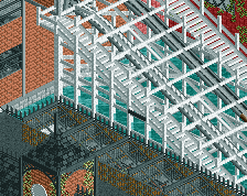
It looks great apart from the architecture. Too many unnecessary and random textures and fences. They just don't make sense. I had the same problem in Mystic Mountain but Louis taught me why they're unnecessary.
It's simple. The building left to the carousel. Take away the fences on the roof, they're unnecessary. The building next to it is great. And the building in the bottom left. Take away the wooden post fences and take away the corrugated walls on the brick windows too. I would make the whole building brick too. You probably think it looks better because there's more but sometimes you just need to leave a building alone.
^Yes. This is the key to nice architecture I think. Unless you're shotguns and can make 5 different textures blend together seamlessly, just choose 1 or 2 and see what you can do with them. If every strip of buildings in every park has bricks, castle walls, metal frames, AND wood fences, it won't be original. Choose a few wall types and go from there.
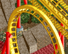
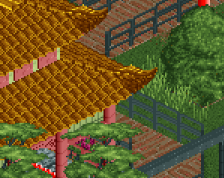
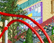
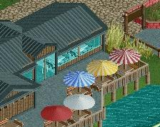
The open station on the shuttleloop coaster is a nice change, and the hidden grotto area is looking good too. I'd echo what's been said about the buildings though.
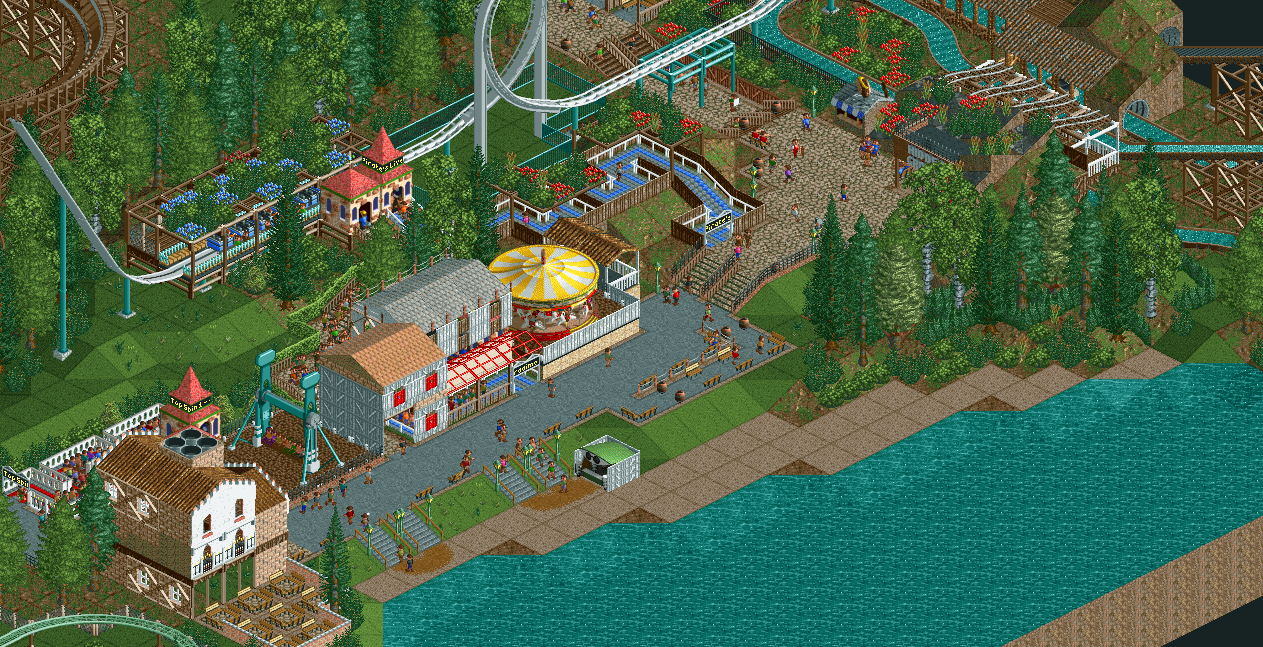
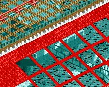
i lacked inspiration to finish my reddit april park in time, but i'm still going to finish it and submit it here. this screen might be a bit messy, so i hope to get tips what to improve on it
 04-May 14
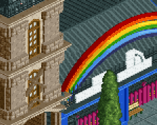
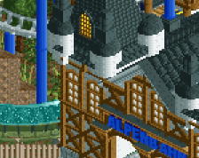
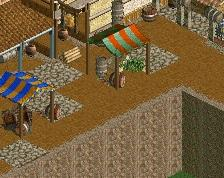
It looks great apart from the architecture. Too many unnecessary and random textures and fences. They just don't make sense. I had the same problem in Mystic Mountain but Louis taught me why they're unnecessary.
YAY I TAUGHT SOMEONE <3
can you teach me too?
It's simple. The building left to the carousel. Take away the fences on the roof, they're unnecessary. The building next to it is great. And the building in the bottom left. Take away the wooden post fences and take away the corrugated walls on the brick windows too. I would make the whole building brick too. You probably think it looks better because there's more but sometimes you just need to leave a building alone.
^Yes. This is the key to nice architecture I think. Unless you're shotguns and can make 5 different textures blend together seamlessly, just choose 1 or 2 and see what you can do with them. If every strip of buildings in every park has bricks, castle walls, metal frames, AND wood fences, it won't be original. Choose a few wall types and go from there.
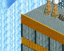
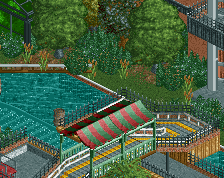
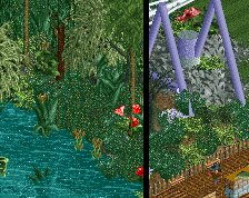
excellent sense of space, good foliage work. This has very strong fundamental parkmaking in it.
The open station on the shuttleloop coaster is a nice change, and the hidden grotto area is looking good too. I'd echo what's been said about the buildings though.