
-
 deanosrs
Go to post #800480
deanosrs
Go to post #800480
This is such high quality. This is 90%+ stuff to me. So clean, really modern parkmaking stuff but on an NSCO bench. Crazy!
-
deanosrs
Go to post #800378
Gustav - cool little micro! Hits the time for y2k with the huge monitor, just not as much content packed in as some other entries.
Josh/Ethan - what I love about this entry is just the volume of references to the era. The super soaker and the rubix cube for me are the top ones. The music with the nokia theme built in was a great shout!
Leon/AVC - top execution of the round for sure. And the level of signage is just so high. The error trapper custom built with the transparent land texture next to it was such a nice idea.
Hydro/Barn - feels like the best functioning ride of the round, really good executio and I love the blend of what is becoming signature Barn lighting and the Hydro influence on the architecture.
Narc - nice little add on to your other entries - I'm excited to see if you are going to stitch these all together post contest for a full scale park!
hypno - a bit simpler than the other entries but great to see you entering again.
split - another fun implementation of the moving map idea!
ge-ride - I think your work would benefit from more textures and going beyond the tt blocks for every sculpture.
Sorry for not having time to post more detailed reviews but really enjoyed all the entries here
-
deanosrs
Go to post #800131
Through The Ages - Round 4 Results 
Logo by J K
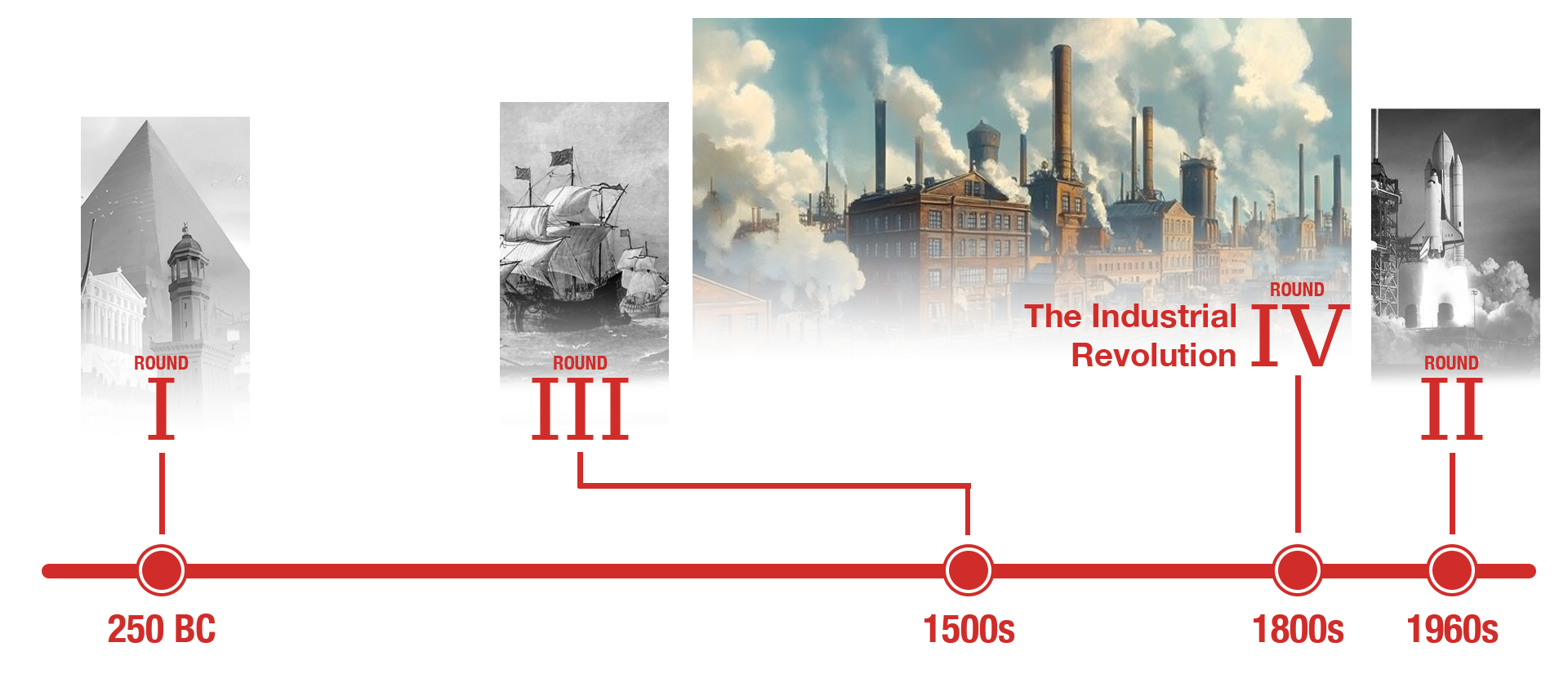
Round 4 - The Industrial Revolution
Results1800 - 1900
Round 4 has now closed, taking us through the industrial revolution—steam power, mechanisation, and railways. Out of the 7 entries received, it was Hepta and RWE who came out victorious with 42 points with their entry Victoria Mine: Shaft 13, and secured their place in the Grand Final! Congratulations!
Find the full results table below. Total score is calculated by adding the number of votes for the entry in the Objectives and Quality questions.
Total = Objectives votes + Quality votes
Entry Objective Quality Total #1 Victoria Mine: Shaft 13
by Hepta and RWE
25
17 42 #2 The Last Frost Fair
by Xophe and Xtreme97
16
24 40 #3 Chamberlain Steel
by hypnopompia and TimmyTuner
14
7 21 #4 Movie Night at the Turn of the Century Club
by Splitvision and Gustav Goblin
10
10 20 #5 AJ's Prairie Lightning
by AJ
3
4 7 #6 Steel Valley
by Lurker
4
0 4 #7 Modern Foundations
by Narc and Liampie
2
0 2
download Download All download -
deanosrs
Go to post #800095
In reverse order, just to spice things up.
Victoria Mine: Shaft 13
Wow, breakout release! And of course more great stuff from Hepta too (lol I joke)
The tilt coaster is a great way to hit the vertical drop prompt. The time setting is clearly hit here. The building materials, shapes, colors all scream industrial rev to me. If I'm being picky, maybe a touch too much glass. But the brick textures especially on the main factory are yum and very on point.
There's some machines that are very much steam powered, across the board I feel like most maps could have encorporated more steam visuals so I don't think anyone 5*'ed this part of the prompt.
Objectives: 4/5
Few if any do foliage/landscape as well as RWE and that's on show here. It's especially exceptional across the railway lines. The buildings and machines are put together so well. Lots of immersive details - the elevator by the lift hill, the train station is exactly the right amount of modest, there's some grid breaking to break things up (namely, the grid). There's one area next to the main factory that drowns a little in red and is harder to make out all the great details. Shout-out to the railway footbridge which is great - wonderful contrast in shapes and color there!
Quality: 81%
The Last Frost Fair
I think this park hits the time period best of any this round by recreating a specific event and also having a real life location helps there too to ground it in the context of the industrial revolution. The coaster doesn't have as imposing a vertical drop as Shaft 13; I do like the splashes of steam here and how the snow has melted off all the nearby roofs. A lovely touch to set the scene!
Objectives: 4/5
The reason why I guess people end up with "styles" is that doing things in a similar way means you get better at it each time, and I can definitely see how Xophe's advent entry helped lay the foundations for this park. The wintery look is fantastic.
The highlight of the park is for sure the Thames, the textures in the ice are fantastic. The gradients in the ice near the edge blew me away and that buried ship with the red mast is lush. Love the peeps trying to drag it!
Lovely city scape over on the other side. I think TTA gives you a bit of a license to have sections without as many attractions or theme park inspired activity so I don't mind that at all If I'm nitpicking for a minus some of the cutaways make the walls look paper thin but that's so tough to counter as making them thicker loses a tile edge to use for interior details.
Quality: 84%
Steel Valley
This one really hits the time period and setting so well, especially with the train circling a little hive of activity in the center. The vertical lift is a checkbox and no more, and I can't really see an obvious steam element on any ride outside of the train, which I guess checks the box.
Objectives: 3/5
Quality wise this is just exactly what I think you set out to do, Lurker. It's got a lovely implementation of the theme in your style, done in a way that I'm sure was a blast to put out on the map. It's always a joy viewing these maps especially as they have so many throwback elements to LL parks from the era of my first stint in the RCT community!
Quality: 65%
Movie Night at the Turn of the Century Club
I can often fall short on the required effort to get the best out of parks like these, so I really tried here to dive in.
Takana Valley is the best steam element on any ride. So cool - I don't even know how you guys did this in such a sporadic way. It's lovely. The rice fields in the orient is a unique touch for the era given the other entries.
The third scene is such a cool agricultural scene setter for the era. I love so many of the little details from the mechanics fixing cars to the tiny model train. But I can't find a vertical drop, which is a shame - with one, this park would have won my objectives vote on its own.
But that steam effect on Takana still splits with some other parks because it's so cool.
Objectives: 4/5
I get the glaze effect is for the movie; it could have been reduced a little to increase visibility. The sparkles of light being lit in the projector more than make up for this though.
The second "picture" seems to be a neat scene but doesn't really win my vote in either category: it doesn't do much for the prompts of the round and doesn't do anything "RCT"-y to make me bump it up the list in the quality category. That's not to say this isn't super cool and unique!
The third scene is incredible and perhaps my favorite. The tiny model railroad in the back does what half diags do to the grid, but to perspective. So unique and something I don't think I've ever seen before in game.
I wish there was more, but I know that setting up the crazy mechanics of something like this must be incredibly time intensive.
Quality: 78%
Modern Foundations
This is such a good pairing for Narc; I felt like in rounds 1 and 2 the start of the macro was there but Liam is such a heavy hitter on architectural details and adding life to parks and those really felt like the two areas for narc to work on and here it is!
While the park certainly could be set in the 19th century, it feels like it could be anytime up to the 1960s too; it would have been nice to see some more concentrated colors or details that were 19th century specific. The layout of Electrification is definitely a highlight that more than checks the vertical drop box. For me the twist over the path down the canal is its crowning moment.
For steam, again there's the trains and I don't really see any other signs. So the box is checked, but not in a way that pushes it ahead of the other entries.
Objectives: 3/5
I feel like this park is overall super proficient but needed to take more risks. It's really tough to fault it in anyway at all, I'd just like to see some more things in it, especially in a contest, to separate it from the pack and take some mad, crazy risks. Everything is good, and I can see some spots of great, especially in the station and its surroundings.
Quality: 74%
Chamberlain Steel
I love the grungier approach to the era. For me, this is more how I picture the industrial revolution - more like a Lowry painting.
There's lots of steam - chimneys, the exhibit steam hammer, and of course the trains, which seem obligatory for the round!
Iron mallet's beyond vertical drop is the second best implementation of that objective after shaft 13. This one I think was the best entry for objectives, but I did vote for multiple parks here since I felt others were close enough to share the spoils.
Objectives: 4.5/5
This park felt alive to the era. So much movement, the inclusion of multiple coasters really works. This is the age when machines started running everything so having so much movement in the park, all the way down to the polluted riverway, works so well.
Lots of grid breaking too, and for two players perhaps more associated with NCSO/DKSO, you would never have guessed it from this entry. All the stuff that is easy to shortcut and requires some CSO specific knowledge - stuff like half diags, rockwork, foliage, you guys hit it out the park.
Quality wise, my joint fav of the round.
Quality: 84%
AJ's Prairie Lightning
A nice contrast with an american agricultural approach to the era! Similarly to Modern Foundations, more era-specific stuff - some industrial rev machines or grungier architecture, would have bought my vote a little more. I like how although again the train is the steam element, it's featured in the map shape, allowing it to contrast nicely with a long stretch of fields. I like how that paints the picture of the era nicely. Prairie Lightning does have the vertical drop too. On objectives this was all boxes checked, but none colored in.
Objectives: 3/5
Quality-wise this really felt right at the level of your round 3, AJ, which is to say, pretty great. There were some nice narrative touches too - the smelting scene under the coaster's drop, the crows in the field, and the central farmhouse was a really lovely centerpiece to the map.Quality: 75%
-
deanosrs
Go to post #800004
 Screenshot 2026-01-02 at 06.42.04.png (1.86MB)
downloads: 63This was probably my fav kumba moment on the map. So much life and so many things happening. We didn't want to have much pirate content, but this pirate bar in the center of the map was a great splash for it.
Screenshot 2026-01-02 at 06.44.08.png (1.43MB)
downloads: 60It was so much fun to open the map each day and see more splashes of peep scenes, stalls, interactions, just anything to break the pattern of building/ride/path.
Our styles I think contrasted very well - weaknesses aligning with strengths, eg. I suck at ride design, so starting a map with a great coaster already on it is huge to me. I really enjoyed working on this map!
I'm done with prelims now as I have other projects I need to work on; but I'd encourage anyone to just reach out to a few other builders and try to find a match for rounds 4 and 5. And then, just start building! And see what happens.
Contact...
Fan of...
Recent Visitors
-

posix 6 days ago
-

Terry Inferno 2 weeks ago
-

Gustav Goblin 3 weeks ago
-

Faas 3 weeks ago
-

MRockets 2 months ago