Park / NeMica-Forgotten Land
-
 14-November 08
- Views 5,736
- Downloads 773
- Fans 0
- Comments 26
-

-
 65.36%(required: 65%) Pro Tour 3
Xcoaster 85% FullMetal 80% Kumba 80% CedarPoint6 75% zodiac 75% nin 70% Fr3ak 65% posix 65% postit 65% ChillerHockey33 60% Magnus 60% RCTFAN 60% geewhzz 55% Milo 55% chapelz 50% Evil WME 35% 65.36% -
No fans of this park
-
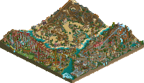
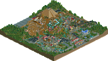
Full-Size Map
-
Download Park
773
-
Tags
Similar Parks
-
Seven Stars Entertainment Parks Germany
-
Charybdis
-
valhalla
-
Pangaea
-
Canthose Valley Theme Park
-
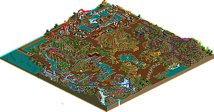
The Last March of the Ents

But it was way too similair to Karizima (which I loved) but there's such thing as too much of a good thing. I know you're capable, I want to see more themes like you did with the chinese area. Also, a different type of path for each area would be nice- you know, so you can distinguish between the areas.
The quality was really good throughout the whole park, but I really was a bit too reminiscent to Karizima. There was a bit too much quarter tile landblocking for my likings, which made the whole a bit busy. Only one corner had some full tile trees, the rest was mostly bushes and quarter tile trees. Maybe you could work on this a bit more...
The coasters were really nice and fresh. I like the accelerator with that hill-hugging 'top-hat' and the narrow twists and turns. The interaction between the rides was really cool. The chinese area was the best for me. The river rapids was very nicely done. The round station was awesome. I wasn't a fan of the visible ride track underneath, though... I dunno if it's possible to make this invisible, though.
The area around Merdia was also one of my favorites. It had a nice modern and clean feel IMO. The interaction with the waterfalls was awesome, especially between the interlocking corkscrews. The only thing that bothered me was the glitching tree. Those errors can be fixed easily.
Orgula was also a nice idea. I liked the idea. It was a bit crowded and just brown, but temples are brown like that, haha... But maybe you could have spice it up with some other brown-tones. I love those filigree building-style you have. There are only a few recognizable styles out there, but you sure have one!
It was a bit dificult for me to distinguish between the themes, Everything but the chinese area looked mostly the same. Hopefully you can try to develop single themes more to let them look completely different among each other. I can say you're the king of 1/4 tile landscaping, though!
Well done, and looking forward to see more!
"MFG"
The park interested me from day 1 when you posted that sick screen a while back, it's great to see it finished.
I felt my main problem with this park was timing. the first half of this park was made over a year ago, then their was a long break, and then i picked it up to finish it off, but i was too late to do everything i wanted. The Main reason this looked alot like Karizima was because Balcore(the flyer) and Karizima were pretty much built at the same time, but i picked up on Balcore in my rush to finish for the first deadline. when it was given a year extension, i went back and did Karizima, defaultly falling back into the same style. The last part of the Park i finished was the Asian section with Red Dragon. That was why it was the best, i looked at my style and realized i need something different and fresh, and some trees. Originally i wanted to go back to the other areas and brush up a ton of stuff, especially around Balcore, which i wanted to change to be more like it was winding through a town in the moantains. that all fell through as time got in the way.
Theming was another area the i wanted to go back and clear up. besides some buildings, Balcore and Merdia were pretty much the same. i think if had i gone back to Balcore i could have helped clear that all up. Either way, that is all based on what i wanted to do, not what i did.
My favorite part of this park was the coasters. Originally i had, jammed into the lake at the back, a 6th coaster which was a air-powered launch the led to a knotted wooden track. i took it out when i realized i wouldnt have time for it. I really had fun with this park in making the rides interact with their surroundings.
Thanks again for the comments! glad you all enjoyed it, for i definetly enjoyed making it.
FK
Brown, repetitive, flat, barren.
The style used in this park was boring, everything looked the same and we've seen everything before. The lack of big trees and grass really damaged the atmosphere, the whole park was just mud with weed on it.
The rides however were nice.
I hope you try something new in your next projects, I suspect you can do a lot better than this.
Congrats on #5! This park was not bad, just boring and... brown.