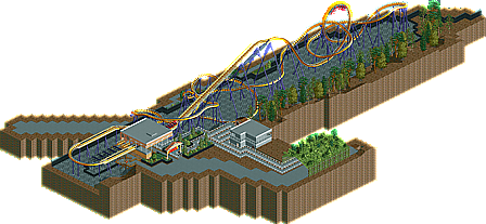
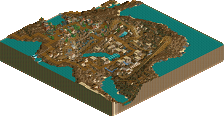
Park / Georgia Scorcher
-
 12-August 05
- Views 7,295
- Downloads 673
- Fans 0
- Comments 22
-
No fans of this park
-
Download Park
673
-
Objects
102
-
Tags
Similar Parks
-
The Faraway Tree
-
Madly Joyful Realms
-
Utrecht, Dwaze Domstad
-
Excavation de la Forclaz
-
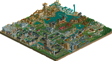
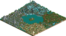
[H2H8 R5] Romon U Park
![park_4134 [H2H8 R5] Romon U Park](https://www.nedesigns.com/uploads/parks/4134/aerialt3926.png)
-
The Milieu
Corkscrewed Offline
Kumba's Vogadio


Panic's Sand Fox
Postit's Georgia Scorcher
DOWNLOAD ALL ENTRIES HERE
Kumba's was fun to look at; Postit's was nice, but the coaster made me ache at points. Still a good one.
By the way, the fence is my favorite part of my entry.
I'll check out Kumba and Panic's entries tomorrow morning. I've just re-installed LL, so I have some catching up to do.
Rhynos Offline
Melt
In
Your
Mouth!
Panic created one of the most elegant woodies I've seen so far. I loved the helix near the end of the ride and... actually the whole coaster.
Postit's recreation was definately fun to watch since I used to love recreations (where's the time of good ol' Batmanfan's SFGA and Mike Robbin's Busch Gardens Williamsburg ; ( ), but it was a tad bit too simple, and in a compo I rather prefer original creations.
Kumba's entry has the best theming, panic the best layout, and eventually that last one gets my vote.
I downloaded, but only had time to look at Panic's. Nice layout, very smooth. I wish there was more the the entry though, because it seems very lacking without much theming.
I'll look at the others later.
Richie Offline
PBJ Offline
inVersed Offline
Panic's had the best layout
Postit's had the best supports
Kumba's had the best theming
Yet still my vote goes to panic, his entrys layout really outweighed the good in the other two, yet still dont get me wrong the other two were very good entries.
Corkscrewed Offline
Panic's layout was excellent. Exciting, fast, and very fluid. As far as layouts go, Panic had the best entry. I'd ride that coaster anytime.
Ok, now I'd like to address a few things about my entry again. Firstly, although I've already said it, I'll say it again. I wasn't going for a fluid layout, I was going for an accurate ride, and yes, I know some parts are ugly to watch, but that's what I had to do to make it as accurate as I could. For those complaining that mine was plain, well here's a shot of the actual coaster:
The only things underneath the coaster are supports and their footers. I did experiment and try to make accurate footers that don't come 2.5 feet up, which would not be accurate. I tried different things, including trying to hack this piece underneath the footers.
Everytime I did it, though, the piece would glitch, and it's better off without footers, because there is nothing really that could represent footers the way I wanted to. As far as the land texture underneath, I chose rocks because there are rocks underneath. Of course the rocks are a lighter color, so it's not going to look that great, but I did try to incorporate some of the sand texture, and it just didn't work. So, in "theming" the ride, I'm pretty sure I did as best as I could because there is no other "theming" in Six Flags parks. I'm also not 100% accurate with the transfer track, and I'm sorry about that. I couldn't find any pictures of it anywhere, and had to do it from memory. The supports and the fence outside are very, very accurate, in case you're wondering. I took a little liberty with the supports in some spots, mainly due to the track not being perfectly the same as the original. As far as the queue goes, well, that is what I remember of it. I couldn't find pictures of the buildings near it either, so I did them from memory, and I didn't have 1/4 windows in the bench so that is what you got. And yes, the line goes all the way out of the way and under that ivy thing. The sign and the station are accurate too. There are only three other things that some people will notice or whatever. The drop from the first brake run to the second is not supposed to be banked. In real life, there is a 3-5 foot drop during that turn, and this was the only way to represent that in the game. Of course, this might be one of those no-no's that some of you might not like about it, but I just thought that I should let you know. Also, the color of the track is up to debate. It's like one of those Medusa things. In some pictures, the supports will look like this:
Very purpley. However, in other pics, the supports are like the color I did, and, when I rode it, I remember it as the color that I selected. Finally, the drop and the loop are 5 feet off because it was more important to me that the flat to steep and steep to flat track pieces were included on the drop, as it has a more realistic look.
I'm sorry this is so long. I'm kind of dissapointed with how I did. But no hard feelings, anyone
Kumba's did not interest me at all, and that coaster was horribly boring. I know it's a "modified" fish hook that used to be popular in LL parks for some unknown reason, but who the fuck would wait in line to ride something like that?
Postit's I thought was definitley the best. I love recreations, and this is no exception. In fact, It was alot better than I expected, because I've never seen your work. Everything looks accurate from what I've seen of the ride, and I know how hard it can be to recreate elements of the ride rct won't allow, or that you forget.
Edit: Nevermind, it works again.
Postit do you want me to post one of yours?
thx for the votes