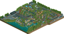
Park / Carnivore
-
 19-September 10
- Views 5,988
- Downloads 758
- Fans 2
- Comments 33
-

-
 72.31%(required: 65%) Design
Nokia 90% Louis! 85% SSSammy 85% Kumba 80% turbin3 80% Wicksteed 80% BelgianGuy 75% geewhzz 70% nin 70% ][ntamin22 70% chapelz 65% John 65% 5dave 60% RMM 55% Roomie 55% 72.31% -
2 fans Fans of this park
-
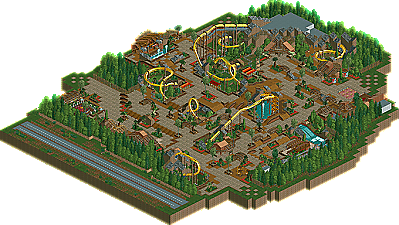
Full-Size Map
-
Download Park
758
-
Tags
Similar Parks
-
Dinoland
-
Extinction
-
Islands of Enchantment
-
Jurassic World: Raptor Strike
-
Silver Valley Theme Park
-
IOA Rome
Never did I think I would see a design or an accolade from posix while I was active!
Great interaction, and hiding the ride away from the peeps pov. I couldn't follow this coaster from the overview at all. I'm definitely looking forward to more. Hopefully this isn't the last! Once again, congratulations!
i just hate the coaster itself.
way to many straight pieces of track, way too long sections underground and for me it just seems to wonder its course back to the station due to the long straight sections in between every inversion it seems. This is a fluke in my eyes from you. I just dont see the usual posix beauty in this coaster as i have seen in everything you have ever released...
This is not as good as some of your older work posix, but nevertheless pretty good. After five years of not releasing anything that was to be expected anyway.
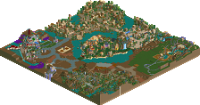
My main problem with this design is how spacious it is... the coaster felt too 'streched' in places and there was way too much (bare) path. More architecture instead of path would've done wonders! I enjoyed it a lot though, I love the coaster's colours and there were great ideas everywhere.
Even if this were a shit honorary mention, it's great to see something by you again anyway. Thanks for the comeback!
i dont understand that... thats like making a %90 perfectly flawless layout and having 400ft of straight track because your built it to far away from the station, so just burry it so no one notices an then say your not suppose to consider that part of the ride when viewing?...
im loosing all faith in NE, if this was someone without the legendary status behind themselves such as posix, i dont think this would have received a remotely close score.
About the layout: It was based on an NL track I downloaded from Coastersims back in the day that I really liked and then tried to adapt in RCT. rrp showed me he used to do this and as I always struggle with layouts, I thought it would help. Worked so so. I knew I wanted a lot of underground parts but I'm afraid I overdid it. I don't mind the straight pieces that much though. I don't want to build coasters the way the game wants you to, but rather the way my "inspiration source" (NL track/real life) shows me.
Anyway, I'll be very happy to read more opinions. Feedback really helps to reflect upon your game and can just be so insightful. Also, sssammy, that was a heart warming writeup. And 5dave, I think the logo is great. You just always have such good ideas for logo concepts.
What's the difference between architecture and path if both serve no purpose but improving aesthetics? I'd prefer architecture over path, especially in the case of an unbalanced area like this one.
I'm losing faith in NE... This anti-filler attitude all the time irritates me. NE, beauty is a function!
I cannot view it in-game at the moment, but from the overview I love to see your style again.
In my opinion it looks a little empty which results in a less intense atmosphere compared to your other releases. The coaster layout looks strange from the overview, but I like the parts coming out from the underground and I can see your intention with this.
What I totally love is the fencing here, especially under the first drop. The themed top spin also looks amazing.
Looking forward to seeing more of this.
Split don't worry too much. I actually voted lotusflower much higher.
Awesome accolade and even though its not your best to date its sure something to be proud of...