Park / ILMENITE
-
 03-October 10
- Views 8,883
- Downloads 1,551
- Fans 0
- Comments 30
-

-
 78.85%(required: 65%) Design
robbie92 90% 5dave 80% BelgianGuy 80% CedarPoint6 80% chapelz 80% Kumba 80% Liampie 80% Milo 80% nin 80% posix 80% RCTNW 80% turbin3 80% SSSammy 75% geewhzz 70% Loopy 65% 78.85% -
No fans of this park
-
Full-Size Map
-
Download Park
1,551
-
Objects
292
-
Tags
Overall, excellent job, this is one of my more favorite projects from you, mainly because I love this sort of theme. Even if it wasn't meant for it, but the post-apocalyptic feel is great, reminds me somewhat of the Jak 2 and 3 games.
Second is the actual layout, which as CP6 mentioned is quite similar to the Dare Devil Dive coaster coming to SFoG next year, though if you got the inspiration from Anubis then it be the same as they're relatively the same, Anubis having the launch like yours does.
Overall though, despite what good things I've said above I have to go with some of the others and say it just didn't 'click' with me. Yes, it was good, some of your best work ever really, but I don't know, something just seemed to be missing. Maybe it was simply the sudden change in your style that threw me off a bit, but still. Hopefully your next release will connect with the viewer a bit more.
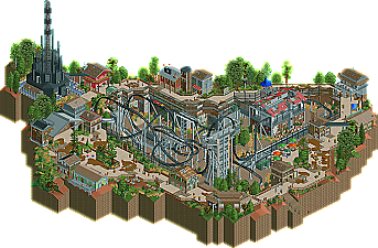
+ Original theme and setting. This design is really a one of a kind!
+ Colour scheme. I loved the colours, bright in a 'realistic' way. Not over-the-top. This really made the atmosphere!
+ The coaster had a fun layout, although some more interaction would be welcome.
+ I really liked the architecture, each building was unique and that's always very important for me. I think they fit the theme too. (Someone said post-apocalyptic, it fits that theme too.
+ This little area was fantastic. The atmosphere is at its peak here, the colours are lovely and there are some fun details. Love it.
+ The stand with the fan. So cool.
+ The use of rocks was great.
+ No lag!
+ Peeps and life!
- This screen also some stuff I like less. The big silver roof didn't work for me and the path textures didn't flow very well... This is still better than no texture change at all though, because the combination of colours and textures really defines the atmosphere here.
- The map edge was too close to the design's content. I'd added a bufferzone of at least 3-5 (preferably much more) tiles around the design to add more context. Blacktiles disrupt the atmosphere... I cut the screen in a way that the blacktiles aren't visible. It enhances the atmosphere while in fact nothing actually changed.
- The flow wasn't as good as it could've been. The buildings were too scattered, I would've connected some of them... A bufferzone would've helped again, landscaping works like glue.
- The coaster's pacing was a bit to ofast perhaps.
Overall an excellent design. If your next park after Dreamport will be of this quality, that might be my one of my most anticipated projects from now on. Congratulations and welcome back!
16/10, 18 if this was a bigger park in the same style.
Nin - Glad you liked the layout and the theme, a post apocalyptic park would be really fun to do. I agree with your point it could connect more, Towards the end I was nit picking to finish the design rather than build every idea I had in my head. I don't regret staggering the buildings like I've done but I just wanted to put something out there with a few aspects of the game I've wanted to try for a while. Glad my newer style has thrown you slightly because I do want to show people I'm progressing with every release.
Posix - Any feedback is awesome. I agree, with every release I put out I always am not impressed by what I see when it's released. I haven't opened spellbrook shore in a few years for that reason and thats why it's taking so long to finish Dreamport. I am a perfectionist but I have come to terms with the fact I am never going to be able to reach it. I will however be more aware about this fact and get around it by having a few testers and more screens of my parks outs and about, I just didn't think that was necessary for such a small design. Thanks for the input, you always push me to do better without realising your doing it.
Liampie - Oh good'o a pro's and cons list! Lol glad you enjoyed what you didand you got from it what I was trying to get across. Do you like the new JK?
Thanks for comments and Project glimpse is on it's way the release prep very soon. A screen is also on it's way even sooner to the guys that took the time to give me amazing crit.
I really like the flow and rapid-fire nature of the layout. It has the right kind of feel to it. The only things I noticed not really liking about it is that it LOVED it's right turns, making left feel very neglected and that the first MCBR couldn't possibly function as such because it was 10 feet LOWER than the loop that succeeds it; i forgive the second one because I decided that its "just a trim break that based on the layout would never be used as an MCBR unless a train valleyed somewhere (the industry term for a coaster stalling out and settling at a low point is valleying). These are both small things though, as the actual ride was awesome, and somehow managed the appearance of being both very aggressive and very graceful and smooth.
The surroundings were also quite extraordinary with my only real complaints being that the entrance and exit buildings for the tower weren't changed to "abstract station" which, being back, blended into the architecture of the surrounding structure (while I loved btw) a good deal better, and the strange paths. The paths themselves that is, the details on the paths, like the signs and the little shops and gardens were composed with such a brilliant use of filled and negative space and such textural awareness that it almost reminded me of Mala or X-sector.
I also loved how the coaster was sat down in a ravine in the middle surrounded by 'park'. Crazy but seemingly natural elevation shifts are some of my absolute favorite things in RCT, especially since I went out west and witnessed so much incredible terrain. And it really adds to both the ride and everything around it. I can imagine walking around a coaster set down like that and it would make for some really cool photo angles and such.
Great stuff, all around. Some little things you can clean up, but really really pushing into incredible work. I wish you luck with your monster solo. Don't let it get you down!
Ride6
RMM Offline
Insanity - I love everything about Gerstlauer so there will be another model from me in my third solo. You should still make one however, just because someones done it before doesn't mean it can't be improved on. Thanks for your comment.
Ride6 - Firstly thanks a lot for such a detailed reply, it's greatly appreciated. I love the look of sky rocket at Kennywood and I especially like the look of the supports. If I was gonna recreate that ride however I'd use the stand-up coaster track and the mini coaster track as I believe that would be a better representation of a premier ride. The vertical drops and inversions may need something else in there but I can see what you mean.
The MCBR's are the only thing that lets this layout down in my opinion. The original design had only one train so it was impossible for it to make it round the track, I loved the layout too much at this point so I decided to add one more car onto the train. To keep the layout going at the right pace unfortunately the first MCBR was higher in speed so it would keep the pace the whole way through the layout. That is a technicality I need to address with future layouts.
Glad you enjoyed all the path work I really did try to put myself in the peeps perspective to address the peep-ability of my park. All little details were added for a reason so I'm glad you picked up on them.
This sunken down ravine seems very popular and I guess this is because I've always viewed Nemesis like this. With Alton Towers always fighting against the height limit in their park this was the option when building Nemesis which is part of the reason I believe it is so well themed.
Thanks again for such a great review, the monster solo will be out and about soon but I don't think it has some of the contemporary things in this design that people will be expecting. I'm kinda unsure how it will be taken now as it's very different from any other large scale release this year.
RMM - Yeah I simply didn't want either entrance to be the other side and spoil the launch, thats the aesthetics in me. As I said above I really need to work on the technicalities of my coaster designs. Thanks for your comment.
RMM Offline
The coaster its self, however, was a bit sub-par IMO. I didn't like how the second dive loop/immlemann was taller than the brake run before it, which obviously wouldn't be realistic to have. I also didn't really like the helix right before the in-line roll, it seemed a bit forced.
All in all though, I really enjoyed this and it was a well deserved design. Congrats man, I can't wait to see more from you.