Park / Cinemagix
-
 20-February 06
- Views 6,035
- Downloads 764
- Fans 0
- Comments 28
-

-
No fans of this park
-
Download Park
764
-
Tags
Similar Parks
-
Mossflower Wood
-
Isole Calabria
-
Age of Sail
-
Moonlight Magic
-
Disney Extreme Orlando
-
Harakiri's Islands of Adventure
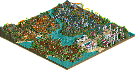
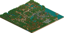
Cinemagix by Six Frags
A parkmaker that many feel has been shafted several times here at New Element. From his placing in the first Pro Tour with his unique "The 10th Kingdom" entry, to the drama surrounding the release of his solo park "League of Extraordinary Gentleman". Well all prior history have been placed aside and I've actually anticipated Six Frags' entry almost as much as anyone else in the contest, due to the fun, one of a kind atmosphere all of his parks seem to have. Unfortunately, again Six Frags will have to settle for less then stellar. In what in my opinion is probably his worst showing at New Element, it seems like this park was just not the primary focus of his attention. It's missing all the fun stuff that made Six Frags parks so interesting, the against the grain larger-than-life architecture, the daring use of colors (for better or worse), and the ability to convey an area just as good as almost anyone (see LXG). Instead, we were treated to a very generic, movie-themed park, something we've seen countless times, and something we've seen done much better honestly. It starts off with a beautiful entrance area in Neverland that got my hopes up, but the other three areas dropped those hopes even quicker. The futuristic area wasn't bad, but it wasn't great either. Pretty run of the mill futuristic architecture (almost a second-rate "Arch Angel" if you will) mixed with an average coaster named "Judge Dredd", that aside from the name...has absolutely no theming to the movie. This was a problem with all the coasters, with slight theming done to "Desperado" the mine train, but not much. It hits it's lowest point with the Austin-Powers 'themed' coaster that meanders quite boringly through the lifeless art-deco area, which I would have expected to be an awesome area from Frags. All in all one of the most disappointing entries in my opinion, but hopefully I'm right and his attention was focused elsewhere, perhaps a major solo release? Still, thanks to Frags for getting an entry in two years in a row...and if I am right and a larger project is on the way, all of us at NE will be holding our breath till then.
Seems like Kumba and I were/are in the same boat, although I was hoping for a higher placing than this... The other entries must be awesome!
Cinemagix wasn't really meant to be a recreation of the movies, more of an inspiration to build this park.. Ah well, I had fun building this and I know contests aren't really my thing or the bench must be huge
Anywayz, I hope all these people that don't like this WILL enjoy my solo that's almost ready!
SF
All together, I thought it was a really good park and I enjoyed looking through it a lot. I think that you could have better left the art deco area out, cause that would have given you some more space to work the other areas out. None the less, it's a step upward in quality from number 13.
I really enjoyed the entrance area, you made two completely contrasting colours (orange and green), work together pretty well, and the architecture in this area was near perfection, although it did not convey its theme too well. I think thats the problem with this park, it has pretty architecture and some good landscaping/foilage, but there are no clear themes. Overall its an average entry, well done on getting something in!
I am looking forward to your solo, i remember you once showing me an entrance screen of it and it does look fantastic. And from what i have been hearing, it sounds great, so good luck with that!
-X-
Disapointing... now I know why iris was cracking up the other day when I told him I think SF and Old Red could slip into the top 5...
I think from now on we will be getting into the parks that really tried. It is pretty clear that up to this point no entry has tried hard at all.
If I judged:
12. Six Frags
13. Old Red
14. Me
So good work judges.
The architecture in the park was definately the strong point with by far the best architecture I've seen from you SF. Especially in the neverland area. Even though this area did not necesarily reflect the theme, the parkmaking skill was there. I think changing the music to fantasy would have helped so much in this case, jurassic didn't work IMO. The Mexico area was kinda cool, the mine train was good enough. The future area was good, but I totally agree with Iris that it is like a not-so-good archangel. The Judge Dred coaster was definately the best coaster layout I've seen from you, pretty much flawless and flowed beautifully, it's just a shame you went uber realistic with it and hardly themed it all. The supports needed footers too. The art deco area was the worst for me. The Austin Powers coaster was average at best with little theming to keep me gripped and an agonisingly slow layout. Also, calling an area "art deco" just doesn't cut it IMO.
That aside, judging from what I saw in Neverland, i think your solo is going to absolutely immense and I can't wait for it. So in some ways, fantastic work, in some ways, I wish you had put more effort in. Either way, congratulations on getting and entry in, and proving that you do have the skills to create a masterpiece.
Metro
I see, if we disagreed with you we would be wrong
As for the park, I really thought the fatal flaw was if your going to use movies to define your areas, they had better represent the movie you're using. To me it caused the whole concept to break down. That and the fact that just about everything about the 'Art Deco' area was a let down. I was disappointed with the park because I really liked '10th Kingdom' and thought it was severely under ranked in the last PT. I guess my expectations will be reserved for this impending solo release!
X- I agree about the no-clear themes.. Maybe I shouldn't have picked those movies as themes, but some other themes that I could actually put more theming ideas in.. Guess it's too late now.. And about that screen I showed you a while ago, it is from this solo, although the entrance is a bit more refined now..
Kumba- Trees count, see Red's entry
Metro- Thanks, I tried to get my architecture up, as it was one of my weak points in my last PT entry.. I think there just wasn't enough in this one to really be able to compete.. I completely agree with you review though, it hits the nail on its head..
Toon- Yeah, I shouldn't have picked the movie themes, guess I'm not really good at them as the 10th Kingdom also was about a movie.. Lucky enough for me my solo isn't about a movie
Thanks for the replies so far..
SF
Edited by Six Frags, 20 February 2006 - 11:18 AM.
If HandyAndyG judged:
Kumba 12
Old Red 13
Six Frags 14
Maybe that's just my opinion. I really liked Kumba's entry best.
Edited by HandyAndyG, 20 February 2006 - 01:00 PM.
That said, the coasters were very good, I thought.
If I was a judge...
14. Memory Lane - Kumba
13. Rugged Range - Old Red
12. Cinemagix - SF
Xcoaster Offline
So so far we have:
14. Memory Lane (Sounds like an address)- Seriously lacking in size, but with lots of depth.
13. Rugged Range: The Last Ride - Strongest point is the landscaping, but the rest isn't noteworthy, except for a few spots, such as the observation tower.
12. Cinemagix - Very well rounded in all respects, but not much stands out.
And I think I agree with the judges ranking, mostly because I feel the size of Memory Lane seriously hampers it, but if it had filled significantly more of the map I might've put it above Rugged Range. But I was pretty impressed with Cinemagix. At this rate I wouldn't be too surprised if my park showed up soon, though I hope it makes it to the top 10.
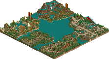
EDIT: Oh, and what was the thing in the middle of the lake? Bloated shark, or some kind of submarine?
Edited by Xcoaster, 20 February 2006 - 01:35 PM.
Yeah I think you can definitely do better than this. But fundamentally I think there are just some bad choices here. Like Iris said, disappointing.
On the plus side, I like the layout for Desperado. It seems like a really fun ride. The architecture is well done, if a little uninspired in spots.
I'm really looking forward to your solo.
Updated stats:
The Art Deco Area, dat pad vond ik erg mooi gemaakt, maar die achtbaan was een beetje sloom, en die supports een beeetje massief.The theming remeberered me of your StPetersburgAmusements. And I really liked the houses, but the coaster was just seperated. But I don't understand one bit of this matched to AustinPowers (The movie
The Future area, well, all I can pretty much say is some amazing texture use you had there, but why make them all grey? The coaster had nice supports, but in the loops/corkscrew it was very slow. It was a bit grey, but I pretty much liked this.
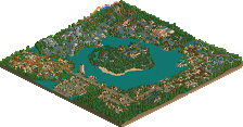
The Mexico area again had nice buildings, but it was again seperated form the coaster. At least the coaster had great landscaping, and up[ to no slow points. Its station was a bit, too much in the open air. But I liked it.
Als je die achtbaantjes nou wat beter had gedaan had dat denk ik een groot verschil uitgemaakt!
A big step upwards from the prevoiusly parks, and hoping that the step upwards continues with number eleven! Dunno about the other parks but I probably would rank this higher.
Edited by Akasha, 20 February 2006 - 02:07 PM.
Excellent park.
High Points-
-Great architecture all around.
-VERY nice color selections.
-Desperado had a kickass layout.
Low Points-
-Naming of stalls/rides/etc.
-Other two coasters.
Am I the only one who thinks Jazz is doing better than we thought?
Corkscrewed Offline
I hope you don't feel down or anything by the "low" placing and whatnot. The thing is that "nice" or "average" at NE still kicks ass at any other place. In a contest like the PT2, you need something a little extra. An intangible. A spirited construction. Going with a technically general theme won't be too impressive unless it's got godly theming, which in this case (no offense intended), it wasn't. The theming was "merely" great.
However, it's not a bad entry by any means and a huge step up from Old Red's entry (which I would have ranked last, having looked at it now). It's definitely a solid tier and a half better than Kumba's as well.
Yeah, thanks Steve.. I myself am suprised I've gotten this far.. but my entry is definitely my best work to date. Hopefully it will be able to get into the top 10 if I'm lucky.
Anyways...
I actually enjoyed this park. As people have already said, Desperado had an excellent layout. Also, the entrance archy was great.
But, the other two areas weren't nearly as good as Mexico and the entrance. But overall, it is still a large improvement from #13.
Nice job.
~Jazz~
Edited by Jazz, 20 February 2006 - 03:53 PM.
The peter pan influenced area was good, not top notch but it was a good theme. I thought you could of expanded on the idea, obviously the typical pirate ship could of been done to bring the theme home with maybe an invisable ride flying round the area representing peter pan. Just the little things that add character would of boosted the area.
This is why i liked Kumba's entry so much, because it had new fresh idea's and it was more than just a theme, it involved you.
Then the art deco area. I liked it but then i did'nt. Again it was'nt really there. I was expecting quotes on signs with "groovy colours" maybe even dr evils seceret lair. haha. Also a union jack woulda been great. The coaster i did'nt like, the colours were different and they somehow worked but the supports put a major downer of the ride. The music also made it seem very unrealistic, it was different so i applaud you for that but it sounded like something out of sim city or holiday island.
Now the futuristic area was great, i loved the coaster alot. But again the supports did'nt do anything for it. The archy was to a good standard and the go-karts looked great. Good area, nothing majorly wrong with it but pulled off well.
The mexican area was also a very good area, the highlight is the coaster. It was excellent and the landscape made it top notch. The colours were great and added to the atmosphere. I was expecting more of a claustrophobic artmosphere with some of the buildings to set the scene of the movie but as you said it was a brief guideline.
I really enjoyed looking at it, and i properly will look at it again and again. While the movies were'nt pulled of well, it was a great idea, the bottom entrys seemed to of been ideas that could of been winners, but not pulled off to the quality we will be seeing soon.
Brilliant entry i am extremley excited about your solo from seeing your entry and what others have been saying.
Cinemagix looks beautiful and as a result I have a hard time understanding why I can't look at it for very long. But I guess beauty is only skin deep and that's really the case here. There's nothing underneith most of it so it just comes off as hollow. The "future" area was very nice though, really like that coaster for it's kill support job and the colors there generally enhansed things enough. The Mexician and Neverland areas were both very pretty but complete fail to bring to mind their themes. The Art Deco bit just completely misses the boat for me. I guess that's all I can say...
My current order doesn't agree at all with the order of release btw. lol:
14) Rugged Range- Old Red
13) Cinemagix- Six Frags
12) Memory Lane- Kumba
So far...
ride6
Turtle- Thanks, I rebuild some coasters several times to get them right.. Seeing some other replies, I guess the AustinPowers coaster could've been better in terms of pacing..
Coasterforce- I see where you're coming from with the bare coasters... I kinda wanted that realistic touch on the coasters, meaning seperated with custom supports, but looking back that was killing for a park in a competition like this (also see Posix' low placing last year)
XCoaster- I'm glad you like the architecture, it was a point I worked pretty hard on.. Also on the coasters.. Guess that failed with the AustinPowers coaster.. Oh, and the thing in the middle of the lake was meant to be a shark
CBass- Yeah, it were defenitely some bad choices, and I probably wanted to build too fast on it too.. therefore lost details and the dreaded 'WOW' factor, that a competing park must seem to have.. Hope to not disappoint you with my solo..
Akasha- Well, the link from the art-deco area with the AustinPowers coaster is that the movie is set in that era... I also tried to get the 'art-deco feel' with the colors and architecture forms.. The futuristic area is grey, because I imagine the future to be grey-ish.. I don't know about the coaster being too slow though.. I think the speed is ok on that one (in contrast to AustinPowers)..
Steve- What naming did you find bad than? I admit though it's nowhere near the quality of names you put into your parks
Oh, and Jazz did surprise, but on the other side he is kinda good at contests as he won some over at rct2.com..
Cork- I think my main problem was I build too fast in order to put that extra in you speak of.. I'll try harder next PT
Jazz- Thanks, and good luck with your best work to date.. Hope you make it to the top 10..
J K- I thought the urban theme music was kinda groovy, so that's why I picked it for the AustinPowers coaster.. I agree it's not the best of all rct-songs though..
Thanks for the review, and good job on getting the 'guideline' idea of the movies! Seems like you're one of the few..
ride6- I see your point with the hollow thing.. Maybe that's because I didn't recreate those movies.. Ah well, guess I'll put more dedication in next time.
Thanks for the replies once again guys!
SF
Edited by Six Frags, 20 February 2006 - 06:26 PM.