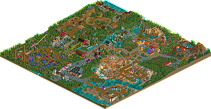
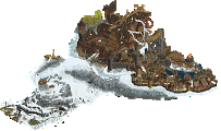
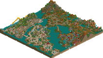
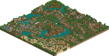
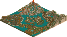
Park / Cyder Hill Theme Park
-
 13-May 11
- Views 8,584
- Downloads 1,452
- Fans 1
- Comments 25
-
-
 65.38%(required: 60%) Silver
Kumba 80% Louis! 80% BelgianGuy 70% Milo 70% turbin3 70% Casimir 65% inVersed 65% Levis 65% Maverix 65% 5dave 60% CedarPoint6 60% Liampie 60% Metropole 60% prodigy 60% Steve 60% 65.38% -
1 fan Fans of this park
-
Full-Size Map
-
Download Park
1,452
-
Objects
530
-
Tags
Similar Parks
-
Giari Palms Theme Park
-
Disastrous Paradise
-
Gladsheim
-
Ports of Magia
-
Disney's Forgotten Kingdom
-
Audrix Towers
First of all grats on finishing because that's always worth a pad on the back imo,
I really liked the park for what is was and I think your set of themes are pretty good here but as someone stated above not truely original but still executed well.
Ok I'd like to point out some stuff on some of the coasters!
I really liked the line-up you had here but some things struck me odd as I though they could've been done better.
First the invert, wich was pretty decent but I think the Cobra looked weird the way it does with the straight track piece in center makes it looks ill proportioned in a way if you get me, and the brakerun was way too short for any type of realistic based layout. I think if you made a hop over the brake-run or anything like a helix after the corks to get a more flowing end and a better brake-run this coaster would've been better in a way. I did like the way it interacted with its surroundings though, good point for that.
The spinner was a very cool idea and I liked the way it was different but the station looked unfinished and rushed in a sense because it looks like you planned a roof and forgot to add one..., also a family oriented ride should be coloured differently imo, make it bright, this was still in the fairytale forest area and you gave it drab colours wich doesn't really inspire much magic, try to think of things like these, they matter greatly I think.
The intamin accel was cool but the theming looked a bit bulky in comparison to the actual coaster so the scale looked a little off but no biggie...
Loved the woodie, nothing more to say about that coaster except that I missed some path interaction with the first drop where you actually could've done so easyly.
Aquatrax was a cool idea but lacked in execution for me, theming was too little/too few and underdetailed for a ride that basically relies on very heavy theming. a missed opportunity, for instance look at bayon falls and look how intensely that thing is themed, this aquatrax barely scraped the surface for me.
Supersplash could've done with a longer splash zone, it looks WAY too short in comparison with the drop, again scale is hard but you need to look out for it. also the station of the supersplash(not the watercoaster in case you're wondering) looked underdetailed and rushed. get more immersive into you themes.
The Flyer! I expected a lot of this ride and was dissappointed a little to be honest, the pretzel was poorly shaped, look at Salga, Alien, Chimei, because those have I know a lot of hacks in those loops but they look way smoother, again a missed opportunity. also the theming ideas where nice but could've done with some more detail...
One thing this park did shine at was foliage and landscape, this is your forte and it seems it came natural while building, thats always good when something looks natural...
One negative point was the backs of the buildings, unthemed is good if you're building them at the edge of the map but not in the centre of a park where on rides and stuff they're visible, I mean even if was just a window and a trashcan, I mean give us something, these things make the difference between a silver and a high gold/spotlight... a few things to keep in mind perhaps.
Hopefully you'll get better with your next park because this sure looked promising.
greets BG
Anyways, the park.
Generally, a very promising park. It had a few stand out features, but they were too few and far between for me. I'll go by coaster:
Barn Storm: For me, the pacing was off here. I felt it was too fast over nearly every element. I think the launch speed should have been reduced a tad here. I like the barn station idea, though it was perhaps a bit too big?
Night Invader: The bit after the pretzel going under the station, then coming out the other side and twisting round that tower was one of the stand out moments of the park for me. I wish you did a bit more like that with your coasters...more on that later. The actual layout was mostly strong, though I didn't really like the ending with the half loop into inline twist, I think I would have preferred it just ended on the loop into the brakes. Also, besides that awesome moment I mentioned, there wasn't much else to excite me with the theming of the coaster. I would have loved to see a bit more path and queue interaction with the coaster, as flyers are prime coasters for spectator viewing. I liked the tiered market with stalls in the area. I felt a bit more detail would have helped here, but it gave off a great atmosphere.
Fairy Flight: This was a big miss for me. Brakes before the first three inversions? That makes me sad. I also didn't like the inline twist directly into double corkscrew, I would have liked you to fit a turnaround or helix between those somewhere. Also, on the theme, however well you do it, I don't think a B&M invert can aptly represent a fairy flight in any way. I thought it was a poor choice in this regard.
Bumblebee: Now this is more the kind of coaster I would want to see in this area. I much more delicate looking coaster, appropriate for the theme. It was nice enough, but a bit more theming would have been fitting.
Mt Gambier: A very nice woodie, but it just had no stand out moments to make it memorable. It served it's purpose though.
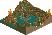
Eruption: This was cool. The volcano was well executed with solid landscaping throughout the area. I would have much much preferred it if you didn't have those buildings between the turnaround over the pond and the path though. I would have made much more of a feature of the turnaround with great viewpoints for guests. Especially since those buildings just served no purpose whatsoever.
Sun God: It was ok. Kinda uninspired, not much to look at. I thought the queue line was too long considering it was just a kiddie ride, though your guests suggested otherwise.
Other notes for improvement:
I didn't like the island with the Burning Bazaar on it. It just seemed too detatched from the rest of the park, with guests having no real reason to go there. I would have definately linked it to the rest of the area so guests wouldn't have to make such a detour to get there. Also, i don't like the name "Burning Bazaar". How can a top spin represent a trading area on fire?
Architecture: For me, this was varied. I loved the architecture in the entrance area, and the buildings that were supposed to represent something were so much better than the rest. On the other hand there was too much filler arhictecture that didn't seem to serve a purpose, and they reeked of lack of inspiration. I would also encourage you to try a few different shapes with your architecture to get some angles and heigh variation within a building, you seemed to stick with block shapes which limits the scope of creativity somewhat.
Foliage: I wasn't fan of the overuse of flowers in non-ornamental ways. In some areas, I wasn't sure why there would be brightly coloured flowers growing there.
Theming: Your park was obviously designed to be heavily themed with distinct areas all with different themes. With this, you succeeded, but seemed to run out of ideas when theming the actual coasters. Generally, your coasters followed a pattern of having a station, with the coaster just going over some grass/dirt/trees behind it. There were a few moments where you strayed away from this, and those were the best moments. With this style park, I would have liked to have seen more path interaction and development of your theme around the coasters.
Overall, contratulations on the silver. You certainly have the skills to get a higher accolade. Your coaster design was strong and you representation of the themes was very good indeed. Just go that bit further into thinking how you can makes you coasters a bit more interesting, and makes sure your architecture all serves a purpose rather than to just exist. I see good things from you, so keep it up!
Thanks for the feedback guys, appreciate it!