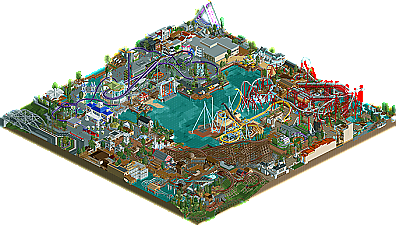
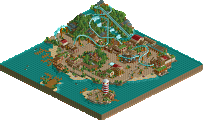
Park / Busch Gardens North America (2010)
-
 09-September 11
- Views 11,983
- Downloads 1,463
- Fans 3
- Comments 21
-

-
 75.00%(required: 70%) Gold
nin 90% SSSammy 90% Maverix 85% prodigy 85% Kumba 75% turbin3 75% tyandor 75% wheres_walto 75% BelgianGuy 70% CedarPoint6 70% JDP 70% Liampie 70% That Guy 70% Levis 65% Metropole 65% 75.00% -
3 fans Fans of this park
-
Full-Size Map
-
Download Park
1,463
-
Objects
509
-
Tags
So that's why many don't call it a fansite anymore but a bunch of nerds that have too much time to play this game.
I thoroughly enjoyed the layouts and was impressed by the many interactions they had with the park. Yet it all felt really cramped together and as though hardly anything had enough air to breathe. I think you should "relax your style" a bit. The more generous you are with space around a coaster, ride, or building, the more it will stand out and attract attention. So especially on a coaster I would say there needs to be a certain belt around it with nothing that wants too much attention. In this case, everything was rivalling with everything and created great disharmony for me. The maximum of this effect was the "big swing" ride tucked away in the corner of the map. Creatively and technically brilliant, but not given any chance to shine. Evoked the impression in me that you were suffering from a too small map. Was that the case?
To bring my point to a one sentence suggestion for your future projects: Think more into the balance of meaningfulness of your park's features, which currently I find is missing.