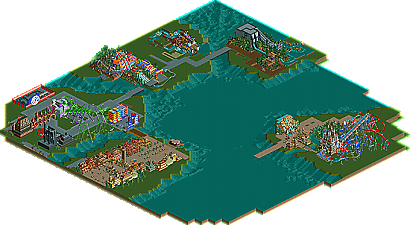
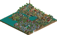
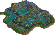
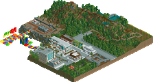
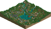
Park / IOA Hollywood
-
 16-September 05
- Views 32,270
- Downloads 580
- Fans 1
- Comments 327
-
1 fan Fans of this park
-
Download Park
580
-
Objects
385
-
Tags
Similar Parks
-
Symphony of Pollution
-
Genus Carcharodon
-
Go Kart Chaos
-
Märchen Paradies
-
Project Dinosaur
-
Disney Dreams
Still, I love the supports and launch tube, they're just about perfect and the colors are working nice. Convincing theming too.
best screen yet, imho. Really nice stuff.
I like the idea that you enter under the launch, and I like the placement of everything. Unfortunately for you, that statue is hideous, and those path fences aren't helping. Play around with them a bit?
If you want to use that fence and make it look exceptible you have to put down a 1 base-block height wall of a similar color and texture to the fencing and put the fencing on top. In this case I would suggest the corrugated steel in grey. I would also suggest that when you incorporate flowers that you have the fence go "behind" them in relation to the pathing because the "wall" part of the fence will otherwise block out most of the flowers from view from the peeps persective.
Ride6
-JDP
Nice screen. great use of blocks.
You should show some of the actual ride
Edited by Ruiz, 13 April 2006 - 03:55 PM.
MORE MORE MORE PLZ
Anyway that looks fantastic but it seems like a lot you your more conceptual stuff does.
Ride6
Edited by yeshli2nuts, 13 April 2006 - 10:31 PM.
I think that it would be better if both queues were covered in a big building like Dr. Doom's Fear Fall. I also think you should zero-clearance the blocks on the logo all the way down on to the path.
Looks pretty good.
Edited by postit, 13 April 2006 - 11:40 PM.
Seconded. I'd reconsider those names, because they just sound strange imo. Even something more simple like "The Punisher", with "Tower 1" & "Tower 2" would be better and would work well with the 3 signs you have in place. You could also do some research on the comic itself and try to find some names more relevant to that....I dunno.
Name aside, its really good though. I love the symmetry of the entire ride. I also like the outdoorsy feel to the queues and how they go indoors just before the ride. Nice stuff. The foliage is ok, but could be better imo. I think some darker trees would be more fitting....
Still though, this park just gets better and better.
I'm not so sure whether guests would be able to see the punisher sign at the very top easily, perhaps a sign elsewhere?
Don't like the arches on that building on the left with fire coming out of them. Think you should just get rid of them altogether, they don't add anything to the screen.
I think i agree with Toon as well
Love the skull though
Metro