Park / [H2H6] R1 - Heaven's Kitchen - The Atlantean Ark
-
 14-May 12
-
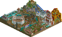
The Atlantean Ark
- Views 51,295
- Downloads 1,295
- Fans 0
- Comments 275
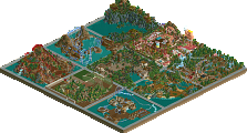
![Park_2373 [H2H6] R1 - Heaven's Kitchen - The Atlantean Ark](https://www.nedesigns.com/uploads/parks/2373/aerialm2126.png)
-
 69.50%(required: 60%) Silver
RWE 80% chorkiel 75% Ling 75% Poke 75% bigshootergill 70% G Force 70% Scoop 70% Camcorder22 65% Cocoa 65% robbie92 65% Sulakke 65% posix 60% 69.50% -
No fans of this park
-
Full-Size Map
-
Download Park
1,295
-
Objects
336
-
Tags
Similar Parks
-
Fusion Survivor 2 - Ultimate Tribe
-
Roman Vice
-
Internet City
-
[H2H8 R3] Forum Caeleste
![park_4114 [H2H8 R3] Forum Caeleste](https://www.nedesigns.com/uploads/parks/4114/aerialt3853.png)
-
[MM2014 R1] 7 Little Sins
![park_3140 [MM2014 R1] 7 Little Sins](https://www.nedesigns.com/uploads/parks/3140/aerialt2704.png)
-
Basics Of My Brain
Some parts of it I loved, and some parts I wasn't so keen on, but as a whole I think it worked. From the overview, I thought I would love the castle, but up close it was just a bit too confusing, a bit too full on. The texture didn't help, I don't think it works very well. The coaster was good, not quite epic, though. But good job getting a coaster into the theme that didn't stick out in a bad way. Some of the support work left me wondering why you did it the way you did, but as a whole it worked. Some good ideas throughout.
I really want to see the file you wanted to submit, because one thing that put me off the park was the rides and staff with no names... I wanted a little bit of detail and explanation in places.
I loved the windmill area, and the graveyard was bloody excellent, as was the waterfall and landscaping over that side of the park. And you did a really good job at having the castle looming over everything in a big way.
As for our park, i'm sad it lost by so much, as I think it was a lot closer than the vote suggests. Looking back on it, I think it maybe lacks vision, as far as individual buildings goes. That's always a hard thing to do, especially when the buildings are this big and imposing. I loved some parts of it, the observatory, university building and lighthouse are excellent, as well as the statues. The colours aren't what i'd have chosen throughout, but I think that's just where personal preference differs.
I still don't think i've ever seen a truly brilliant Atlantis theme.
I'm really looking forward to seeing what you've got for the rest of the contest, Dogs. I know Cena was probably working fucking hard on a week 1 park to beat Liam before that whole mix up, can't wait to see what it is!
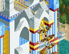
Atlantean Ark
The good;
Awesome statues! I would imagine it'll be an impressive entrance to the park.
Nice looking building, love the texture and color choices here and the waterfall is a nice touch.
Nice architecture. Again, love the color and texture choices and the building has good variation in forms.. Nice detail with the cog-wheel too.
Just a nice quaint place in this hectic park. Love the foliage there and the building is simple, yet effective.
The bad;
I didn't like the large pillar lines throughout the park. It takes away some views, look aesthetically unappealing and the color choices don't work. Since it's such a large part of the park it really dragged the quality of the park down.
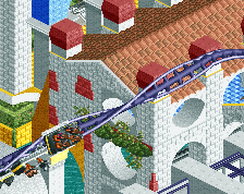
The overall structure looks too bulky and the floating coaster track isn't helping much either.. Also all the white is killing any atmosphere that could've been there. The plain textures used are not looking that hot too.
Looks way too messy. Also, I don't like that the coaster doesn't have custom supports.
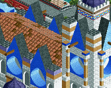
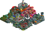
Frankenstein
(I'm doing the color version as I think it looks better and I can review it better that way)
The good;
Lovely object, and adds soooo much to the atmosphere!
Love this little cemetery. Just nice details, foliage and the worn down path is well done.
Love this little church. Nice architecture forms, texture usage and object choices.
Nice to know people living in this haunted village still do some laundry
Just a nice plaza/town square. Love the well as well.
Lovely windmill. Nice touch with the horse next to it!
Overall the castle looks impressive. Up close not so much.
Love the worn-down-ness of the building.
The bad;
Just ugly supporting on the coaster. Also dislike the topspin in the background. Just doesn't fit there and takes away from the atmosphere.
What is it? Meat grinder? I just think it looks weird and also dislike the foliage and terraforming there. Too many jagged edges.
Unfinished?
Now you're making it look like it's kind of a place to visit, but all other things in this park don't exactly add to that. It just doesn't fit there at all and looks aesthetically unappealing.
Overall, Frankenstein looked a bit better. At first you're blown away by the black and white water palette in Frankenstein, but when more closely looking into the park, I saw too many things that looked not so good. Atlantean Ark on the other hand, looked initially like one big mess, but after looking more closely into it I found things I really liked and almost got it to same level as Frankenstein. In the end the village part and overall idea won it for me for Frankenstein.
Good job both teams!
FK
We built mostly in normal color mode...switching back and forth (at least I did) to make sure that things worked properly in both.
Unfortunately, much of the concept itself was lost because without the 'read-me', most of you didn't quite get what was really going on. When you spend this much time creating something...you get involved and just kind of assume that everyone will see what you see as you're creating it.
Since we had to rush this...even with the extension...I'm gonna touch a few things up before I release a REAL "final version" of this. The voting is over, so I'd like to have the true representation of what we built be the final "copy" here.
That's why everyone that has asked for it has yet to get it.
3:06
Looking forward to your final version, K0NG!
(ps, I might have missed it in the time I was away, but did you also release that finals park from last H2H you had to forfeit because you thought it wasn't up to your standard? I remember you said back then you would release it after H2H5. Just wondering)
Over last year we have;
His deathmatch and tsunami. This one will probably also never be finished.
Also, in before kong stating that he willactually finish it followed by him not responding to this topic anymore.
Frankenstein was impressive, but it felt like i'd seen it all before, and instead of everything being too brown, it was all too black and white
Atlantean Ark was structurally incredible. But the colours and coaster layouts really let you down. Had you put in decent layouts and perhaps made the colours more aesthetically pleasing you would have gotten my vote easily. I think you were brave to experiment with colours and it was a brilliant contrast to your rival park, its a shame the match up wasn't closer, I think it should have been, but nevermind, I still think you'll do well in this contest.
Yeah...well, I'm a little bit busy ATM (not only am I actually IN H2H6, I captain a team) to be overly concerned with replying to every post that disses me for one reason or another.
As far as my "Deathmatch" project...I stopped building on that when the RRP Design contest came up. The design that came from that contest (Raging Bull) along with Tsunami are on hold (at appx 98%) until H2H6 is finished. And, Frankenstein has very little to "touch up"...so, it'll also be re-released right after H2H6 is finished (if not before).
BTW Chorkles....when is your next project going to be released? Or so you even play the game?
3:06
I'm not dissing your work. (not tryna diss anyone actually). I just hate to see all your great work unreleased. I know H2H is keeping you busy atm and you are not easily satisfied with your work. I'd rather see you spend your time at running your team in H2H well than finishing designs that you can finish after H2H. I just hope you actually will finish it.
BTW, I barely build and usually when I start on a project I'll get unhappy with it before I've build anything substantial. I can't say whenever I'll actually release anything again, I don't wanna send out shit work anymore, but I gotta say that h2h is quite inspirational.
btbtw, does that mean we won't ever see the finished product of your deathmatch because I was kinda looking forward to that park with the screens you posted and even more after seeing the movie.
capture "Idiocracy" properly in that short amount of time. So...I changed gears and built something completely different:
An industrial themed diver that's also become a 'design' project now. This one's not real high on my priority list ATM though.
As for "Idiocracy"...it's going to be a full scale solo now. I have NO idea when I'll get back to it though... but, it was a blast to build so I don't think it's too far in the future (most likely right after I finish Tsunami).
3:06
Airtime Offline
Also this was quite a good topic in the end. Honestly Kong I gained a lot of respect for you from quite a few good posts in here, normally there sometimes annoying but I'm seeing them in a different light recently were I greatly respect your words.
As for the match...
The Atlantean Ark was not for me. I'm sorry guys. There was some great structures in there but I found the colours a bit too in my face. I'm also not a fan of buildings, coasters and that on top of each where I struggle to see everything. The amount and quality in there is impressive for round one though. The statues at the entrance are brilliant. I also really love this building in the screen that SF showed, Liam's?
I think if this happened maybe 2 or 3 H2Hs ago it would done a lot better.
Frankenstein. When I first opened it I thought "fucking hell, I can't view this in black and white." So I had to change the water pallete back. Great idea don't get me wrong but it makes viewing impossible for me. It took a way a lot from my vote because I had to change it. Maybe you should of released two versions, one with black and white and one colour? I quite liked the coaster. I loved the supports on the far turnarounds, I've always loved that coaster track being used like that, great job. The castle or mansion/whatever was impressive but a little repetive and I feel like I've seen it before. The coaster moving around behind a glass wall was a great touch, I can't exactly remember what it was though. I thought the top spin was pretty random same for the monorail stacked wall near it. The village was good but I thought the burger place didn't fit with the dark atmosphere, an attempt at slight humour? Kong I loved to see you vary your game up a little bit more as well.
Frankenstein – I really enjoyed the park. The black and white theme really helped pull the concept together and was a unique aspect which worked in this case (even if it was a bit difficult to see). I really liked “The Monster” and its interaction along with the village and landscaping work. This is classic work by k0ng and now that I have had the pleasure of working with BG, I can see his influence in this as well. Well done guys. I would rate this as 9.00 on a scale of 1-10.
The Atlantean Ark – I’m sorry to say that this is not the style I prefer. Although I can appreciate the effort that went into this with the structures, it just missed with me. That’s not to say its not good, I just didn’t understand it all that well. Sorry. I would rate this as 7.0 on a scale of 1-10.
James