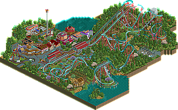
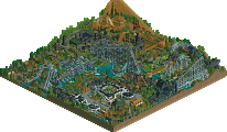
Park / Mamba vs. Taipan
-
 18-June 12
- Views 2,619
- Downloads 495
- Fans 0
- Comments 10
-
 63.08%(required: 65%)
Design Submission
63.08%(required: 65%)
Design Submission
inVersed 75% Airtime 70% CedarPoint6 70% Maverix 70% Casimir 65% Liampie 65% turbin3 65% tyandor 65% wheres_walto 65% BelgianGuy 60% posix 60% Phatage 55% prodigy 55% Roomie 55% That Guy 55% 63.08% -
No fans of this park
-
Download Park
495
-
Objects
322
-
Tags
Similar Parks
-
[H2H8 R2] Feira do Flamengo
![park_4090 [H2H8 R2] Feira do Flamengo](https://www.nedesigns.com/uploads/parks/4090/aerialt3829.png)
-
Discovery Bay
-
Busch Gardens Sydney
-
Papilio Valley
-
Rift Valley
-
Les Trois Mousquetaires
You're very talented. Props for going for something as difficult as duellers. Liked the colour schemes you chose and those trees are obviously cool as people replied in the topic for this. The custom music created a very good vibe. Refreshing to see something like this. What you had outside the coaster I thought was too colourful, directionless and too close together. I only really liked the orchard which was picturesque. For your next project please focus on more cohesion and back-logic in what you create.
Still, you have a strong belief in your style and I like that. Hoping for more from you soon.
All in all, I feel the design is the strong point, and that's a huge plus. I think perhaps the score was a tad high (your transfer track might need some more storage... also, the canvas things on the queue appear to be missing some deco?), but this does deserve a solid 60 in my opinion, and that's head-and-shoulders above most of the stuff we've seen recently. Really good work.
pros:
-I loved the attention to detail on all of the technical things, like the watertower, power plant, etc.
-foliage was wonderful, but most importantly, unique, and really made the design feel warm and encompassing.
-the general atmosphere was awesome, and really captured the sort of pure 'fun' feel that rct has just on its own without sacrificing any modern 'ne style'.
-great layout, and certainly unique without any inversions. that was a risk that I guess didn't pay off in the end :/
-great supporting rides, especially the carousel and frisbee
-coaster station was good
cons:
-some of the architecture was a bit awkward, as in not realisticly shaped or just weird looking. like the tgi fridays and the cinema.
-a bit too colorful and all over the place. (gasp!) I think you probably needed a specific theme and 'feel' of colors (e.g. 'mostly warm colors' or 'mixture of bright colors but with a dark brown "base"') to really nail the design. it felt european, but yet, like kumba in places, and that just confused me.
hope that sort of helps, because I really do like what you did here and I'm sure your next effort will nab you a design
RCTER2 Offline
Edit I have found it with google, it's a kind of snack.
Tai-Pan = "Supreme Leader"
I think this was a case of less is more. If you'd taken out a couple of those extra buildings/rides I believe the chance of this winning design would've increased.
The coaster layouts were good enough for it, as was the landscaping/foliage. The direct surroundings of the coaster, like the powerhouse & the orchard, were very enjoyable. The coaster station was simple, but it suited it's purpose and fits with the type of coaster/style. The custom flatride also added to the atmosphere, and had a very nice flow.
However, some of the other stuff just didn't feel right. I liked some of the buildings, like the one's in which the ''Burger hut'' and the ''Supra's seafood'' were located, even though they didn't quite fit the coaster's style. However, other buidlings like the cinema, as well as the standard flats (launch, carrousel) just didn't do it for me. Their color was off, they were randomly placed, they distracted me from the coaster rather than enhanced it.
I think the lesson to be learned is that the power of a good design is that you only add those things that add to the coaster. Your archy level and layout work are definitely good enough for a design, you just need to have a ''better plan'' next time.
Tough luck, but you should easily win design with your next attempt, as long as you take the critique in this topic into account.
I mean, someone who puts this much effort to make something that is genuinely good should get awarded in some way. I know the game is not for getting awards, but I can imagine this being a huge demotivation for SupraSix. At least mention it on the front page somewhere.