Park / World of Creations
-
 25-July 12
- Views 12,626
- Downloads 980
- Fans 0
- Comments 46
-

-
 55.00%(required: 50%) Bronze
In:Cities 85% Loopy 70% Camcorder22 60% Fizzix 60% 5dave 55% CedarPoint6 55% Coupon 55% disneylhand 55% Pacificoaster 55% pierrot 55% Jonny93 50% Phatage 50% wheres_walto 50% Maverix 45% posix 45% 55.00% -
No fans of this park
-
Full-Size Map
-
Download Park
980
-
Objects
532
-
Tags
Similar Parks
-
Faastopia - World Showcase
-
Watkins Woods Amusement Park
-
Kukulkan
-
Happy Valley Hangzhou
-
LLawbreakers - Astroworld
-
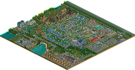
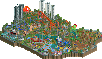
[H2H8 R2] Tubiao Action Park
![park_4091 [H2H8 R2] Tubiao Action Park](https://www.nedesigns.com/uploads/parks/4091/aerialt3830.png)
The foliage was less than amazing. Again, the actual ride layouts weren't the strongest either. However, I thought this park was definitely deserving of a bronze, maybe even low silver.
- Didn’t like the TT car objects in the parking lot.
- Layout for the Evolution has some good ideas, but overall was too awkward. You want to use elements functionally, eg a dive loop if you’re changing direction 90 degrees, 540 helix if you need to turn 180 degrees, etc. The turn after the double heartline roll and the turn into the 540 helix go against that and make the layout look awkward. The huge spiraling helix after the brake run and long straight section on the interlocking corkscrews detracted from the layout for me too. The interaction with the air powered is a good idea, but it just clashes because of the colors.
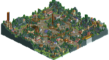
- Loved the SLC despite an unconventional layout due to the interaction with paths, water, etc. The whole Spanish area was beautifully done, if not completely obvious what the theme was at first.
- Loved the castles as well, the wooden coaster was not terrible, but unmemorable and just kind of meandering. The garden in front of the coaster was a great touch.
- Not sure the idea behind the “Woody Corner” the architecture was kind of lacking, but the foliage and general atmosphere made up for that.
- You probably would’ve been better off without the area with the shuttle loop as the ride wasn’t particularly interesting and the long straight section of path was undeveloped and wouldn’t be particularly interesting for the guest.
- For the rest of the modern area…there were some brilliant ideas like the glass viewing of the launch, and the fountain underneath the purple glass. However you would’ve been better off sticking to a few core colors on your buildings as there is too much clashing right now. Also, the area is a bit too spread out, as if you made any part of the park that you didn’t know what to do with and called it “modern”.
- The majority of the foliage and landscaping was beautiful, such as the area around the wild mouse, the woody corner, etc. However, there were other parts that just seemed lazy and rushed, such as anywhere with long rows of the same tree type, the huge dense clump of firs near the parking lot, and the hill behind the wooden coaster.
- I’m always a fan of developing the area outside of the park like the apartments, houses, etc, even if it was all a bit too static and lifeless. The industrial park was a particularly unique touch though and I liked the sea containers idea, never seen that done before.
Was originally going to give this a 55% because initially some of the flaws were so striking, but once I got past those I really warmed up to this park and it was obvious that a ton of thought went into the layout, ideas, and atmosphere. Congrats on getting this done, with a bit of refinement I expect your next big release to get at least a gold.
(Gave it a 60%)
I ended up giving this a 45%, I was on the fence about this between 45 and 50 and I think the deciding factor for me was that I didn't enjoy viewing this very much, just not my taste.
-Josh
Another huge thing that I really did not like was the foliage. A lot of it was very repetitive, some of your flower/bush choices were just... hideous looking (not sure why they're even on the workbench), and there was almost no underbrush to any of it... You clearly have 8cars, I would use it to put a little more time into the foliage. The area just outside the park by the woodie was a particular offender, with the trees lining that one roadway on the adjacent side of the map were just boring.
I have to agree that the woodie's station was one of the highlights of the park, although more "fantasy" than specifically medieval. I'd have liked to see more life in the middle ages area. That big black castle was a nice stark contrast, but the rest was just so boring and lifeless. Your structures were underdetailed throughout the park.
As a final note... what was up with the extra track piece on The Evolution, on that first hill after the loop? You even bothered supporting it, but there's no support blocker... just... wtf? The little B&M connectors on that first loop, though, were fantastic. Not sure why you didn't do the same thing on the dive loop immediately following.
The most impressive thing about the park is its scale, but I feel a lot of it has some very poor design choices. For the attention you gave to the parking situation, there doesn't seem to be enough of it for the hotel/shopping district/park all together, and the custom cars were just as bad as the foliage. I would probably have voted similarly to posix, if not a bit lower, simply because the only remarkable thing about this park, in fact the only thing I really liked, was its sheer size.
Review
> Loved how you improved on the path in the Modern Zone, you made different textures, made tunnels, this path gave life to the zone because the textures of the buildings were boring.
> I liked a lot the supports of The Evolution, the layout was nice but the landscape could be better.
> The Dark Zone was the best zone of the park IMO, the castles are so pretty well done, the x factor of the park was the castle witch is the entrance of the woody, the landscape here was boring too but other than that this is the best zone of your park.
> The atmosphere of the streets was dead, was like the time stooped in that zone (not on the park), the structures were so good but you didn't add details enough on the buildings.
> This maybe should be better if you had build an hotel of the park, if you did the hotel, sorry for my ignorance but I'm not remembering if you did or not.
I'd vote on this park 50%, this park shows that you build with fun and it's a good start to you on the accolades! If the landscape here was better and if you had add more details on the buildings, the score would be higher, believe me. Congrats for the first accolade
Also thanks to trav, 5Dave, Jonny93 and geewhzz , (hope i didn't forget anyone) to make this submission ready for release.
Also thanks to all the voters for your honest vote.
@ Fizzix: Thanks , i'm glad you liked it.
@ Pacificoaster : Thanks as well.
@ Camcorder22 : Thanks and also nice you wrote me an extensive review.
@ Maverix : I can only hope you like my next park more, but also thanks.
@ posix : A lot of thanks in a row allready, but thanks.
@ In:Cities, you've really put a smile on my face when i saw your vote. A spotlight?
Wow, i felt honored. I'm glad you've enjoyed it.
I thought my park would have scored a high silver i.m.o.
But i'm happy with the Bronze ,since this is my first accolade.
@ Mika: Thanks, i'm happy with it.
@Wanted: Thanks.
But to be honest, i didn't had much fun anymore when i reached about 75% of completion, it was too big for my motivation, and i'm still struggling a lot on how to use some items ,texture variation and a lot of other stuff, like parkplanning ,pathplanning and creating a real themepark feel . I know i still have a lot to learn. I had a lot of uninspired days ,while i really wanted to complete this and i think that shows by some parts being rushed. my next park is also a lot smaller, so i will stay motivated this time ,to try and show a lot better refined and definately not rushed park.
@ MorganFan : Thanks, i hope you like it.
@ rct2isboss : Everybody has his own taste, but if this really was that bad, then why did it get an accolade?
I'm glad you liked the castle entry from the woody though.
It was a difficult piece of architecture ,since i don't work with examples when i make my castles, they are unique and my own.
@ chorkiel: do you have a comment for me too?
@ ling : Too bad you didn't like it, but you do like my next park, i know.
I've just checked my file, and to be honest ,i don't have a clue how that trackpiece got there, it definately wasn't supposed to be there, maybe an error, since i didn't build it there, my bad i guess.
But thanks for the comments as well
@ BC : Thanks as well, and yes i know i could have been better.
Great thanks for all the comments and tips for my future parks, I know i messed up a lot by starting on the wrong foot and i'm just not there yet , i know i have bits of brilliance ,but also a lot of uninspired and not well thought of ideas. I'll work on everything mentioned above, altough some things i just don't get yet ,especially when it comes to coaster design. maybe i'll aproach some of you to help me out a little in the future if you wouldn't mind.
I'll be aiming for a gold with my next park.
Edit: I've checked again ling and it definately is an error.
The support that was under there shifted/duplicated a tile to the left, like said before ,i really don't have a clue how that happened and really feel shit, that i didn't see it before i submitted it.
Forgive me.
You'll need much much better planning than what This park had.