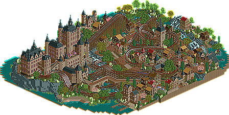
Park / The Battle for the Throne
-
 17-March 14
- Views 7,788
- Downloads 753
- Fans 6
- Comments 24
-
 71.25%(required: 65%) Design
inthemanual 85% disneylandian192 75% Jonny93 75% MCI 75% Faas 70% FredD 70% Liampie 70% Pacificoaster 70% pierrot 65% Louis! 55% 71.25% -
Description
The king of the castle has died.
You can find his grave in the castle garden...
A new king must be chosen!
To do that, there has been decided, to have a duel between his 2 sons, Ivan and Pelleas...
Choose you weapon and witness the duel! -
6 fans Fans of this park
-
Full-Size Map
-
Download Park
753
-
Objects
500
-
Tags
![park_3134 [MM2014 R1] The Great Vilnius Hotel](https://www.nedesigns.com/uploads/parks/3134/aerialt2723.png)
![park_3230 [MM2014 Final] The Time Traveler](https://www.nedesigns.com/uploads/parks/3230/aerialt2951.png)
![park_3153 [MM2014 R1] Bad Kraken!](https://www.nedesigns.com/uploads/parks/3153/aerialt2759.png)
![park_3119 [MM2014 R1] El Paso Springs](https://www.nedesigns.com/uploads/parks/3119/aerialt2737.png)
![park_3226 [MM2014 Final] Ode to the Ood - MMFinale by Stoksy](https://www.nedesigns.com/uploads/parks/3226/aerialt2837.png)
Finally! Checking it out later.
this one is so great, you made a lot of custom objects and the custom trees somehow look good in this,
I love this, I love the mice catcher ride and the little island in the bottem right with the tree on it, I also really like how the coasters interact with the surroundings and overall it just looks really great!
The WOW factor just doesn't stop
This was phenomenal. A beautiful design. It was enjoyable to watch the coasters interact with the buildings and paths and the timing was nice. I really like the simple wooden buildings and the majestic, huge castle to show 'class' which really sets the medieval theme. I don't really have any problem with all the brown as I feel any other colours would've been out of place. The trees were mostly good, some are a bit iffy in my opinion though, and the cliffs around the castle were executed brilliantly.
Overall, I loved this design. I gave it 80%.
I checked it out and think you deserve some elaborate commentary.
The things I liked:
+ The coasters. I loved how they were racing and you made them interact really cool. Coaster interaction is one of your strong points.
+ Landscaping. Really cool cliffs and waterfalls.
+ The Castle. Awesome castle. I know you like to build castles and I'm certainly not stopping you to do so.
+ The cat ride. Really cute and cool garden.
Things I didn't like:
- Foliage. Making your own custom trees is awesome and shows your dedication to this community and the game. But that doesn't mean you can't use other trees. I felt like you wanted to show every tree you made a bit too much. I think the strong point of these custom trees is combining them with the trees that were already in the game. Now the foliage just looks weird.
- The village buildings. This is a personal preference of me. I like colours. This was way too brown. I also thought every building looked a bit too much alike, and I didn't know the purpose of most buildings. Giving the buildings a purpose gives them character, you did this better in oasis of Xcitement for instance.
- The names of the rides. The story of this design is great, but why do you give your rides names like "The Tower" and "Big Wheel"? You're more original than that.
Overall it looks like I'm more negative than positive but I'm not. I just thought this could have been a bit more and I hope you take my advice into account the next time. I would like to compliment you with your dedication thought and with this awesome design.
Gave this 70%.
The garden behind the castle is amazing.
I pretty much agree with faas on everything. I would have liked to see more textures and less windows on the castle too. I gave it an 85%.
The coasters were great! The castle was immense and great and the surrounding atmosphere was lovely, despite the immense amount of 2x2 buildings.
Congratulation to your next finished work.
I think this is a descent design with two racing woodie with an amazing interaction to its surroundings, which is like faas said, one of strenghts. Also the atmosphere was pretty good.
But i had some big issues with this one:
- The overall color scheme is a bit to monotonous for my taste, brown fits of course with this theming, but the amount of this color is just to much
- As much i enjoy the tons of new objects you made, i think some of them don't fit with game graphic, especially some of the new trees.
- There was no free space to relax my eyes. Nearly every tile was full of objects. Also the tons of animated seemed to slow the game speed.
I know my critic sounds a bit negative, but this is of course a really good design. I voted 75%.
It just doesn't feel design worthy to me.
The layouts didn't have flow, the duels weren't anything majorly impressive, and was something that really could have been improved.
I've seen better architecture than this from you too, so I was disappointed there. The castle was impressive, but it could have had so much more detail.
The foliage isn't bad, but it isn't good either, there are a lot of trees that just don't fit the theme/feeling of the area, and because of this, the atmosphere was harmed.
In screens, this looked good, but when it came together, I just wasn't keen. I was expecting something immersive and full of atmosphere, but I was left wanting for this.
I feel that had you spent less time making objects, this would have been so much better.
Sorry if this sounds harsh, but I thought it was weak compared to your other work. Particularly Halcon Azul, which was incredible.
I don't agree with Louis but I cant vote either. I think the medievail theme was really good on this. I really don't think there was any shortage of detail on the castle and I really love the custom stuff.
Thanks for the replies so far.
@ gdb : Thanks and enjoy the new objects.
@Recurious : Thank you, i'm happy that you like it.
@ olddtfan : Enjoy it.
@ PokeCoasterEmpires : I fully agree with your statement. You've nailed the idea behind it. The villagers are mostly poor people with modest housing and the Lord of the land is rich, but also kind, since his huge castle can also house the villagers when needed, since there's enough space. Too much color wouldn't be the best choice, since these villages aren't so colorful.
Some of trees probably aren't 'fitting' enough, but i did my best.
Thanks!
@ Faas : More castles will come, something Efteling inspired is going to be the next design (droomvlucht, zwevende planeetjes met kastelen erop). I'll post a picture at some point.
Honestly, i didn't mean or wanted to show of my trees, but i didn't use the original trees in there, since i thought they wouldn't mix together.
We'll have to disagree about the brown, but i respect your opinion just as much as you respect mine, i assume.
Most buildings didn't really have a purpose, they are just houses.
The fact that this design isn't based on a theme park, or something related, might have been a bad choice.
Sorry for the lazy attitude, when it comes to naming rides.
Thanks Faas.
@ inthemanual : The castle is exactly what it is, not decorative but a settlement that protects you. Don't worry though, i'll make a decorative castle one of these days. Thanks inthemanual.
@ disneylandian : Good to hear, thanks.
@ Jonny : If you hated it so much, than why the 75 vote?
Kidding of course, but the design itself probably is the best of it, with the crazy amount of interaction.
Colors... colors... i know i've got to improve that, but honestly, in this design, too much color wouldn't be right i.m.o.
And i think the castle caused a slow game speed as well.
Thanks Jonny!
@ Louis : I just don't agree about the fact that the dueler isn't impressive. Try it yourself, especially with maintaining a perfect flow, reminding the restrictions of the track.
This castle isn't about detail, but i'm not done playing rct yet, so castles with detail will come.
Foliage still isn't my best thing, i guess.
I know i've got to slow down editing, especially when i'm working on something. I'll admit... i'm addicted to it.
Also, i don't think this design was weak, it is different and not at all theme park related.
But to make you happy... i'm working on a park (semi-realistic). I'm not sure wich real park i'm going to draw inspiration from, but i want it to be colorful this time.
Also more castles in a next design.
You still surprise me though, that you liked Halcon Azul so much.
Thanks Louis!
Don't worry about it olddtfan, i'll respect any opinion i get nowadays. I don't hate Louis for his opinion.
Thanks.
^try seeing his six shooter... he did it in a way harder challenge and succeeded!
I finally had a chance to spend a decent amount of time looking at this.
Personally I really enjoyed it. I loved the coaster interaction and I actually thought the color scheme worked really well. The only thing I really didn't like was the finish line. Everything else was built with solid looking custom objects and elaborate stone and brick archways were everywhere but that archway which was a focal point of the design came across as an afterthought to me.
Still, I was blown away by this. I rarely spend that much time watching a coaster but this one really held my attention. I can't wait to see what you build next.
Congrats on the design, I loved the atmosphere and all the nice custom objects. Duelers are always hard to pull off.
Also I love how you respond to every comment on your screens/parks, shows you really care about feedback
Each to their own I guess. I know it's a difficult thing to do, I've tried it on many occasions and only succeeded a few times. Of which these times had more than 2 tracks (Emperor and Six Shooter). So believe me, I know how difficult it is to maintain flow, perfect timing and be aesthetically pleasing with a lot of interaction and duels. Maybe that's why I'm more difficult to please on this
(Thanks BG by the way )
)
Congratulations on the design though
@ BG : Thanks for defending Louis!... kiss-ass.
I saw six shooter a long time ago...
@ Coasterbill : The finish line wasn't an afterthought, i just didn't know what to do with it and kept it simple because of that.
Thanks though, glad that you enjoyed it.
@ csw : I'm always happy with feedback, it also motivates to keep going. Thanks csw, hope you can use the new objects as well.
@ Louis : Well said and no hard feelings, at least, not on my side.
Thanks Lew.
That's the great thing about this site we can chose to disagree and not hate each other.
I hate you all.