Park / SuperSonic
-
 28-June 15
- Views 6,350
- Downloads 800
- Fans 2
- Comments 31
-
 66.25%(required: 65%) Design
Faas 80% FredD 75% Poke 70% Stoksy 70% inthemanual 65% Liampie 65% RCT2day 65% 5dave 60% geewhzz 60% Ling 60% 66.25% -
Description
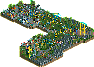
SuperSonic - A fast and intense hyper coaster.
I took a lot of inspiration by Carrowinds upcoming Fury 325 but changed some key features. -
2 fans Fans of this park
-
Full-Size Map
-
Download Park
800
-
Objects
1
-
Tags
I'm really excited to check this out in-game. From the overview the layout looks beautiful, but it also looks like it's going to absolutely crawl through around the majority of the circuit. I feel like just from the overview the lift should be a solid 20 to 50 feet higher to really give it the feel of being a big coaster. Also it looks like the dispatch times are causing some stacking on the final brakes but I can't confirm that yet. That's just my initial impressions, still can't wait to check it out though!
What inthemanual says rings true, I think. And the score accurately reflects that. What is there is great, but there is not much on the map. Yes it's only a design, but for a design, so much attention is given to a parking lot and path. No one is debating JimmyLaessig's technical skill.
that's basically right
It's funny the realist rcters are NOW complaining about this problem when fantasy players have been on the short end of this stick since the beginning of this new wave of "technical" RCT.
Also I feel compelled to remind you that the current voting poll literally judges a park on "I like everything in this" vs. "I like nothing in this". Nothing is about objective quality or technical precision. It's about if you like it or not.
i know it's especially bad with fantasy due to not being as accessible as realism, but it's a problem overall
Yes, it assumes that the first 10 panelists to vote are a fair representation of the site. The first 10 can only be a lot more fair than the first 10 who didn't dislike the style.
Great design. I'll stick with the +/- method for this one:
+ layout: truly beautiful
+ exceptionally clean everywhere
+ exceptionally clean, especially the parking lot
+ Fury is clearly the inspiration, but the coaster and area is still unique enough
+ those signs
+ foliage mostly
- some errors (make sure you go back and look carefully everywhere, maybe have someone else take a look). I found 2 really obvious mistakes within 5 minutes
- the big turnaround could have been better
- that bridge could have been used in a much better way
- fountain
- something in between the fountain and the entrance would have been a great way to add more to the design
I gave it a 65%. Looking forward to more from you.
I liked this a lot, very nice work.
Pros:
+The station, layout and cleanliness of everything were VERY Cedar Fair
+ You pulled off the B&M Giga hideous brake run really well
+Great transfer track
+ I love the "obvious old Skyway station" building
+ The Billboards
Cons:
-The ride was way too short in height and too slow. If it's supposed to be a Giga I would give it more of a presence
- I would have preferred 8 or 9 car trains though I believe Mako will have 7 so it's not unrealistic.
- The ride was Fury like but the chain return and lift support structure were more old school as was the brake run so from a realism standpoint it was a bit confusing
- If you're not going to use block sections I'd set the minimum dispatches so 2 trains aren't on the lift at once.
Like I said, I enjoyed this a lot and the nit picks are minor. Personally I don't know if this had enough content for a Design but clearly the panel disagreed and I still really, really liked it.
Very nice!
This was excellent. Only thing I thought would make this even better would be if you had utilized more space next to the paths instead of having them on the map edge. Otherwise, I enjoyed pretty much everything. Great string of buildings next to the station and I like how you cutaway your facades to peek inside.
We also review your park in this video, starting at 1:02min.
https://youtu.be/GdM5nj8PJr8?t=1m3s
Solid work, nice design. 70%
this is an awesome design all around. fun, solid realism, great detailing, cool layout, nice colors/atmosphere/life. good work!