Park / Lake Chronus
-
 04-October 15
-
Lake Chronus
- Views 7,334
- Downloads 942
- Fans 7
- Comments 30
-

-
 80.63%(required: 70%) Gold
chorkiel 90% yes inthemanual 90% no 5dave 85% no ][ntamin22 85% yes csw 80% no Liampie 80% no Cocoa 75% no Jonny93 75% no MCI 75% no geewhzz 65% no 80.63% 20.00% -
Description
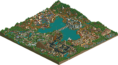
Lake Chronus is a full sized LL park with 5 themed areas: Knossos, Trondheim, Florentia, The Black Country and Arcadia
-
7 fans Fans of this park
-
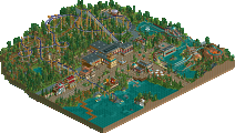
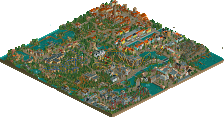
Full-Size Map
-
Download Park
942
-
Tags
Thanks Recurious & nin - great to hear you both liked it so much! Gold feels an appropriate score and I'm content with it, I don't think I would have voted it spotlight in all honesty. But I am proud of this park. Cheers for the votes!
no green name then?? Only then will my life be complete.
Your life is complete.
apologies this has taken the better part of two months, but:
A Lake Chronus review! Area by area for the most part; that's how iris did it, that's how America does it, and it has worked out pretty well so far.
The Black Country turned out to be much more pleasant to look at than I expected from the screens. I give this top marks for atmosphere, really – it nails the industrial countryside. I half expected to see an Ironbridge recreation. Huge plus for the Rusty Bucket, although it would be cooler if working. It really does add a lot that everything about the area is in-theme; the locks on the waterway, the lifting bridges, the various chimneys and waterwheels and the barge, all great touches. Lovely work as well with the little split-level path around the train station and the gas lamp waterfront. Coasterwise this is obviously a solid area. Excellent variety and very fun to watch all of them. Baron 189- I mean Copperhead Colliery is nicely done; it would be easy for a layout like that to feel like an afterthought, but the way it fits in is just perfect. The Copperhead/Steamhammer interaction is fantastic as well, and I love the added supports on Steam hammer. One downer is that all three of the coasters have the same weird quirk, which is that their turnarounds feel a little too tight and fast. The curve right after the Flying Shuttle's loop could be a bigger radius, the Copperhead and Steamhammer turnarounds are both small-radius even though they're moving pretty good through there. I'm also not sold on the naming here - and to a lesser degree throughout the park. I would expect a ride called Flying Shuttle to be, well, a shuttle, and something called Steam Hammer to probably be launched.
Grapevine isn't exactly a conventional family coaster, but it sure does look like it would be fun. The setting is magnificent; lovely work on the hillside vineyards. I was a little confused on the broader area setting initially, but once things came together I think it is actually a very neat idea.
Brief aside - I think I can see where Florence grew out from our H2H efforts; we both seem to favor the longer transitions in atmosphere and architecture that a big area allows, and this not only borrows some of the architectural cues from Muertos but also the choppier “town – straight into farmland” rhythm we set up to squish the action into an H2H tile restriction.
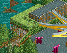
Arcadia is a fascinating experimental area. (That's probably damning it with faint praise – presumably if it had just been a great area there would be no need to preface it with “experimental” - but I don't mean it that way) I wouldn't say it is the strongest area, but this is a park with a lot of variety that makes it hard to pin down which area is my least favorite. Looking around, the maze awnings and various tunnels / biospheres are all wonderful unique touches. I'm not sure it sells itself as being a Utopian future as well as it could, but it makes for a solid-enough RCT experience. I think the whole place could use a little more “curating;” it feels a bit too much like it just spilled out and hasn't been funneled or shaped into a really sharp area. The paths meander a lot, the attraction entrances are a little obscure, and it feels a little torn between a lazy garden walk and an outdoor adventure zone. One “oops” here too - I'm guessing the "Ozone" sign should be for Windsong. Regardless of which role the area is focused on – adventure or relaxation - There are a lot of interesting departures from the theme park standard in Arcadia. Maybe they're better described as departures from the coaster-heavy RCT approach to parks, but it was fun to see a well-executed high course and a slide, of all things. The coaster was ok, but not a particularly stand-out addition to the park. All in all, for the type of Iris-era park this project is emulating, one offbeat experimental area that isn't so much poorly-executed as lacking focus isn't enough to ruin a Spotlight chance in my estimation.
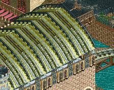
Knossos is a bit of an unpolished gem. Many, many things about it are exceptionally well done, and done creatively and with new ideas and better than others have done this kind of thing before, so very high marks on this area. My largest complaint is that it could be better still if only it followed the same patterns of clear layout that the other areas do. The Labyrinth is excellent, and I appreciate the atmosphere value of having it nestled in the shadows, half-buried, but it might have nice to have it be more of a showpiece attraction rather than background fill. Similarly, Minotaur is really nicely done with the intertwining path- and self-interaction, but the trouble with big twisted layouts is there's a big puzzle about where to put the path. I'm not convinced you solved it really well here. The meandering paths in Arcadia seem to work with the garden of paradise theme, but the pathing in Knossos seems more like it was put in places that would benefit the rides with actually getting out the other side of the area kind of an afterthought. On a broader level it detracts a bit from the idea of having a maze if the general footpath is itself a maze... of course, I'm not really one to talk. Building first and planning afterwards is my default and it tends to bite me in the ass. The boat ride station is another slight downer – I would have gone for maybe brown tile or virgina reel, something else for the roof. The green seems out of place. Lovely work with the swamp landscape at water-level however both at the boat ride start and back in around the labyrinth.
Daedalus was a bit of a disappointment in the sense that it seemingly has less to do with the source material than the fittingly-themed Ikaros nearby, which makes it a rare exception in this park full of nicely on-theme examples. Not really a big hiccup though - the station is exceptionally good, the layout is fine, and who doesn't love seeing the variety of having a single-rail coaster on display. The transitional landscaping here is also a very nice touch and something I think probably went unnoticed by many.
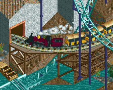
Maybe this is a good place to interject on the overall landscaping of the project; on the whole, very good. I'm hesitant to give it an “outstanding” because there isn't too much adventurous about a center lake enclosed by identical ridges on three sides, but it is absolutely good enough to add interest in places that, as a viewer, I care about. Lots of interesting waterside areas to take in, and I love the little spit of land that eventually extends into the castle bridge. One day I'll post a whole big network theory thing on why this kind of central nodal crossing is a great idea, but the short version is park visitors don't have to go all the way around the lake and you can create a cool park icon thanks to the central isolation. A classic trope that still works very well. I also appreciate the chairlift as a good option for guests looking to get across the park. The train serves that purpose a little less well – the stations are sort of awkwardly placed – and doesn't present as natural a fit as I'd like it to for most of the course. I've never been a big fan of sharp course changes or elevation shifts for railroads, but I can at least say that you did remarkably well integrating the tracks into the places where they meet the path and rides – plus of course the castle bypass is delightfully picturesque.
That just leaves the vikings! The reversers I thought were outstanding. Exceptionally neat idea with the face-off duels and I think you pulled it off about as well as anyone could ask; they just look like a total blast to ride. It is maybe a little underwhelming that the theming is basically just coaster in the woods, but that has always been one particular on which I'm willing to give the benefit of real-life experience primacy over what looks interesting in RCT. Coasters like the Beast and Boulder Dash are entirely tree and they're fantastic for it, while these even have the nice little castle towers and a whole bunch of tunnel action. The constant changes of direction that pop you out of the trees just long enough to see the other train come charging at you are such a great element. The rest of the area is similar in the sense that it seems underdone at first (and I find it really is in places) but on the whole it is pleasant and a nice take on the theme. I think the architecture could have been pushed further. The solution you arrived at isn't bad per se, but it feels like a few more tweaks and maybe a firm decisions either towards or away from trackitecture were needed. The watercoaster is great and is a really exciting way to weave all kinds of action through the castle, and it is a noteworthy achievement in and of itself that the castle area looks pretty good from all angles. Not 100% on the flying buttresses fitting the theme – aren't they more of a gothic period development? Would have liked to see more fanfare surrounding the big splashdown – same goes for the knossos boat ride – but I can live with it. An inverted boomerang is kind of a head-scratcher for a park that doesn't seem to be trying to present itself as a true realism effort; they just aren't interesting to look at and feel like filler. So while I can't fault the landscaping, station, or support work, I don't think the area (or park) needs the additional coaster here and maybe a kids/family ride or some buildings would have been nicer.
There's a lot more I could add here, but I don't think most people want to sit through me critiquing every tiny detail (the fantastic use of castle scenery on the hotel! The entry sculpture matching the logo!) for weeks. Suffice it to say I thought this brought enough clear parkmaking talent and exciting ideas to the table to vote it for Spotlight despite a few rough edges.
Thanks so much for the review ][. Sounds like you explored this park very thoroughly which makes me glad!
You're spot on with many of your observations, particularly in regards to how many of the awkward path layouts came together in Knossos and Arcadia. You're also correct that the railway also suffered from 'shoe-horning' in many places too.
I'm glad you addressed transition areas and the variation within the themes too (i.e. having denser, urban areas blend into countryside). One of my main goals with this park was having smooth, subtle area transitions rather than abrupt gateways. The idea being that the centre of each area is more heavily themed than the transition points.
You've made me think a little about what I consider to be the strengths and weaknesses of my park (now that it's been released for a while and I'm detached from building on it) so I'm going to try and describe them, hopefully it will be seen as interesting insights as appose to vain self indulgence! :P
I think I succeeded really well with the macro planning in this park. The areas flow together well, I didn't rely on rivers or cliffs to divide them and like ][ pointed out the bridge is both practical and a cool set piece. You'll notice I also kept the foliage fairly consistent throughout with slight changes such as more pine trees in the Viking area and more oak trees in The Black Country. I wanted to create an overview that looked natural and I think I did this well. I avoided desert or winter areas for this reason too.
Another objective with this park was to have the themes linked conceptually somehow rather than random. So I chose to pick eras in time which are fairly evenly spread out through time (and this can be followed chronologically from Knossos clockwise round to Arcadia). Whilst the idea has been done before with parks like Through The Ages, I think it tied the themes together well and added to the overall cohesion.
Atmosphere is another of the parks strengths, in my opinion. I wanted to create very dense themes with lots of interesting passageways, overhangs, cool bridges etc. This is probably best realised in The Black Country. I'm really happy with all the levels and 'vertical interest' (for lack of a better phrase) in Knossos but the confusing paths stopped it from really coming together.
As for weaknesses, the architecture is very inconsistent (in quality) and even the stronger buildings are just 'ok'. This is just something that'll come with practice I hope! I need to take the time to give every building a cool story and purpose too. There are too many times in this park where I rushed together an area just to see how it looks on a whole rather than taking time to consider why some of the buildings exist.
As I already mentioned the pathing in places was confusing. I also think I could add an extra layer of polish and flair to how the paths are decorated in places too. When I look at one of my fav parks like Liampie's Escapist Experience, it's scattered with beautiful, vibrant plazas and thoroughfares. This is something I'd like to achieve next time!
That's about all I got. Thanks again for the thorough review ][, really makes building parks worth it!
I just had a look at this park. Seriously powerful stuff. There's a lot of creative trackitecture use which is pretty dazzling given how much we've explored over the years. You've advanced it. Makes me think of OZONE and pierrot, but your style is different, refreshing, unique, playful (successfully), and looking quite effortless really. This would have been an easy spotlight and important release back in the day. Today it should be a high gold, and I'm a little sad to not see it over 85%.
Very excited to see what you do next.
Thanks posix. I hope you're inspired to build something now you've got the game working again.
here we go
Entrance area
- The hotel was brilliant. Amazing use of the castle scenery.
- The way you used track and objects was really interesting and innovative.
- Architecture was great. Varied enough, still sticking to the theme. It was unique but still felt traditional.
- I did not enjoy the fountain because I think the monorail doesn't really fit well texture wise and also looks a bit funny because of perception issues.
- The farmy area was really cute and I liked the foliage work. The coaster layout wasn't particularly aesthetically pleasing although I did think the colour scheme was good.
- The ship looked cool.
- The landscaping was good around the edges although some of your rock work could have been more emphasized.
Industrial Area
- I liked the way the enterprise was sunk into the ground.
- It's cool to see an industrial area that isn't so stereotypical. Meaning one that isn't so grey and grotty but one that feels very modern.
- The rapids could have been emphasized more, like some railings could have been used or some outside rapid features. The theming was great though.
- I liked your use of ride trains on the path and as theming. Makes it feel quite immersive.
- Not sure how I feel about the vertical drop coaster. It felt forced and didn't really belong there in my opinion.
- I also have similar thoughts on the water ride.
- I thought the woodie had a cool flowing layout. I thought the station was a bit safe and blocky though. Like it could have been a lot more interesting.
Modern Area
- It's always good to see new, refreshing themes in LL. I really struggle with doing that.
- Architecture was a bit featureless in some parts. Like some structures were just massive blocks.
- Then there's some really cool stuff with unique textures like glass and hedges.
- I liked your use of track and you had some really cool ideas in this area like the playing zone/trail thing and the aquatopia ride.
- The area as a whole is so clean and natural and your use of elevation is really effective.
- The coaster station was really simple and boring; you could've have done something really cool with that.
- The landscaping was gorgeous and framed the coaster really well.
Knossos
- I adore the colours and theming.
- Some of your composition needs work in my opinion. Like the show area was a really cool idea with the vertical drop cars but could have have a more focal position.
- I think some things could have been placed more consciously. For example: the swinging coaster didn't really need to exist. But if it had some more theming and interaction it could have been more purposeful and in terms of people visiting this park, it could have been more exciting for the riders and guests.
- It's refreshing to see a coaster so up front and centre and completely interact with its theming and surroundings. I didn't particularly like the purple, could have done with more of a natural colour.
- Were the walls intentionally windows less? Like is it part of the theming? Made the area feel a bit empty.
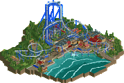
Viking area
- I thought the transition between Knossos and this area could have been more clear.
- Freki and Geri was a really cool idea although I think it could have done with some more theming. It's good to see a playful, fun idea executed in a professional way.
- The castle was executed really well and looked really convincing.
- It was good to see some underused coaster types in this area and park as whole: like the reverser, water and lay down.
- The bridge, I think could have been larger and more grandeur as it's in the position to be a very central important feature of the park.
Alex, your contribution to LL is very important as you're combining traditional aesthetics with new and modern theming and techniques. I think the score is perfect for this park. If you can improve your composition, layouts (which I don't really care about but others do), and your theming in terms of scale and scope, a spotlight is definitely in reach.
Since my two year old park still gets comments I dont feel bad about bumping this one.
I never told you how awesome that park was alex!
https://www.youtube.com/watch?v=M9uF08TiroM
First of all
The concept of having different areas set in different eras is not new or original, but you turned it into a feature quite well, with the logo (and the entrance sculpture), the name, and the chronological order of the areas. It would've been nice if the entrance was set in Knossos, so a guest could travel through all the eras in chronological order in a linear fashion. On the other hand, it's kinda nice that guests start in the middle and they can go two steps forwards or two steps backwards. In that case I would've gone with an Italian name though. Lago del Tempo or something like that, but slightly better sounding.
Florentia
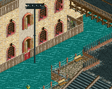
Great first area. The entrance doesn't look too exciting from the front, but the piazza that comes after is beautiful. Must be quite breathtaking from a guest's perspective... Warm italian architecture in the foreground, a cool (well executed) ship at medium distance, a badass bridge in the distance and coasters and a huge castle making up the rest of the skyline. That's a lot to take in suddenly... For the guest, that is. For the viewer everything is super easy on the eyes. The architecture is simple, but effective in this area. It looks sufficiently Italian, I could correctly guess the theme and setting just from the theming. I especially like the tall 3x3 building, the under construction church (yessss) and the row of waterfront houses. The details are subtle, but there is enough to make exploring the area a fun experience. I'm not a fan of the back half of the area though... I think the flat looks stupid, the kiddie coaster has an ugly layout with ugly colours, and the composition is just lacking. The architecture seems more generic and uninspired here too... Some good stuff to be found here as well though. The queue to the Da Vinci ride and the hotel that rocks its excess of castle turrets like nothing before it.
Trondheim
Probably the weakest area in the park... Which is nothing to be ashamed of. From Florentia two paths go into this area, and both are cool: through the castle gates (although the actual gate seems to be missing) or under the diagonal train tracks. The castle is a great centerpiece for both the area and the whole park (that bridge, brilliant!). The water coaster is beautifully integrated (drop under the bridge, drop wrapped around round tower), but the layout isn't flawless... That splash section in the lake definitely is too short. Oh, by the way, I love how the train also makes an appearance here for increased complexity. The complexity isn't in the theming in this area, it's in the composition. Fafnir, the invertigo doesn't do much for me, and Thor's Hammer looks very out of place. I think this area hasn't really decided if history or mythology is the focus; mostly history I think, but with these two rides it becomes almost cartoonesque mythology. No big deal though, they're both well done albeit a bit simple. Eriksson's Crew is brilliant, on the other hand, and the dueling reverser coasters are mindblowing even. The surroundings are minimal and frankly they don't need much more. Rarely has a coaster been this much fun to watch. Stellar work. Lastly, I want to point out the beautiful colours in this area. Cold, but not bleak. The blues work amazingly well.
Knossos
Now this is a theme I can relate to! I've done this theme so many times, the latest attempt getting really out of hand, and ending up as a spotlight. It's no use comparing the two, but there is one funny difference I noticed: my Knossos focused on Ikaros and had the Minotaur thing in the background, in your Knossos this is exactly the other way around. Anyway, Minotaur: great layout, except for the underground 180 degree turn. The Flood is a ride our areas have in common, although mine was a log flume. I'm not sure what to think of yours... It looks pretty in some areas, and shoehorned in others. The splash section is too short again and it bothers me a little bit that you have two different rides splashing into the central lake. The Heracles theatre is awesome, those seats are fucking fantastic. I like the little scene you created as well... Shows in RCT tend to get really big, this one was credibly small although ironically I don't think credibility was a goal of yours in this park. Daedalus works for what it is. Could've done with more theming, but I like it. All in all the rides are fine, but the theming is what steals the show here. Great effective trick with the columns. The multi-leveled theming is excellent, especially the bits of sunken labyrinth, not being accessible (I think?) add a great sense of mystery and adventure. In early screens of this area I was worried that it would become a mess, but you saved it and turned it into something beautiful. Also good call on not having any windows. I almost wish there was more of this.
The Black Country
I'm not jumping from an almost prehistoric civilization to the distant future... Let's go back to the park entrance, and turn left into the 19th century. Guests are welcomed by a train bridge - fitting. Not the only place where the train has become a piece of theming aside from being a ride. The area has three coasters, which is at least one too many I think. So which one has to go? The Flying Shuttle looks pretty flawless. Steam Hammer has a spectacular layout and some good looking supports. And one of the best queues I've ever seen in LL. No, it is the b&m diver that could've been left out. There's nothing bad about it, but nothing about it stands out either. The support structure at most. It feels like it's too small too, compared to the other coasters in the park. What other rides are there? Watermill Rapids is hardly noticable at first, tucked into the corner, but it is super well done. Only a guide rail here and there is missing, but maybe that would've made it look less good. Smoke Rings is clever on one hand, and irrelevant/far-fetched on the other. Malfunction is also not really conceptually strong. The Rusty Bucket could've been left out but the name is hilarious so I'm glad it's there anyway. Theming: fucking awesome. Plenty of unique chimneys, dams, pulleys, bridges, wheels... I like the train cars as seatings. The signal box is a good idea. I think the train station should've been longer and it was an unused opportunity for many more train-related details, but what's there looks good. Aside from the good details, the textures and colours are spot on in this area. Very, very atmospheric!
Arcadia
Very interesting... Different stuff. A minimal style like this is not easy. I don't think you succeeded everywhere, in most places you did though. Windsong is a great centerpiece ride, with some beautiful interactions and elements. And I love, love, loooove that station with the waterfall. I also like what you did with the queue and the path supports. The other rides are great too: aquatopia, photosynthesis, the ropes course (damn), the slide (I like the boats deposit at the bottom - another unexpected realistic touch). The architecture has some cool tricks too. Most notably the hedges, but also the domes, the glass overhangs, the roof terrace with the minigolf path, and the pergolas (love the big assymetric one). What everything in this area does well is getting a theme across: a future civilization that is much more harmonious with nature than our current civilization. Great contrast with The Black Country (again, the naming does its job here). I've said it before multiple times, the whole area reminds me of futuristic utopian artwork from the 60's - from either artists, architecturs, urban planners or scientists. I think the mankind-nature balance is done well in this area. The flyer station and how it dissolves into the landscape is a good example, but also how the queue for aquatopia dives underground for example. All in all, plenty to love here.
Spotlight?
After six months, I'm still bouncing between yes and no. I don't think I will ever make definitive decision. With Brighton Glen I still haven't made up my mind after seven years... I voted no in the end, and this is why: the park is lacking grandeur, somehow. Each area has a dense and a less dense half, and the less dense halves feel too much like gaps rather than transitions. There is no lack of fantastic theming, flawless landscaping (something I largely ignored in the review above), interesting rides, clever ideas and pretty compositions, but they're somehow too spread out despite the quantity of all of those. Look at the map below:
The green areas are great, and the red areas are where the 'fabric' becomes too stretched and the park tears. Before I said the duelers don't need much theming and I still stand by that, but they're framed by more emptiness. Some denser surroundings would really enhance their simplicty. If you got rid of the Italian countryside and the nordic mythological stuff (should've made that red on the map) and flipped over the duelers to the other side of the castle, you'd have a new free corner that could've housed a new small area. Same with the central peninsula, housing the weakest stuff of the Arcadia and Black Country areas. If Arcadia expanded a bit into Knossos territory (Daedalus is not quite irreplacable), there would be room for yet another area! And not a small one this time. I'm not telling you the park should've had more areas, that's a creative choice you must make yourself, I'm just saying that there was a density problem that could've elevated this into a spotlight worthy park. I'm also not saying that is THE reason this didn't win - I'm still not sure about what exactly made me vote no. It's a gut feeling. Lack of grandeur is the term that comes closes to it. But a park like this winning gold instead of spotlight has never been LESS bitter... You've got two parks coming up and at least one of them will win it, that I can guarantee. You'll get a spotlight soon enough (third one this year!?!?!?!). Congrats on the achievement nonetheless!