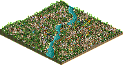
Park / Tula City
-
 14-October 03
- Views 21,742
- Downloads 1,979
- Fans 1
- Comments 35
-
 58.50%(required: none) Silver
Steve 70% saxman1089 65% Cocoa 60% Jaguar 60% Liampie 60% posix 60% Scoop 60% G Force 55% Ling 55% RWE 55% Xeccah 55% 5dave 50% 58.50% -
1 fan Fans of this park
-
Download Park
1,979
-
Objects
122
-
Tags
As for RCT2...
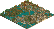
TULA CITY
This one was very creative and I'm glad to see you imported all the good walls from WW. You also used them very well to make your theme. The theming was great and I loved your flowering choices, but overall this park was too repetitive for me. I got tired of it very quickly. The coaster was pretty good and I liked the placement of the Immelman(I think it was)
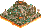
BABYLON
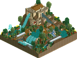
I have to say that I was very surprised by this one. I didn't expect there to be this much effort put into it, but there certainly was. The hanging gardens, I thought, were great. The theming was there, but I dunno about those coasters. They got the job done, but they were really nothing special, especially that woodie.
Any way, good job everyone...
I thought I themed all of the coasters but yes the larger half was better....it was the most recently finished part. I didn't feel I could have a hanging gardens area with sand and I didn't feel I could have the market area in grass...so not sure how I could have made it different and I don’t really see what is wrong with having grass and sand. The observation tower building was the Tower of Babel and the look I was going for had path going around it, hence the raised land…again I don’t understand what is wrong with that. I think the park was innovative since it was my own work I didn’t just follow the parkmaking norm that seems to be what most are doing. I used grass and sand, I experimented with architecture elements, I made it peepable, and I finished with a park that was different and that is why some people didn't like it.
CoasterkidMWM: Didn't like the coasters in Babylon. Two went 15 mph or below over hills. That's a no no. Babylon contrasted too much, it's certainly better then what I could do, it was kinda of cluttered. It was still a great park though.
The only time any of the coasters went 15mph or below over hills was in the mid course brake areas. But I dont get good comments about my coasters very often so all I can do is keep trying. Although I have got some pretty good comments about the Babylon coasters. The contrast was to show the areas of Babylon near the rivers and to show the areas that were not. I wouldn’t call it cluttered, I put in as much detailed architecture as I could to get the crowded market look.
sloB: I have to say that I was very surprised by this one. I didn't expect there to be this much effort put into it, but there certainly was. The hanging gardens, I thought, were great. The theming was there, but I dunno about those coasters. They got the job done, but they were really nothing special, especially that woodie.
A lot of people have been surprised…it’s not every day that I have a park to release…I put lots of effort into everything I do…I’m glad you liked the gardens and theming…as I said before all I can do is keep working on my coasters, I’ll learn from my club members…
Babylon
Nice park, AP! I loved the way the gardens area fucked with my eyes - one of the features of the new scenery engine is that it's seriously difficult to work out what is at what level, especially in areas like that one where everything is raised up high. It took me a while to figure out what was going on, but, most importantly, it gave a distinct impression of elevation, which I guess is good for Hanging Gardens etc. In principle I liked the steel twister and the giga (the twister more so) but both seemed to suffer from meandering sections where nothing much was going on. For instance, the twister finished its inversions about half way round, and the rest of the ride was just waltzing around inanely, albeit past some nice scenery. The woodie looked poor compared to the other coasters - treed, no buildings for it to interact with, no focus...the flyer was better, but not up to the other coasters. I liked the architecture the most in this park, along with the colours. You were brave to go with big architecture like the Tower of Babel, and I think it paid off! Good job on this park - looking forward to some more focussed coasters in the future (check any of SAC's, Kirii's or JS's coasters to see what I mean...never a dull moment!).
Tula City
Ooh, pretty, but suffers from the 'larger than a megapark-area but less-variation-than-ALE' syndrome, as I just thought of calling it. The architecture carries the park, along with the pleasant colours. The coaster had pretty strange colours (did people comment on that in the screens? I can't remember) and a weird layout, but looked fun all the same. The rapids were good, but too hidden! That bit where they emerged underneath the leaking barrels was the best bit, because really it was the only bit on view! Clever little ghost train, which was actually better for being indoors, but apart from that there were a few too many trees and not enough individual strokes of mastery that I thought could have pushed the park towards 'brilliant'. Iris is right - if you make a full park where each area is as good as this, then you're definitely on to something. Congrats on the runner-up, though - your resume is looking really slick!
Nice round of runners-up IMO, and i'm looking forward the the spotlight!
Twisted Offline
mantis you'll be happy to know i am using rides more
Action Zone was awesome but as others mentioned the theme did get boring. Break away from this kind of theme and you could make some great stuff. I look forward to your next park.
Foreign Legions wasn't really my type of park. I wasn't keen on the Dunlun area as there were far too many flat roofs for my tastes. There were also too many trees. Apart from that it was a nice looking park.
Thanks again.
Wasted years was great, just the feal of the park when I opened it up was awesome. Twisted's best work for sure. Can't wait to see your next park.. released that is.
Great Job to eveyone, I'll comment on the others if I get time to view them.
Babylon - Very good archy, i liked the market are alot and the gradens were awsome, however like Tula i did not like the coasters, they just did not seem realistic to me, the colers in this park got crazy at some points and distraced me from the skill you have with archy. overall its a good park, but please work on your coasters a bit more, you not that far off. 7.5/10
I'd love to do a Dutch theme, but all the dutch players would just shit on it
or maybe I should call it a dutch oven
Liam, go on the old site or FTP and look for Tony's (aka KumbaMaster (=the original member called "Kumba" here)) "Avalon". Used to be my absolute favourite park when I discovered NE. Has a suspended mouse by Natelox in it called Spear that is totally golden.. Still special today I think.
Also I just emailed Tony. Shameless fanmail.
Most of it isn't. We need a task force to finish filling in all the leftover NE3 files (which are mostly leftover NE1 + 2 files) into the DB. Like, we don't even have Laramie Lake in here.