Park / Bungarus
-
 18-April 16
- Views 2,287
- Downloads 495
- Fans 2
- Comments 12
-
 54.38%(required: 65%)
Design Submission
54.38%(required: 65%)
Design Submission
chorkiel 80% posix 65% inthemanual 60% Liampie 55% Poke 55% alex 50% Cocoa 50% csw 50% Stoksy 50% nin 45% 54.38% -
Description
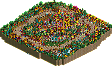
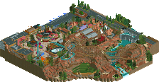
Deep in the jungle lies a small village whose inhabitants pay honour to the snake. We hear it's quite popular this time of year...
-
2 fans Fans of this park
-
Full-Size Map
-
Download Park
495
-
Objects
1
-
Tags
it's not easy on the eyes is it. That being said I love it. I can't really tell why but I do.
It's disgustingly perfect. I love it!
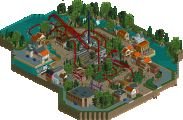
A nice little piece of work here, style wise it feels unique and not derivative of really anything which is quite commendable. The coasters were quite awesome as well, some great synchronization.
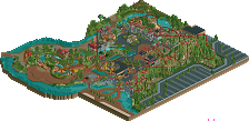
One thing I might of preferred was slightly less peeps, maybe would a of helped the atmosphere a bit, it was just epically crowded and stuffed with peeps kind of conflicting with the theme a bit. Very minor though.
Another suggestion, I really liked the swan boat ride idea, but maybe making it tracked and then using crooked house to make it invisible would of been a better option, the stupid AI makes even the simplest path a nightmare to navigate.
Nice work.
Yeah, this is just a lovely, fresh design. I too noticed wayyyy too many peeps, it's far too jammed, though you kind of tried to address that on the sidebar of your release. Still, just to remove the guests and fill it half way would have been better.
I loved the pop of colors, not really jungle like, but who cares! It's a quirky creation of funness! And to use a unique coaster style, with just two cars was fabulous, and the timing was outstanding, very well done there.
One thing that looked unfinished was the huts to the swan ride. If you had of made them invisible or hid them with some architecture would have cured that issue. I found they detracted from the atmosphere you were going for.
I would say 65%, but it'll be a close call for a design. Keep bringing the fun, that's what it's all about!
so much purple and gold...
not bad! I like the sort of indian vibe I get from it but it is a bit small and sore to the eyes. With a bit more care and maybe some subtlety I reckon you could improve it.
Thanks for taking a look guys
@Scoop and chorkiel: Hah! Mixed opinions, huh? I've often wondered about colours though, in the way that they can appear one way on one person's screen, and entirely different on another's, based on their monitor settings. I suppose I have mine quite subdued, and don't realise just how bright/vibrant it may appear to others.
@G Force: Honestly, a surprising opinion from you, in that your work is highly realistic and I wouldn't have expected you to enjoy this kind of... folly I suppose. But thanks, and yeah I don't tend to look at other people's work when I build. I just get a bit of an idea in my head and run with it. Agreed about the peeps - there are too many!
About the swan ride, I was really annoyed when I opened it up in OpenRCT2 and they were jamming at the start (as per the aerial). On the version of the game that I built it on, it worked fine - no jams, no bumping and turning back. I guess that's something for me to consider in the future.
@bigshootergill: Cheers. I was going for something that would stand out from the jungle foliage, with the gold to symbolise wealth, and the pink/purple... because I wanted to
Agreed about the swan huts. Looking back at it, they do stand out as being neglected. At the time I thought they were fine, but a bit more deco (or even a different default covering) would look better.
@Cocoa: Sorry it hurt What kind of subtlety do you mean though? I purposely intended for the ride and structures to completely contrast the foliage - do you think more variant colours and less of the purple and gold would've improved it? (I'd seriously like to know your thoughts on this, as I've always admired your use of colour, particularly when you utilise bold and uncommon choices)
@nin: I'm a bit confused with what you say. You refer to it as throwback, yet say it's fresh too. It can't be old and fresh, can it? Incidentally though, I didn't intend to replicate an older style. This is just the way I build when I'm less focused on creating an "NE style" park (not that I'm quite there yet either though). But still, glad you appreciated the novelty of it.
I think this was quite neat. I liked the coaster layouts. They were nice and fun to watch. The River Swan is probably my favourite. I love the part where it goes next to the Temple Twist and the waterfall. So good!
The dense foliage works perfect and I really like the red flowers in there. I also liked what you did with the open area - the one with grass and benches. It’s a nice contrast to the rest of the park.
Maybe it was a little bit chaotic, even for me, in terms of colours, textures and peeps. I think the coasters would look better if one were purple and the other one were yellow. I’m not really sure about the stone texture underneath them either.
Anyway, good job! This was nice and fun!
Layouts are great.
Wow, what a vote spread.
I thought this was fun, but it relied too heavily on the same colors, and looked a bit blocky or messy.